Supplier Quality Analysis sample for Power BI: Take a tour
This industry sample dashboard and underlying report focus on one of the typical supply chain challenges: supplier quality analysis. Two primary metrics are at play in this analysis: total number of defects and the total downtime that these defects caused.
This sample has two main objectives:
- Understand who the best and worst suppliers are, with respect to quality.
- Identify which plants do a better job finding and rejecting defects, to minimize downtime.

This sample is part of a series that shows how you can use Power BI with business-oriented data, reports, and dashboards. The company obviEnce created this sample using real, anonymized data. The data is available in several formats: built-in sample in the Power BI service, .pbix Power BI Desktop file, or Excel workbook. See Samples for Power BI.
This tutorial explores the Supplier Quality Analysis built-in sample in the Power BI service. Because the report experience is similar in Power BI Desktop and in the service, you can also follow along by using the sample .pbix file in Power BI Desktop. Get the sample in one of the following ways:
- Get the built-in sample in the Power BI service.
- Download the .pbix file.
- Download the Excel workbook.
Prerequisites
You don't need a Power BI license to explore the sample in Power BI Desktop. You just need a Fabric free license to explore the sample in the Power BI service, and save it to your My workspace.
Get the built-in sample
Open the Power BI service (
app.powerbi.com), and select Learn in the left navigation.On the Learning center page, under Sample reports, scroll until you see the Supplier Quality Analysis Sample.
Select the sample. It opens in Reading mode.
Power BI imports the built-in sample, adding a new dashboard, report, and semantic model to your current workspace.
Select the dashboard to view the sample dashboard.
Get the .pbix file for this sample
Alternatively, you can download the Supplier Quality Analysis sample as a .pbix file, which is designed for use with Power BI Desktop.
After you open the file in Power BI Desktop, select File > Publish > Publish to Power BI or choose Publish in the Home ribbon.
In the Publish to Power BI dialog, choose a workspace and then Select.
In the Power BI service, in your workspace, scroll down to the Supplier Quality Analysis Sample report and select to open.
From the More options (...) menu, select Pin to a dashboard. Select New dashboard, enter a name, and choose Pin live.
The dashboard that you create this way isn't the same as the sample dashboard created by the built-in sample. You can still use Q&A and make changes to your dashboard.
Get the Excel workbook for this sample
If you want to view the data source for this sample, it's also available as an Excel workbook. To see the raw data, enable the Data Analysis add-ins, and then select Power Pivot > Manage.
If you want to get and use the Excel file in the Power BI service, follow these steps:
Download the sample from Power BI Desktop samples. The file is called Supplier Quality Analysis Sample-no-PV.xlsx.
Open the file in Excel and then select File > Publish > Publish to Power BI.
Select a workspace, such as My workspace, and choose Export.
There are different ways to work with Excel files. For more information, see Explore the Excel samples in Excel.
In the Power BI service, the exported data appears as a semantic model in the selected workspace. Select More options (...) > Auto-create report.
Select Save, enter a name for your report, and then choose Save.
From the More options (...) menu, select Pin to a dashboard. Select New dashboard, enter a name, and choose Pin live.
The dashboard that you create this way isn't the same as the sample dashboard created by the built-in sample. You can still use Q&A and make changes to your dashboard.
Downtime caused by defective materials
With the built-in sample in the Power BI service, you have a report and a dashboard. Let's start the tour at the dashboard to analyze the downtime caused by defective materials and see which vendors are responsible.
On the dashboard, select the Total Defect Quantity or the Total Downtime Minutes tile.
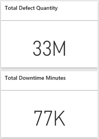
The Supplier Quality Analysis Sample report opens to the Downtime Analysis page.
Notice we have 33 million defective pieces, causing a total downtime of 77,000 minutes. Although some materials have fewer defective pieces, they can cause delays, which result in more downtime. Let's explore them on the report page.
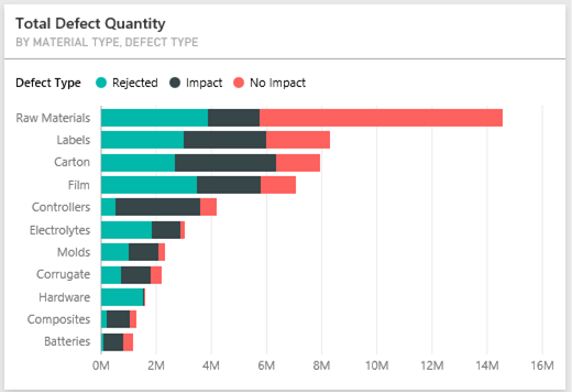
If we look at the Total Downtime Minutes line in the Defects and Downtime (min) by Material Type combo chart, we can see that corrugate materials cause the most downtime.
Select the Corrugate column to see which plants are affected most by this defect and which vendor is responsible.
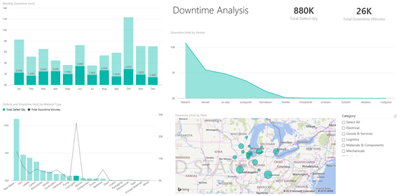
In the Downtime (min) by Plant map, select individual plants in turn to see which vendor or material is responsible for the downtime at that plant.

Which are the worst suppliers?
We want to find the worst eight suppliers and determine what percentage of the downtime they're responsible for creating. We can do so by changing the Downtime (min) by Vendor area chart to a treemap.
On the Downtime Analysis page of the report, select Edit in the top menu.
Select the Downtime (min) by Vendor area chart, and in the Visualizations pane, select the Treemap icon.
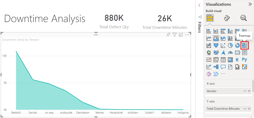
The treemap automatically sets the Vendor field as the Group.
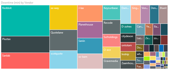
From this treemap, we can see the top eight vendors are the eight blocks on the left of the treemap. We can also see they account for about 50% of all downtime minutes.
Select Supplier Quality from the left navigation bar to return to the dashboard.

Comparing plants
Now let's explore which plant does a better job managing defective material, resulting in less downtime.
On the dashboard, select the Total Defect Reports by Plant, Defect Type map tile.
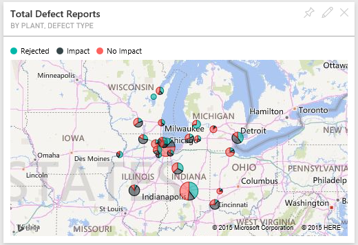
The report opens to the Supplier Quality Analysis page.
In the legend of the Total Defect Reports by Plant and Defect Type, select Impact.

Notice in the bubble chart that Logistics is the most troublesome category. It's the largest in terms of total defect quantity, defect reports, and downtime minutes. Let's explore this category more.
Select the Logistics bubble in the bubble chart and observe the plants in Springfield and Naperville, IL. Naperville seems to be doing a much better job of managing defective supplies as it has a high number of rejects and few impacts, compared to Springfield's large number for impacts.
Select Supplier Quality in the left navigation bar to return to the dashboard.


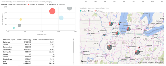
Which material type is best managed?
The best managed material type is the one with lowest downtime or no impact, regardless of defect quantity.
In the dashboard, look at the Total Defect Quantity by Material Type, Defect Type tile.
Notice that although Raw Materials material type has many total defects, most of those defects are either rejected or have no impact.
Let's verify that this material type doesn't cause much downtime, despite high defect quantity.
In the dashboard, look at the Total Defect Qty, Total Downtime Minutes by Material Type tile.
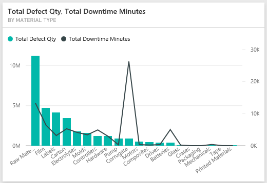
Raw materials appear to be well managed; although they have more defects, they have lower total downtime minutes.
Compare defects to downtime by year
Select the Total Defect Reports by Plant, Defect Type map tile to open the report to the Supplier Quality Analysis page.
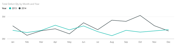
In the Total Defect Qty by Month and Year chart, notice that defect quantity is higher in 2014 than in 2013.
Do more defects translate into more downtime? Ask questions in the Q&A box to find out.
Select Supplier Quality in the left navigation bar to return to the dashboard.
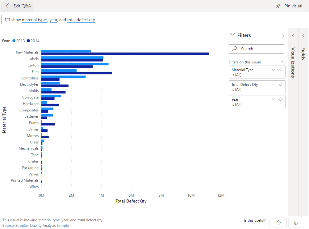
Because we know that raw materials have the highest number of defects, type the following query into the question box: show material types, year, and total defect qty.
There were many more raw materials defects in 2014 than in 2013.
Next, change the question to: show material types, year, and total downtime minutes.

Notice that downtime for raw materials was about the same in 2013 and 2014, even though there were many more raw materials defects in 2014. It appears that more defects for raw materials in 2014 didn't lead to much more downtime for raw materials in 2014.


Compare defects to downtime month to month
Let's look at another dashboard tile related to total defective quantity.
Select Exit Q&A in the upper-left corner to return to the dashboard.
Look more closely at the Total Defect Quantity by Month, Year tile. It shows that the first half of 2014 had a similar number of defects as 2013, but in the second half of 2014, the number of defects increased significantly.
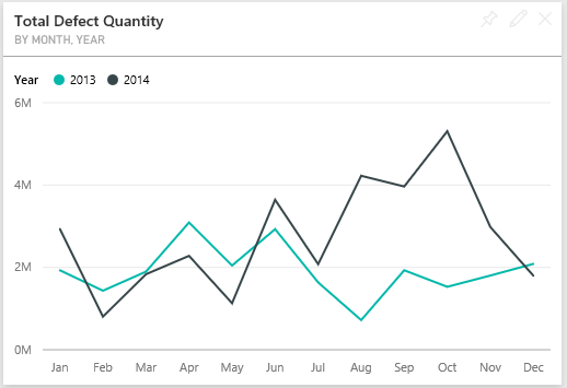
Let's see if this increase in defect quantity led to an equal increase in downtime minutes.
In the question box, type total downtime minutes by month and year as a line chart.

Other than a jump in downtime minutes during June and October, the number of defects didn't result in significantly more downtime. This result shows we're managing defects well.
To pin this chart to your dashboard, select the pin icon
 above the question box.
To explore the outlier months, check out the downtime minutes during October by material type, plant location, category, and so on, by asking questions such as total downtime minutes in October by plant.
Select Exit Q&A in the upper-left corner to return to the dashboard.

Related content
This environment is a safe one to play in, because you can choose not to save your changes. But if you do save them, you can always return to the Learning center for a new copy of this sample.
We hope this tour has shown how Power BI dashboards, Q&A, and reports can provide insights into sample data. Now it's your turn. Connect to your own data. With Power BI, you can connect to a wide variety of data sources. To learn more, see Get started creating in the Power BI service.
Feedback
Coming soon: Throughout 2024 we will be phasing out GitHub Issues as the feedback mechanism for content and replacing it with a new feedback system. For more information see: https://aka.ms/ContentUserFeedback.
Submit and view feedback for