Note
Access to this page requires authorization. You can try signing in or changing directories.
Access to this page requires authorization. You can try changing directories.
APPLIES TO:  Power BI Desktop
Power BI service
Power BI Desktop
Power BI service
The Slicer visual is a versatile filtering control that supports multiple settings including vertical list, tile, dropdown, and date picker. It's the foundational slicer in Power BI and works with text, numeric, and date data types.
For an overview of all slicer types available in Power BI, see Slicers overview.
Create a slicer
To create a slicer:
- With nothing selected on the report canvas, select the Slicer icon in the Visualizations pane.
- In the Data pane, select a field to populate the slicer. The slicer displays the unique values from that field.
- Resize or reposition the slicer on the canvas as needed. If the slicer is too small, items might be cut off.
- Select values in the slicer to filter other visuals on the page. Hold Ctrl to select multiple values. Select a value again to deselect it.
- Format the look and feel of your slicer in the Format pane, including changing the slicer setting to match your data type and layout needs.
Slicer settings
The Slicer visual supports multiple display settings. Select the setting that best fits your report design and data type.
| Setting | Data types | Common use cases |
|---|---|---|
| Dropdown | Text, numeric, date, hierarchy | Space-constrained layouts, many filter values, clean report design |
| Vertical list | Text, numeric, date, hierarchy | Displaying all options at once, small to medium value lists, drill-down filtering |
| Tile | Text, numeric | Compact horizontal layouts, short category names, button-like appearance |
| Between | Date, numeric | Filtering a range with start and end values; slider and input boxes |
| Before | Date, numeric | Filtering values up to a specific point; slider and input box |
| After | Date, numeric | Filtering values from a specific point onward; slider and input box |
| Relative date | Date | Rolling time periods like "last 7 days" or "this month"; supports static anchor date |
| Relative time | DateTime | Rolling time periods with time precision like "last 5 minutes" |
| Date picker (preview) | Date | Relative date filtering with anchoring on first, last, or today's date; calendar and slider selection |
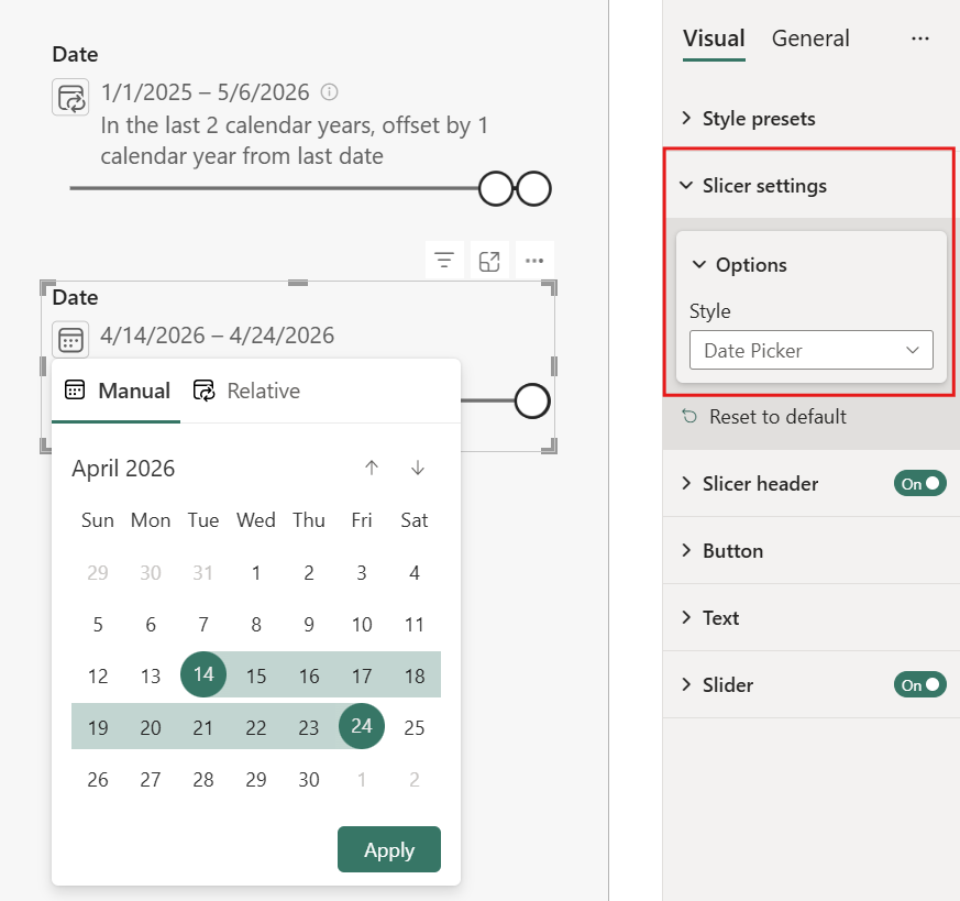
To change the slicer setting:
- Select the slicer.
- In the Format pane, expand Visual > Slicer settings > Options.
- In the Style dropdown, select the setting you want.
Dropdown
The dropdown setting collapses the slicer into a dropdown menu, saving space on the report canvas while still providing full filtering capabilities. Dropdown is the default setting for new slicers. Use dropdown for space-constrained layouts where you have many filter values but want to maintain a clean report design. When users select the dropdown, they see the full list of values and can select one or more items.
Dropdown supports text, numeric, date, and hierarchy columns. Add multiple fields to create a hierarchy, allowing users to select values at any level. A search option helps users quickly find specific values. Of all the slicer settings, dropdown takes up the least amount of space on the report canvas.
Vertical list
The vertical list setting displays items as a vertical list with check boxes, showing all options at once without requiring users to expand anything. This setting works well for small to medium value lists where you want users to see available options at a glance. It takes up more vertical space than dropdown but lets users see and compare all available options without expanding.
Vertical list supports text, numeric, date, and hierarchy columns. Add multiple fields to create a hierarchy for drill-down filtering, where users can expand and collapse levels. A search option helps users find specific values in longer lists.
Note
If you want more details, more formatting options, or images in your slicer, consider using the List slicer (preview) instead.
Tile
The tile setting displays items as horizontal buttons or tiles with scroll arrows when values overflow the available space. This setting creates a compact horizontal layout with a button-like appearance, making it ideal for short category names like status values, years, or other brief labels. Tiles provide a modern, dashboard-style look that integrates well with contemporary report designs.
Tile supports text and numeric columns. It doesn't support hierarchies, so add a single column to the slicer.
Note
If you want more details, more formatting options, or images in your slicer, consider using the Button slicer instead.
Between
The between setting displays a range slider with two handles and input boxes for filtering values within a specific range. Use this setting for date or numeric data when you want users to select both a start and end value. Users can drag the slider handles or type values directly into the input boxes to define their filter range.
Between supports date and numeric columns. It doesn't support hierarchies, so add a single column to the slicer.
Note
If you prefer a more freeform input experience with more filter operators, consider using the Input slicer instead. The Input slicer works with text or numeric columns.
Before
The before setting displays a single slider handle and input box for filtering values up to a specific point. Use Before for dates before a cutoff or numbers under a threshold.
Before supports date and numeric columns. It doesn't support hierarchies, so add a single column to the slicer.
Note
If you prefer a more freeform input experience with more filter operators, consider using the Input slicer instead. The Input slicer works with text or numeric columns.
After
The after setting displays a single slider handle and input box for filtering values from a specific point onward. Use After for dates after a start point or numbers above a threshold.
After supports date and numeric columns. It doesn't support hierarchies, so add a single column to the slicer.
Note
If you prefer a more freeform input experience with more filter operators, consider using the Input slicer instead. The Input slicer works with text or numeric columns.
Relative date
The relative date setting enables rolling time period filters like "last 7 days" or "this month" that automatically adjust as time passes. The filter range is based on the current date. You can also set a static anchor date instead of using today, which is useful when you want the relative calculation to start from a specific reference point like the last date in your data.
Relative date supports date columns. It doesn't support hierarchies, so add a single column to the slicer.
Report viewers can change the relative options when interacting with the report. The slicer restates the selection as the date range it represents, without indicating which dates are filtered in the data.
For more information, see Use a relative date slicer and filter in Power BI.
Relative time
The relative time setting enables rolling time period filters with time-level precision, such as "last 5 minutes" or "last 2 hours." Use this setting for DateTime data when you need filtering at the hour, minute, or second level. This setting is useful for real-time monitoring dashboards or operational reports where data refreshes frequently.
Relative time supports DateTime columns. It doesn't support hierarchies, so add a single column to the slicer.
Report viewers can change the relative options when interacting with the report. The slicer restates the selection as the time range it represents, without indicating which dates are filtered in the data.
For more information, see Use a relative time slicer and filter in Power BI.
Date picker (preview)
The Date picker style provides relative date selections that automatically roll forward as time passes, and can be anchored on today, the last date, or the first date of the date column. When you set a relative selection like "last full month," the slicer keeps the date range up to date as time passes. Report viewers can also select any manual date range or single date using a calendar or slider.
Date picker supports date columns. It doesn't support hierarchies, so add a single column to the slicer.
Note
Date picker is a preview feature. To enable it, go to File > Options and settings > Options > Preview features and select Date picker slicer.
During preview, you can only create date picker slicers in Power BI Desktop. However, after you publish a report with a date picker slicer, you can use and edit it in the Power BI service.
Create a date picker slicer
- Create a slicer and add a date column from your semantic model.
- With the slicer selected, in the Visualizations pane, expand Visual > Slicer settings > Options.
- In the Style dropdown, select Date picker.
Relative date selection
Relative selections automatically adjust as your data updates. Configure a relative selection with the following options:
| Option | Description |
|---|---|
| Last/Next/This | The direction and scope of the period relative to the anchor date. |
| Number of periods | How many days, weeks, months, or years to include. |
| Period type | Days, Weeks, Weeks (Calendar), Months, Months (Calendar), Years, or Years (Calendar). |
| Anchor | The reference point for the relative calculation: Today, First date, or Last date of the date column. |
| Offset | Optional. Shifts the anchor point forward (positive) or backward (negative) by the specified number of periods before calculating the range. |
For example, "Last 1 month from last date offset by -1 months" moves the anchor back one month from the last date in your data, then calculates the previous month from that point.
Manual date selection
Select any date range or single date manually:
- Calendar: Select a start date, then select an end date. Select the same date twice for a single-date selection.
- Slider: Drag the slider handles to adjust the date range.
Select Apply to filter the report with the selected dates.
Slicer display
The date picker slicer shows:
- The filtered date range, formatted according to the column's format string.
- A summary of the current selection (for example, "In the last 1 month from last date" or "Nov 1, 2026 to Nov 30, 2026").
- An indicator when the selected range falls outside the available dates in the column.
Publish reports with relative selections
When you save or publish a report with a relative selection, the slicer continues using that relative rule. The date range recalculates each time the report loads based on the current data. Report viewers can switch to any manual or relative range when interacting with the report.
Pin visuals with relative selections to dashboards
When you pin a visual to a dashboard, any relative selection that filters the visual continues to filter relatively. The date range stays current based on the latest data.
For example, if you filter a chart with a relative selection of "last 30 days" and pin it to a dashboard, the dashboard tile continues to display data from the last 30 days. As time passes, the date range automatically rolls forward to always show the most recent 30-day period.
Format slicers
Different formatting options are available depending on the slicer style. The Slicer visual has three main formatting sections: Slicer settings, Slicer header, and Values. Some options are only available for particular slicer display settings. For example:
- The Tile and Vertical list settings include a Show summary option that displays the current selection in the slicer header.
- Only the Dropdown, Tile, and Vertical list settings include selection options to enable single select, choose whether multi-select requires Ctrl, and show or hide a Select all option.
- When the slicer includes a slider (Between, Before, After, and Date picker settings), a Slider option is also available to format the slider's appearance.
The Values > Background color option also behaves differently depending on the slicer setting:
- Between, Before, and After: colors the input boxes.
- Relative date and Relative time: colors the input boxes and the restatement of the date or time range that the relative option represents.
- Vertical list: colors the area behind each item individually.
- Dropdown: colors the dropdown box and the flyout's background fill.
- Tile: colors each button's background.
For the Vertical list and Dropdown settings, you can also update the selection icon color (the check box or radio button) in its own top-level Selection icon formatting section.
Visual options
The Dropdown and Vertical list settings include a Search option under Slicer settings that adds a search box to help users find specific values.
By default, slicer list items sort in ascending order. To switch to descending order, select the ellipsis (...) in the top right corner of the slicer > Sort axis > Sort descending.
Responsive layout
After you select the Tile setting, turn On Responsive layout to change the size and arrangement of slicer items based on the view screen and slicer size.
Responsive layout works only for tile and numeric range slicers, not for vertical list slicers. For more information about responsive layouts, see Create a responsive slicer you can resize.
For range slicers, responsive formatting changes the slider style and lets you resize more flexibly. Read more about numeric range slicers.
Selection controls
The Show "Select all" option is Off by default. Under Selection, turn Show "Select all" option to On to add a Select all item to the slicer. Use it to select or deselect all items at once. When all items are selected, selecting one item deselects it, which allows an is-not filter.
Single select is Off by default. To filter by an item, select it. To select multiple items, hold Ctrl. To deselect, select the item again.
When Single select is On, you can select only one item. In vertical list slicers, the check boxes become radio buttons.
Title options
The Title text in Slicer header is On by default. This selection shows the data field name at the top of the slicer. You can edit the title text, which is especially useful for hierarchy slicers. See Change the title text in the article "Add multiple fields to a hierarchy slicer" for details.
Title on the General tab is another option. It's Off by default.
Other formatting options
Other formatting options are Off by default. Turn On these options to control them:
Lock aspect: Keep the relative height and width when you resize the slicer. Under General > Properties > Size.
Background: Add a background color to the slicer and set its transparency. Under General > Effects.
Border: Add a border around the slicer and set its color. Under General > Effects.
There's also a Border option on the Visual tab. It adds a border either over, under, or next to each option in the slicer. It's separate from and unaffected by the General settings.
Shadow: Add a drop shadow to the slicer. Under General > Effects.
Search in slicers
When working with slicers that contain many values, searching helps you quickly locate specific items without scrolling through the entire list.
To enable and use search in a slicer:
- Select the ellipsis (...) in the top-right corner of the slicer, and then select Search from the dropdown menu. Alternatively, select the slicer and press Ctrl+F.
- A search bar appears at the top of the slicer. Type a name or keyword in the search bar. The slicer instantly filters to show only matching entries.
For example, entering the letter "C" filters the slicer to show only items that begin with or contain that letter.
Considerations and limitations
The following considerations and limitations apply to the Slicer visual:
Date picker slicers
- Date picker slicers don't filter other date picker slicers, even when visual interactions are set to filter.