Xamarin.Forms Brushes: Radial gradients
The RadialGradientBrush class derives from the GradientBrush class, and paints an area with a radial gradient, which blends two or more colors across a circle. GradientStop objects are used to specify the colors in the gradient and their positions. For more information about GradientStop objects, see Xamarin.Forms Brushes: Gradients.
The RadialGradientBrush class defines the following properties:
Center, of typePoint, which represents the center point of the circle for the radial gradient. The default value of this property is (0.5,0.5).Radius, of typedouble, which represents the radius of the circle for the radial gradient. The default value of this property is 0.5.
These properties are backed by BindableProperty objects, which means that they can be targets of data bindings, and styled.
The RadialGradientBrush class also has an IsEmpty method that returns a bool that represents whether the brush has been assigned any GradientStop objects.
Note
Radial gradients can also be created with the radial-gradient() CSS function.
A radial gradient brush's gradient stops are positioned along a gradient axis defined by a circle. The gradient axis radiates from the center of the circle to its circumference. The position and size of the circle can be changed using the brush's Center and Radius properties. The circle defines the end point of the gradient. Therefore, a gradient stop at 1.0 defines the color at the circle's circumference. A gradient stop at 0.0 defines the color at the center of the circle.
To create a radial gradient, create a RadialGradientBrush object and set its Center and Radius properties. Then, add two or more GradientStop objects to the RadialGradientBrush.GradientStops collection, that specify the colors in the gradient and their positions.
The following XAML example shows a RadialGradientBrush that's set as the Background of a Frame:
<Frame BorderColor="LightGray"
       HasShadow="True"
       CornerRadius="12"
       HeightRequest="120"
       WidthRequest="120">
    <Frame.Background>
        <!-- Center defaults to (0.5,0.5)
             Radius defaults to (0.5) -->
        <RadialGradientBrush>
            <GradientStop Color="Red"
                          Offset="0.1" />
            <GradientStop Color="DarkBlue"
                          Offset="1.0" />
        </RadialGradientBrush>
    </Frame.Background>
</Frame>
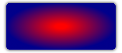
In this example, the background of the Frame is painted with a RadialGradientBrush that interpolates from red to dark blue. The center of the radial gradient is positioned in the center of the Frame:

The following XAML example moves the center of the radial gradient to the top-left corner of the Frame:
<!-- Radius defaults to (0.5) -->
<RadialGradientBrush Center="0.0,0.0">
    <GradientStop Color="Red"
                  Offset="0.1" />
    <GradientStop Color="DarkBlue"
                  Offset="1.0" />
</RadialGradientBrush>
In this example, the background of the Frame is painted with a RadialGradientBrush that interpolates from red to dark blue. The center of the radial gradient is positioned in the top-left of the Frame:

The following XAML example moves the center of the radial gradient to the bottom-right corner of the Frame:
<!-- Radius defaults to (0.5) -->
<RadialGradientBrush Center="1.0,1.0">
    <GradientStop Color="Red"
                  Offset="0.1" />
    <GradientStop Color="DarkBlue"
                  Offset="1.0" />
</RadialGradientBrush>
In this example, the background of the Frame is painted with a RadialGradientBrush that interpolates from red to dark blue. The center of the radial gradient is positioned in the bottom-right of the Frame:
