Monitor your Kubernetes cluster performance with Container insights
Use the workbooks, performance charts, and health status in Container insights to monitor the workload of Kubernetes clusters hosted on Azure Kubernetes Service (AKS), Azure Stack, or another environment. This article helps you understand how to use Azure Monitor to help you quickly assess, investigate, and resolve detected issues.
Workbooks
Workbooks combine text, log queries, metrics, and parameters into rich interactive reports that you can use to analyze cluster performance. For a description of the workbooks available for Container insights and how to access them, see Workbooks in Container insights.
Multi-cluster view from Azure Monitor
Azure Monitor provides a multi-cluster view that shows the health status of all monitored Kubernetes clusters deployed across resource groups in your subscriptions. It also shows clusters discovered across all environments that aren't monitored by the solution. With this view, you can immediately understand cluster health and then drill down to the node and controller performance page or navigate to see performance charts for the cluster. For AKS clusters that were discovered and identified as unmonitored, you can enable monitoring from the view.
To access the multi-cluster view, select Monitor from the left pane in the Azure portal. Under the Insights section, select Containers.
You can scope the results presented in the grid to show clusters that are:
- Azure: AKS and AKS Engine clusters hosted in Azure Kubernetes Service.
- Azure Stack (Preview): AKS Engine clusters hosted on Azure Stack.
- Non-Azure (Preview): Kubernetes clusters hosted on-premises.
- All: View all the Kubernetes clusters hosted in Azure, Azure Stack, and on-premises environments that are onboarded to Container insights.
To view clusters from a specific environment, select it from Environment in the upper-left corner.
On the Monitored clusters tab, you learn the following:
- How many clusters are in a critical or unhealthy state versus how many are healthy or not reporting (referred to as an Unknown state).
- Whether all of the Azure Kubernetes Engine (AKS Engine) deployments are healthy.
- How many nodes and user and system pods are deployed per cluster.
The health statuses included are:
- Healthy: No issues are detected for the VM, and it's functioning as required.
- Critical: One or more critical issues are detected that must be addressed to restore normal operational state as expected.
- Warning: One or more issues are detected that must be addressed or the health condition could become critical.
- Unknown: If the service wasn't able to make a connection with the node or pod, the status changes to an Unknown state.
- Not found: Either the workspace, the resource group, or subscription that contains the workspace for this solution was deleted.
- Unauthorized: User doesn't have required permissions to read the data in the workspace.
- Error: An error occurred while attempting to read data from the workspace.
- Misconfigured: Container insights wasn't configured correctly in the specified workspace.
- No data: Data hasn't reported to the workspace for the last 30 minutes.
Health state calculates the overall cluster status as the worst of the three states with one exception. If any of the three states is Unknown, the overall cluster state shows Unknown.
The following table provides a breakdown of the calculation that controls the health states for a monitored cluster on the multi-cluster view.
| Monitored cluster | Status | Availability |
|---|---|---|
| User pod | Healthy Warning Critical Unknown |
100% 90 - 99% <90% Not reported in last 30 minutes |
| System pod | Healthy Warning Critical Unknown |
100% N/A 100% Not reported in last 30 minutes |
| Node | Healthy Warning Critical Unknown |
>85% 60 - 84% <60% Not reported in last 30 minutes |
From the list of clusters, you can drill down to the Cluster page by selecting the name of the cluster. Then go to the Nodes performance page by selecting the rollup of nodes in the Nodes column for that specific cluster. Or, you can drill down to the Controllers performance page by selecting the rollup of the User pods or System pods column.
View performance directly from a cluster
Access to Container insights is available directly from an AKS cluster by selecting Insights > Cluster from the left pane, or when you selected a cluster from the multi-cluster view. Information about your cluster is organized into four perspectives:
- Cluster
- Nodes
- Controllers
- Containers
Note
The experiences described in the remainder of this article are also applicable for viewing performance and health status of your Kubernetes clusters hosted on Azure Stack or another environment when selected from the multi-cluster view.
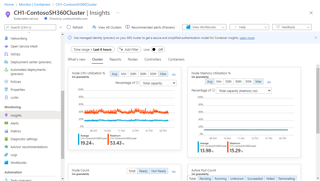
The default page opens and displays four line performance charts that show key performance metrics of your cluster.
The performance charts display four performance metrics:
- Node CPU utilization %: An aggregated perspective of CPU utilization for the entire cluster. To filter the results for the time range, select Avg, Min, 50th, 90th, 95th, or Max in the percentiles selector above the chart. The filters can be used either individually or combined.
- Node memory utilization %: An aggregated perspective of memory utilization for the entire cluster. To filter the results for the time range, select Avg, Min, 50th, 90th, 95th, or Max in the percentiles selector above the chart. The filters can be used either individually or combined.
- Node count: A node count and status from Kubernetes. Statuses of the cluster nodes represented are Total, Ready, and Not Ready. They can be filtered individually or combined in the selector above the chart.
- Active pod count: A pod count and status from Kubernetes. Statuses of the pods represented are Total, Pending, Running, Unknown, Succeeded, or Failed. They can be filtered individually or combined in the selector above the chart.
Use the Left and Right arrow keys to cycle through each data point on the chart. Use the Up and Down arrow keys to cycle through the percentile lines. Select the pin icon in the upper-right corner of any one of the charts to pin the selected chart to the last Azure dashboard you viewed. From the dashboard, you can resize and reposition the chart. Selecting the chart from the dashboard redirects you to Container insights and loads the correct scope and view.
Container insights also supports Azure Monitor Metrics Explorer, where you can create your own plot charts, correlate and investigate trends, and pin to dashboards. From Metrics Explorer, you also can use the criteria that you set to visualize your metrics as the basis of a metric-based alert rule.
View container metrics in Metrics Explorer
In Metrics Explorer, you can view aggregated node and pod utilization metrics from Container insights. The following table summarizes the details to help you understand how to use the metric charts to visualize container metrics.
| Namespace | Metric | Description |
|---|---|---|
| insights.container/nodes | ||
| cpuUsageMillicores | Aggregated measurement of CPU utilization across the cluster. It's a CPU core split into 1,000 units (milli = 1000). Used to determine the usage of cores in a container where many applications might be using one core. | |
| cpuUsagePercentage | Aggregated average CPU utilization measured in percentage across the cluster. | |
| memoryRssBytes | Container RSS memory used in bytes. | |
| memoryRssPercentage | Container RSS memory used in percent. | |
| memoryWorkingSetBytes | Container working set memory used. | |
| memoryWorkingSetPercentage | Container working set memory used in percent. | |
| nodesCount | A node count from Kubernetes. | |
| insights.container/pods | ||
| PodCount | A pod count from Kubernetes. |
You can split a metric to view it by dimension and visualize how different segments of it compare to each other. For a node, you can segment the chart by the host dimension. From a pod, you can segment it by the following dimensions:
- Controller
- Kubernetes namespace
- Node
- Phase
Analyze nodes, controllers, and container health
When you switch to the Nodes, Controllers, and Containers tabs, a property pane automatically displays on the right side of the page. It shows the properties of the item selected, which includes the labels you defined to organize Kubernetes objects. When a Linux node is selected, the Local Disk Capacity section also shows the available disk space and the percentage used for each disk presented to the node. Select the >> link in the pane to view or hide the pane.
As you expand the objects in the hierarchy, the properties pane updates based on the object selected. From the pane, you also can view Kubernetes container logs (stdout/stderror), events, and pod metrics by selecting the Live Events tab at the top of the pane. For more information about the configuration required to grant and control access to view this data, see Set up the Live Data.
While you review cluster resources, you can see this data from the container in real time. For more information about this feature, see How to view Kubernetes logs, events, and pod metrics in real time.
To view Kubernetes log data stored in your workspace based on predefined log searches, select View container logs from the View in analytics dropdown list. For more information, see How to query logs from Container insights.
Use the + Add Filter option at the top of the page to filter the results for the view by Service, Node, Namespace, or Node Pool. After you select the filter scope, select one of the values shown in the Select value(s) field. After the filter is configured, it's applied globally while viewing any perspective of the AKS cluster. The formula only supports the equal sign. You can add more filters on top of the first one to further narrow your results. For example, if you specify a filter by Node, you can only select Service or Namespace for the second filter.
Specifying a filter in one tab continues to be applied when you select another. It's deleted after you select the x symbol next to the specified filter.
Switch to the Nodes tab and the row hierarchy follows the Kubernetes object model, which starts with a node in your cluster. Expand the node to view one or more pods running on the node. If more than one container is grouped to a pod, they're displayed as the last row in the hierarchy. You also can view how many non-pod-related workloads are running on the host if the host has processor or memory pressure.
Windows Server containers that run the Windows Server 2019 OS are shown after all the Linux-based nodes in the list. When you expand a Windows Server node, you can view one or more pods and containers that run on the node. After a node is selected, the properties pane shows version information.
Azure Container Instances virtual nodes that run the Linux OS are shown after the last AKS cluster node in the list. When you expand a Container Instances virtual node, you can view one or more Container Instances pods and containers that run on the node. Metrics aren't collected and reported for nodes, only for pods.
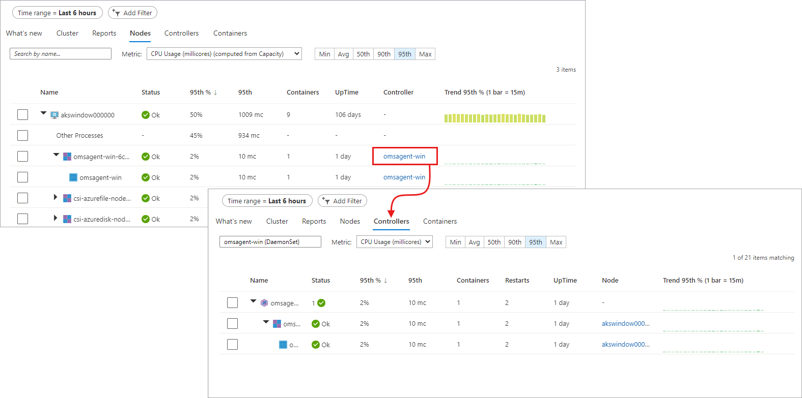
From an expanded node, you can drill down from the pod or container that runs on the node to the controller to view performance data filtered for that controller. Select the value under the Controller column for the specific node.
Select controllers or containers at the top of the page to review the status and resource utilization for those objects. To review memory utilization, in the Metric dropdown list, select Memory RSS or Memory working set. Memory RSS is supported only for Kubernetes version 1.8 and later. Otherwise, you view values for Min % as NaN %, which is a numeric data type value that represents an undefined or unrepresentable value.
Memory working set shows both the resident memory and virtual memory (cache) included and is a total of what the application is using. Memory RSS shows only main memory, which is nothing but the resident memory. This metric shows the actual capacity of available memory. What's the difference between resident memory and virtual memory?
- Resident memory, or main memory, is the actual amount of machine memory available to the nodes of the cluster.
- Virtual memory is reserved hard disk space (cache) used by the operating system to swap data from memory to disk when under memory pressure, and then fetch it back to memory when needed.
By default, performance data is based on the last six hours, but you can change the window by using the TimeRange option at the upper left. You also can filter the results within the time range by selecting Min, Avg, 50th, 90th, 95th, and Max in the percentile selector.
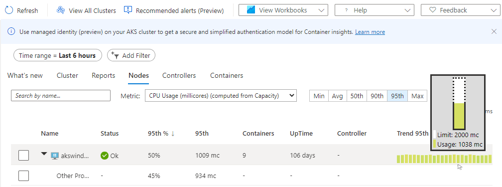
When you hover over the bar graph under the Trend column, each bar shows either CPU or memory usage, depending on which metric is selected, within a sample period of 15 minutes. After you select the trend chart through a keyboard, use the Alt+Page up key or Alt+Page down key to cycle through each bar individually. You get the same details that you would if you hovered over the bar.
In the next example, for the first node in the list, aks-nodepool1-, the value for Containers is 25. This value is a rollup of the total number of containers deployed.
This information can help you quickly identify whether you have a proper balance of containers between nodes in your cluster.
The information that's presented when you view the Nodes tab is described in the following table.
| Column | Description |
|---|---|
| Name | The name of the host. |
| Status | Kubernetes view of the node status. |
| Min %, Avg %, 50th %, 90th %, 95th %, Max % | Average node percentage based on percentile during the selected duration. |
| Min, Avg, 50th, 90th, 95th, Max | Average nodes' actual value based on percentile during the time duration selected. The average value is measured from the CPU/Memory limit set for a node. For pods and containers, it's the average value reported by the host. |
| Containers | Number of containers. |
| Uptime | Represents the time since a node started or was rebooted. |
| Controller | Only for containers and pods. It shows which controller it resides in. Not all pods are in a controller, so some might display N/A. |
| Trend Min %, Avg %, 50th %, 90th %, 95th %, Max % | Bar graph trend represents the average percentile metric percentage of the controller. |
You might notice a workload after expanding a node named Other process. It represents non-containerized processes that run on your node, and includes:
- Self-managed or managed Kubernetes non-containerized processes.
- Container run-time processes.
- Kubelet.
- System processes running on your node.
- Other non-Kubernetes workloads running on node hardware or a VM.
It's calculated by Total usage from CAdvisor - Usage from containerized process.
In the selector, select Controllers.
Here you can view the performance health of your controllers and Container Instances virtual node controllers or virtual node pods not connected to a controller.
The row hierarchy starts with a controller. When you expand a controller, you view one or more pods. Expand a pod, and the last row displays the container grouped to the pod. From an expanded controller, you can drill down to the node it's running on to view performance data filtered for that node. Container Instances pods not connected to a controller are listed last in the list.
Select the value under the Node column for the specific controller.
The information that's displayed when you view controllers is described in the following table.
| Column | Description |
|---|---|
| Name | The name of the controller. |
| Status | The rollup status of the containers after it's finished running with status such as OK, Terminated, Failed, Stopped, or Paused. If the container is running but the status either wasn't properly displayed or wasn't picked up by the agent and hasn't responded for more than 30 minutes, the status is Unknown. More details of the status icon are provided in the following table. |
| Min %, Avg %, 50th %, 90th %, 95th %, Max % | Rollup average of the average percentage of each entity for the selected metric and percentile. |
| Min, Avg, 50th, 90th, 95th, Max | Rollup of the average CPU millicore or memory performance of the container for the selected percentile. The average value is measured from the CPU/Memory limit set for a pod. |
| Containers | Total number of containers for the controller or pod. |
| Restarts | Rollup of the restart count from containers. |
| Uptime | Represents the time since a container started. |
| Node | Only for containers and pods. It shows which controller it resides in. |
| Trend Min %, Avg %, 50th %, 90th %, 95th %, Max % | Bar graph trend represents the average percentile metric of the controller. |
The icons in the status field indicate the online status of the containers.
| Icon | Status |
|---|---|
|
|
Running |
|
|
Waiting or Paused |
|
|
Last reported running but hasn't responded for more than 30 minutes |
|
|
Successfully stopped or failed to stop |
The status icon displays a count based on what the pod provides. It shows the worst two states. When you hover over the status, it displays a rollup status from all pods in the container. If there isn't a ready state, the status value displays (0).
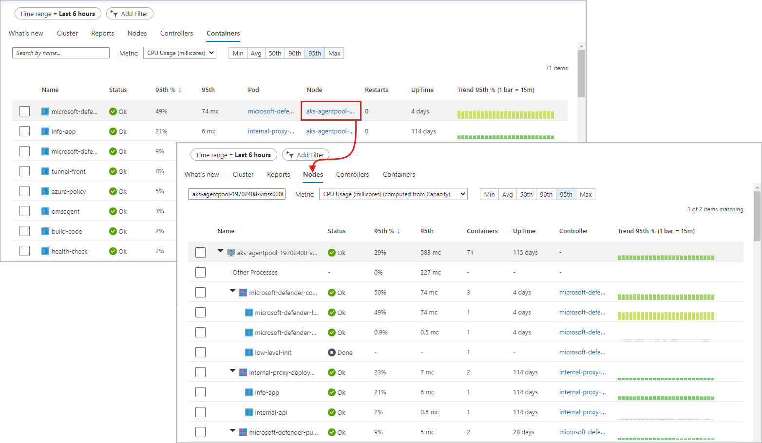
In the selector, select Containers.
Here you can view the performance health of your AKS and Container Instances containers.
From a container, you can drill down to a pod or node to view performance data filtered for that object. Select the value under the Pod or Node column for the specific container.
The information that's displayed when you view containers is described in the following table.
| Column | Description |
|---|---|
| Name | The name of the controller. |
| Status | Status of the containers, if any. More details of the status icon are provided in the next table. |
| Min %, Avg %, 50th %, 90th %, 95th %, Max % | The rollup of the average percentage of each entity for the selected metric and percentile. |
| Min, Avg, 50th, 90th, 95th, Max | The rollup of the average CPU millicore or memory performance of the container for the selected percentile. The average value is measured from the CPU/Memory limit set for a pod. |
| Pod | Container where the pod resides. |
| Node | Node where the container resides. |
| Restarts | Represents the time since a container started. |
| Uptime | Represents the time since a container was started or rebooted. |
| Trend Min %, Avg %, 50th %, 90th %, 95th %, Max % | Bar graph trend represents the average percentile metric percentage of the container. |
Other processes
The Other processes entry in the Node view is intended to help you clearly understand the root cause of the high resource usage on your node. This information helps you to distinguish usage between containerized processes versus noncontainerized processes. These are noncontainerized processes that run on your node and include the following:
- Self-managed or managed Kubernetes noncontainerized processes.
- Container run-time processes.
- Kubelet.
- System processes running on your node.
- Other non-Kubernetes workloads running on node hardware or a VM.
The value of other processes is Total usage from CAdvisor - Usage from containerized process.
Status
The icons in the status field indicate the online statuses of pods, as described in the following table.
| Icon | Status |
|---|---|
|
|
|
|
|
Waiting or Paused |
|
|
Last reported running but hasn't responded in more than 30 minutes |
|
|
Successfully stopped or failed to stop |
|
|
Failed state |
Monitor and visualize network configurations
Azure Network Policy Manager includes informative Prometheus metrics that you can use to monitor and better understand your network configurations. It provides built-in visualizations in either the Azure portal or Grafana Labs. For more information, see Monitor and visualize network configurations with Azure npm.
Next steps
- See Create performance alerts with Container insights to learn how to create alerts for high CPU and memory utilization to support your DevOps or operational processes and procedures.
- See Log query examples to see predefined queries and examples to evaluate or customize to alert, visualize, or analyze your clusters.
- See Monitor cluster health to learn about viewing the health status of your Kubernetes cluster.


![Screenshot that shows selecting Controllers.]](media/container-insights-analyze/containers-controllers-tab.png)


