Typeahead search in Adaptive Cards
Typeahead search functionality in Adaptive Cards gives an enhanced search experience on Input.ChoiceSet component. It provides a list of choices to enter text in the search field. You can incorporate typeahead search with Adaptive Cards to search and select data.
You can use typeahead search for the following searches:
Static typeahead search
Static typeahead search allows users to search from values specified within Input.ChoiceSet in the Adaptive Card payload. Static typeahead search can be used to show multiple choices to the user. The payload size in static search increases with number of choices specified in the payload.
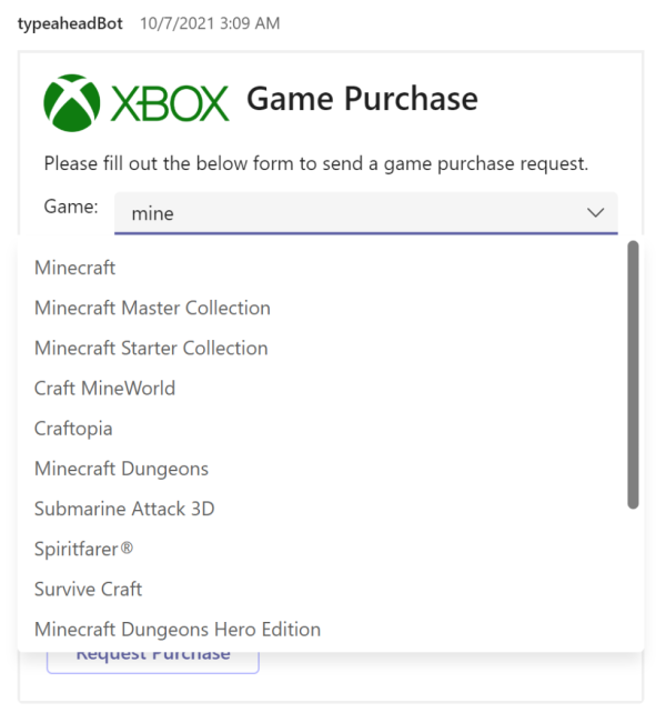
As user starts entering the texts, the choices are filtered, which partially match the input. The dropdown list highlights the input characters that match the search.
The following image demonstrates static typeahead search:

Dynamic typeahead search
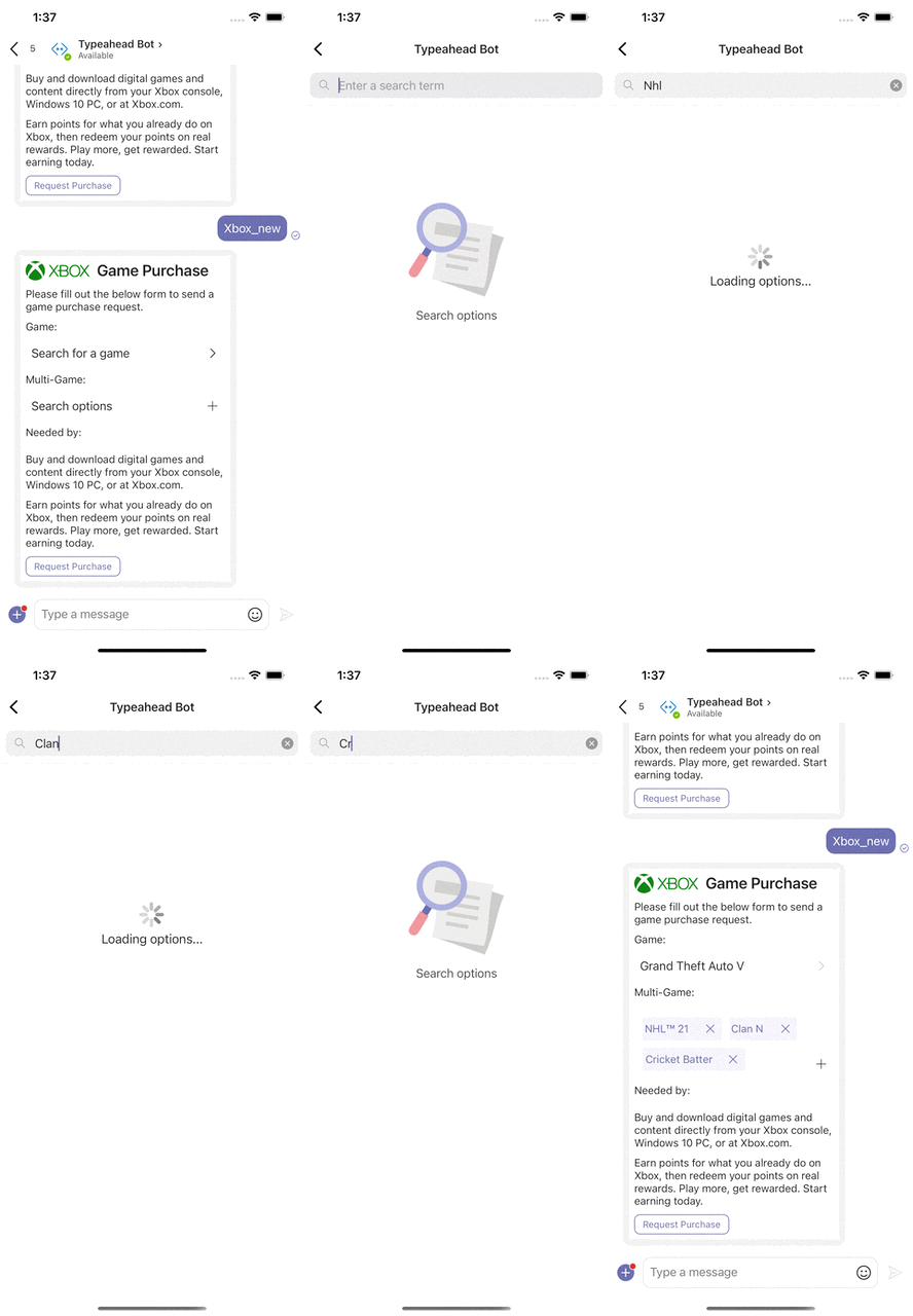
Dynamic typeahead search is useful to search and select data from large data sets. The data sets are loaded dynamically from the dataset specified in the card payload. The typeahead functionality helps to filter out the choices as the user types.
Note
You can't get rich card experiences with dynamic search, such as query-based message extensions.
Implement typeahead search
Input.ChoiceSet is one of the important input components in Adaptive Cards. You can add a typeahead search control to Input.ChoiceSet component to implement typeahead search. You can search and select the required information with the following selections:
- Dropdown, such as expanded selection.
- Radio button, such as single selection.
- Checkboxes, such as multiple selections.
Note
- The
Input.ChoiceSetcontrol is based on the style andisMultiSelectproperties. - To use dynamic typeahead search in group chat, the user must add
groupchatscope to the bot installation scope in the app manifest and install it to that particular group chat. - The number of options in the dropdown is limited to 15.
Schema properties
The following properties are the new additions to the Input.ChoiceSet schema to enable typeahead search:
| Property | Type | Required | Description |
|---|---|---|---|
| style | Compact Expanded Filtered |
No | Adds filtered style to the list of supported validations for static typeahead. |
| choices.data | Data.Query | No | Enables dynamic typeahead as the user types, by fetching a remote set of choices from a backend. |
| value | String | No | The initial choice (or set of choices) that must be selected. For multi-select, specify a comma-separated string of values. |
Data.Query
| Property | Type | Required | Description |
|---|---|---|---|
| type | Data.Query | Yes | Specifies that it's a Data.Query object. |
| dataset | String | Yes | Specifies the type of data that is fetched dynamically. |
| value | String | No | Populates for the invoke request to the bot with the input that the user provided to the ChoiceSet. |
| count | Number | No | Populates for the invoke request to the bot to specify the number of elements that must be returned. The bot ignores it if the users want to send a different amount. |
| skip | Number | No | Populates for the invoke request to the bot to indicate that users want to paginate and move ahead in the list. |
| associatedInputs | String | No | Specifies the input values associated with the Data.Query object. Allowed values: auto, none |
When you define the associatedInputs property under the Data.Query object and set it to auto, Teams includes all input values of the card in the data query request sent to the bot. If you set the value to none, Teams doesn't include any input values in the data query request. This property allows the bot to use input values as search filters to refine dynamic typeahead search. For more information, see dependent inputs.
Example
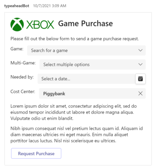
The example payload which contains static and dynamic typeahead search with single and multi select options as follows:
{
  "type": "AdaptiveCard",
  "body": [
    {
      "columns": [
        {
          "width": "1",
          "items": [
            {
              "size": null,
              "url": "https://urlp.asm.skype.com/v1/url/content?url=https%3a%2f%2fi.imgur.com%2fhdOYxT8.png",
              "height": "auto",
              "type": "Image"
            }
          ],
          "type": "Column"
        },
        {
          "width": "2",
          "items": [
            {
              "size": "extraLarge",
              "text": "Game Purchase",
              "weight": "bolder",
              "wrap": true,
              "type": "TextBlock"
            }
          ],
          "type": "Column"
        }
      ],
      "type": "ColumnSet"
    },
    {
      "text": "Please fill out the below form to send a game purchase request.",
      "wrap": true,
      "type": "TextBlock"
    },
    {
      "columns": [
        {
          "width": "auto",
          "items": [
            {
              "text": "Game: ",
              "wrap": true,
              "height": "stretch",
              "type": "TextBlock"
            }
          ],
          "type": "Column"
        }
      ],
      "type": "ColumnSet"
    },
    {
      "columns": [
        {
          "width": "stretch",
          "items": [
            {
              "choices": [
                {
                  "title": "Call of Duty",
                  "value": "call_of_duty"
                },
                {
                  "title": "Death's Door",
                  "value": "deaths_door"
                },
                {
                  "title": "Grand Theft Auto V",
                  "value": "grand_theft"
                },
                {
                  "title": "Minecraft",
                  "value": "minecraft"
                }
              ],
              "style": "filtered",
              "placeholder": "Search for a game",
              "id": "choiceGameSingle",
              "type": "Input.ChoiceSet"
            }
          ],
          "type": "Column"
        }
      ],
      "type": "ColumnSet"
    },
    {
      "columns": [
        {
          "width": "auto",
          "items": [
            {
              "text": "Multi-Game: ",
              "wrap": true,
              "height": "stretch",
              "type": "TextBlock"
            }
          ],
          "type": "Column"
        }
      ],
      "type": "ColumnSet"
    },
    {
      "columns": [
        {
          "width": "stretch",
          "items": [
            {
              "choices": [
                {
                  "title": "Static Option 1",
                  "value": "static_option_1"
                },
                {
                  "title": "Static Option 2",
                  "value": "static_option_2"
                },
                {
                  "title": "Static Option 3",
                  "value": "static_option_3"
                }
              ],
              "value": "Static_option_2",
              "isMultiSelect": true,
              "style": "filtered",
              "choices.data": {
                "type": "Data.Query",
                "dataset": "xbox"
              },
              "id": "choiceGameMulti",
              "type": "Input.ChoiceSet"
            }
          ],
          "type": "Column"
        }
      ],
      "type": "ColumnSet"
    },
    {
      "columns": [
        {
          "width": "auto",
          "items": [
            {
              "text": "Needed by: ",
              "wrap": true,
              "height": "stretch",
              "type": "TextBlock"
            }
          ],
          "type": "Column"
        },
        {
          "width": "stretch",
          "items": [
            {
              "id": "choiceDate",
              "type": "Input.Date"
            }
          ],
          "type": "Column"
        }
      ],
      "type": "ColumnSet"
    },
    {
      "text": "Buy and download digital games and content directly from your Xbox console, Windows 10 PC, or at Xbox.com.",
      "wrap": true,
      "type": "TextBlock"
    },
    {
      "text": "Earn points for what you already do on Xbox, then redeem your points on real rewards. Play more, get rewarded. Start earning today.",
      "wrap": true,
      "type": "TextBlock"
    }
  ],
  "actions": [
    {
      "data": {
        "msteams": {
          "type": "invoke",
          "value": {
            "type": "task/submit"
          }
        }
      },
      "title": "Request Purchase",
      "type": "Action.Submit"
    }
  ],
  "$schema": "http://adaptivecards.io/schemas/adaptive-card.json",
  "version": "1.2"
}
Code snippets for invoke request and response
Invoke request
{
    "name": "application/search",
    "type": "invoke",
    "value": {
        "queryText": "fluentui",
        "queryOptions": {
            "skip": 0,
            "top": 15
        },
        "dataset": "npm"
    },
    "locale": "en-US",
    "localTimezone": "America/Los_Angeles",
    // …. other fields
}
Response
protected override async Task<InvokeResponse> OnInvokeActivityAsync(ITurnContext<IInvokeActivity> turnContext, CancellationToken cancellationToken)
{
    if (turnContext.Activity.Name == "application/search")
    {
 var packages = new[] {
   new { title = "A very extensive set of extension methods", value = "FluentAssertions" },
   new { title = "Fluent UI Library", value = "FluentUI" }};

 var searchResponseData = new
 {
     type = "application/vnd.microsoft.search.searchResponse",
     value = new
     {
  results = packages
     }
 };
 var jsonString = JsonConvert.SerializeObject(searchResponseData);
 JObject jsonData = JObject.Parse(jsonString);
 return new InvokeResponse()
 {
     Status = 200,
     Body = jsonData
 };
    }

    return null;
}
Dependent inputs
Note
Dependent inputs aren't available in Government Community Cloud (GCC), GCC High, and Department of Defense (DOD) environments.
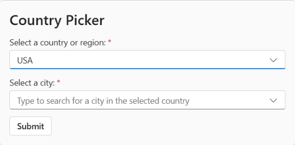
You can design Adaptive Cards in Teams where the value of an input depends on the value of another. For example, consider an Adaptive Card with two Input.ChoiceSet dropdowns: one for selecting a country and another for selecting a specific city within that country. The first dropdown must filter the cities displayed in the second dropdown. This can be achieved by creating an Input.ChoiceSet dropdown with dynamic typeahead search that depends on one or more other inputs in the card.
How it works
To create dependent inputs in an Adaptive Card, use the following properties:
valueChangedAction: Define this property on any input element, such as
Input.TextorInput.ChoiceSet. This property allows you to define theAction.ResetInputsaction, which triggers a data query request to the bot when a user changes the value of an input in the card.Action.ResetInputs: This action resets the values of the inputs you specify under
targetInputIdsto their default values.associatedInputs: Define this property under the Data.Query object. This property ensures that when Teams makes a data query request to your bot, it includes the values of all the inputs in the card.
Action.ResetInputs
The Action.ResetInputs property resets the values of the inputs in an Adaptive Card. By default, the Action.ResetInputs property resets the values of all the inputs in an Adaptive Card. If you must reset particular input values, define the IDs of the elements containing those values in the targetInputIds property.
| Property | Type | Required | Description |
|---|---|---|---|
valueChangedAction |
Action.ResetInputs | ✔️ | Contains the Action.ResetInputs property. |
Action.ResetInputs |
String | ✔️ | Resets the input values. |
targetInputIds |
Array of strings | Defines the IDs of the input values to be reset. | |
id |
String | A unique identifier for the action. | |
requires |
Object | A list of capabilities the action requires the host application to support. If the host application doesn't support at least one of the listed capabilities, the action isn't rendered, and its fallback is rendered if provided. | |
fallback |
Object or String | Defines an alternate action to render. Set the value to drop to ignore the action if Action.ResetInputs is unsupported or if the host application doesn't support all the capabilities specified in the requires property. |
|
iconUrl |
String | A URL to an image to be displayed on the left of the action's title. Data URIs are supported. | |
isEnabled |
Boolean | Defines the enabled or disabled state of the action. A user can't select a disabled action. If the action is represented as a button, the button's style reflects this state. |
|
mode |
String | Defines if the action is primary or secondary. Allowed values: primary, secondary |
|
style |
String | Defines the style of the action, affecting its visual and spoken representations. Allowed values: default, positive, or destructive |
|
title |
String | The title of the action, as it appears on a button. | |
tooltip |
String | The tooltip text to display when a user hovers over the action. |
Example
Consider the earlier example: a card with two Input.ChoiceSet dropdowns that allow users to select a country and a city within that country. The following card payload demonstrates how to use the valueChangedAction and associatedInputs properties to implement the card.
- The
valueChangedActionproperty is defined alongside thecountryinput to ensure that whenever its value changes, the value of thecityinput is reset. - Since the
cityinput is required, resetting its value forces the user to select a new city whenever the value ofcountrychanges. - With the
associatedInputsproperty defined, when Teams sends a data query request to the bot, it includes the value of thecountryinput. Thus, when the user starts typing in thecityinput, the card returns a list of cities for the selected country.

{
    "type": "AdaptiveCard",
    "$schema": "https://adaptivecards.io/schemas/adaptive-card.json",
    "version": "1.5",
    "body": [
        {
            "size": "ExtraLarge",
            "text": "Country Picker",
            "weight": "Bolder",
            "wrap": true,
            "type": "TextBlock"
        },
        {
            "id": "country",
            "type": "Input.ChoiceSet",
            "label": "Select a country or region:",
            "choices": [
                {
                    "title": "USA",
                    "value": "usa"
                },
                {
                    "title": "France",
                    "value": "france"
                },
                {
                    "title": "India",
                    "value": "india"
                }
            ],
            "valueChangedAction": {
                "type": "Action.ResetInputs",
                "targetInputIds": [
                    "city"
                ]
            },
            "isRequired": true,
            "errorMessage": "Please select a country or region"
        },
        {
            "style": "filtered",
            "choices.data": {
                "type": "Data.Query",
                "dataset": "cities",
                "associatedInputs": "auto"
            },
            "id": "city",
            "type": "Input.ChoiceSet",
            "label": "Select a city:",
            "placeholder": "Type to search for a city in the selected country",
            "isRequired": true,
            "errorMessage": "Please select a city"
        }
    ],
    "actions": [
        {
            "title": "Submit",
            "type": "Action.Submit"
        }
    ]
}
The following code snippet shows an example of a bot invoke request for the card payload:
{
    "name": "application/search",
    "type": "invoke",
    "value": {
        "queryText": "india",
        "queryOptions": {
            "skip": 0,
            "top": 15
        },
        "dataset": "cities",
        "data": {
            "country": "<value of the country input>"
        }
    },
    // …. other fields
}
Code sample
| Sample name | Description | .NET | Node.js | Manifest |
|---|---|---|---|---|
| Typeahead search control on Adaptive Cards | The sample shows how to use static and dynamic typeahead search control in Adaptive Cards. | View | View | View |
See also
Platform Docs

