Microsoft 365 and Office | Excel | For business | Windows
A family of Microsoft spreadsheet software with tools for analyzing, charting, and communicating data
This browser is no longer supported.
Upgrade to Microsoft Edge to take advantage of the latest features, security updates, and technical support.
' cx='32' cy='32' r='32' /%3E%3Ctext x='50%25' y='55%25' dominant-baseline='middle' text-anchor='middle' fill='%23FFF' %3EH%3C/text%3E%3C/svg%3E)
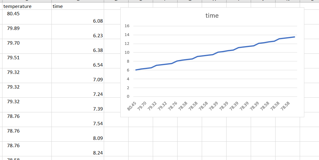
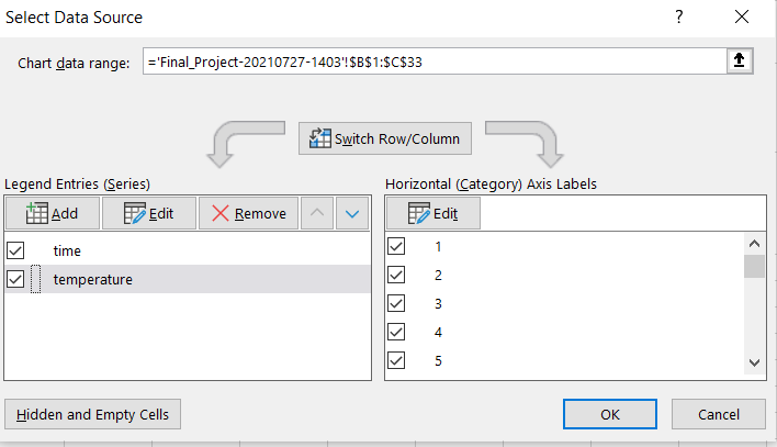
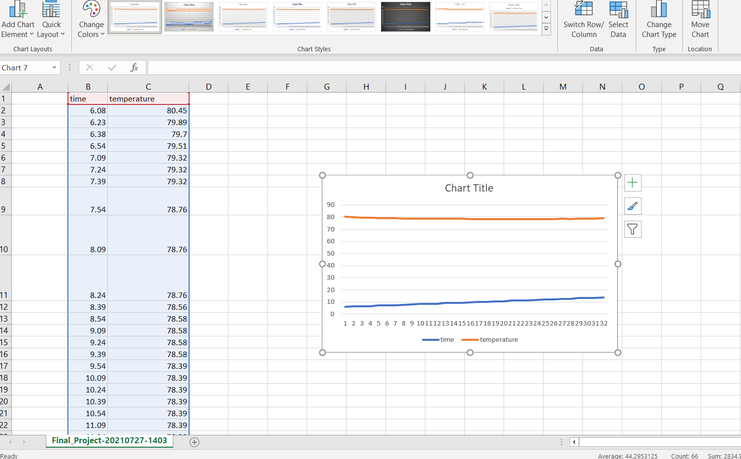
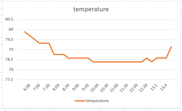
Hello all, currently I am attempting to plot temperature vs. time. However, whenever I try to plot my data, it keeps coming out like below. How can I fix this?
A family of Microsoft spreadsheet software with tools for analyzing, charting, and communicating data
' cx='32' cy='32' r='32' /%3E%3Ctext x='50%25' y='55%25' dominant-baseline='middle' text-anchor='middle' fill='%23FFF' %3EMM%3C/text%3E%3C/svg%3E)
@Harper , this issued is related with Excel. Helped add the correct tag so that you would get help from the corresponding team
Couldn't find it when I was making this so thank you.
Answer accepted by question author

@Harper ,
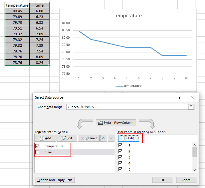
Based on your description, I think you may need to re-select data for your chart.
Besides, I found this Customize charts Video, you could also have a look.
Hope the information could be helpful to you. Any updates, please let me know.
If an Answer is helpful, please click "Accept Answer" and upvote it.
Note: Please follow the steps in our documentation to enable e-mail notifications if you want to receive the related email notification for this thread.
@Harper ,
I am checking this thread, how is your issue going now?
@Viki Ji_MSFT I attempted to use your solution, but for some reason my temperature values are not working when I try to select them. After I highlight the column, it just says =1 instead of listing all the values in the graph. Is there a simple way to just select the x and y values for the graph? Below is what I'm seeing at every step.
@Harper ,
Thanks for your reply and sharing.
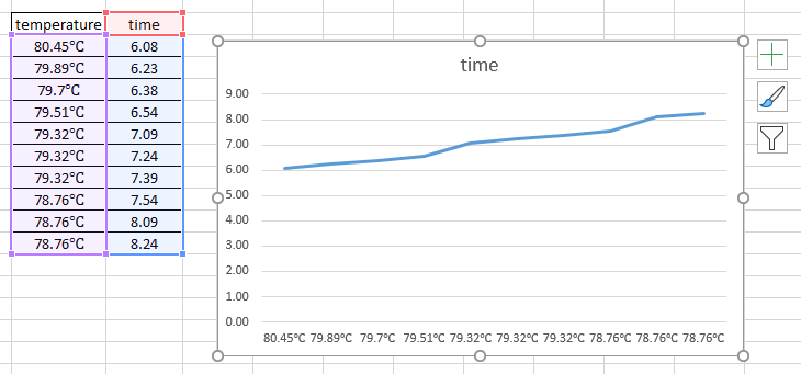
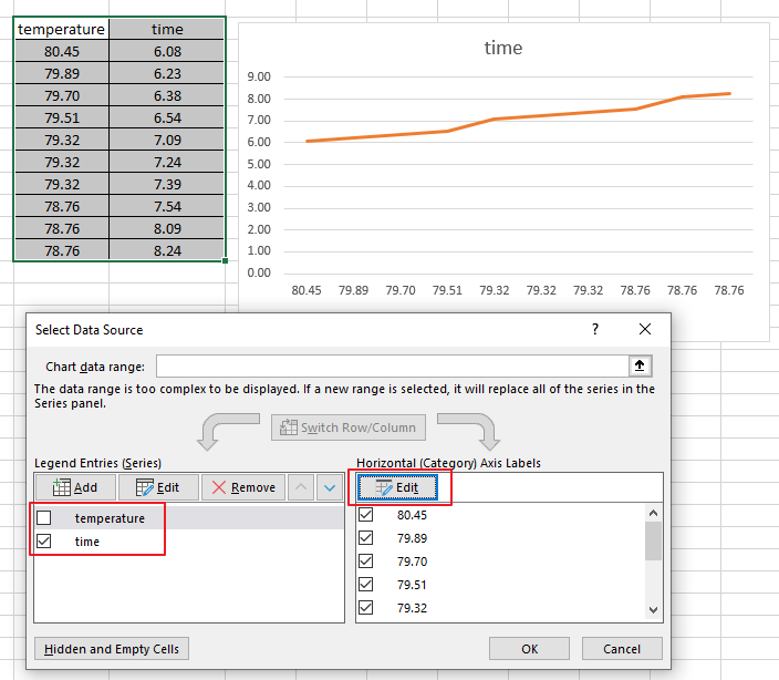
Due to the particularity of recording temperature and time as numerical values, Excel will display numerical values as data in the chart by default.
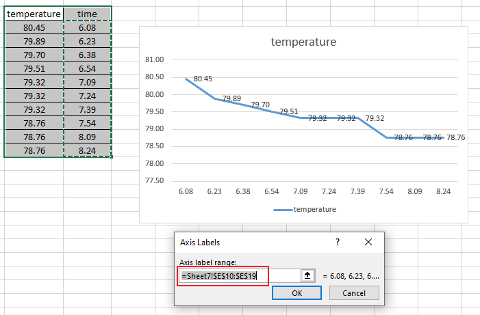
If the first column of the table is text, such as abc, you may not have this worry. I added the ℃ symbol after the temperature value, and directly generated the chart shown below.
In this case, if you want the temperature value as the x-axis, you may need to manually uncheck the temperature under the Legend Entries tab, and click Edit under the Horizontal tab to select all the values under the temperature column. As shown in the second picture in my first reply.
My test:
Any updates, please let me know.
' cx='32' cy='32' r='32' /%3E%3Ctext x='50%25' y='55%25' dominant-baseline='middle' text-anchor='middle' fill='%23FFF' %3ET%3C/text%3E%3C/svg%3E)
Need to show status for a simple project schedule with a Gantt chart? Though Excel doesn’t have a predefined Gantt chart type, you can create one using this free template: Gantt project planner template for Excel
Microsoft 365 subscription offers premium Gantt chart templates designed to help you track project tasks with visual reminders and color-coded categories. If you don't have a Microsoft 365 subscription or the latest Office version
To create a Gantt chart like the one in our example that shows task progress in days:
Select the data you want to chart. ...
Click Insert > Insert Bar Chart > Stacked Bar chart.
Next, we'll format the stacked bar chart to appear like a Gantt chart. ...
If you don't need the legend or chart title, click it and press DELETE.
@Viki Ji_MSFT This worked and I finally got the graph I wanted. Thank you very much for taking your time to help me figure out my problem, I really appreciate it.
@Harper ,
I am glad to hear that your issue has been resolved.
Could you please accept the useful information as an answer, this action will help other users who have the similar issues on this forum.
Thanks for your understanding!
' cx='32' cy='32' r='32' /%3E%3Ctext x='50%25' y='55%25' dominant-baseline='middle' text-anchor='middle' fill='%23FFF' %3ELW%3C/text%3E%3C/svg%3E)
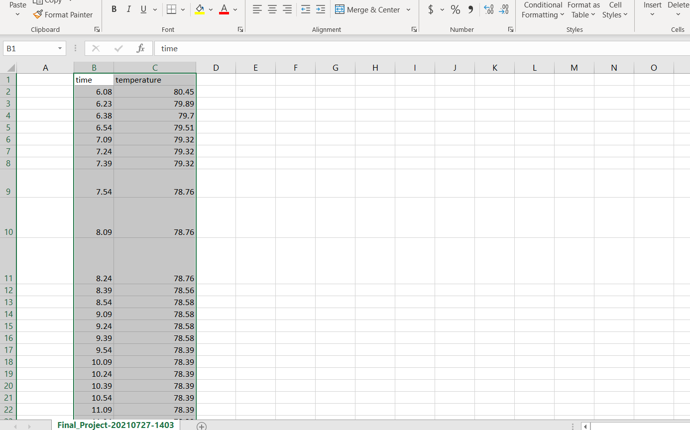
Could you please tell me how you did it? I want a same type of graph (time vs temperature )