Microsoft 365 and Office | Excel | For business | Windows
A family of Microsoft spreadsheet software with tools for analyzing, charting, and communicating data
This browser is no longer supported.
Upgrade to Microsoft Edge to take advantage of the latest features, security updates, and technical support.
' cx='32' cy='32' r='32' /%3E%3Ctext x='50%25' y='55%25' dominant-baseline='middle' text-anchor='middle' fill='%23FFF' %3ED%3C/text%3E%3C/svg%3E)
I have a list of skills on the y-axis and a list of people on the x-axis. Skills are rated in three ranges.
Very good 7.9 - 10. I have formatting that highlights these cells in yellow.
Good 6 - 7.8. I have formatting that highlights these cells in blue.
Average 4 - 5.9. I have formatting that highlights these cells in pink
I would like to show the skills that the team has strength in and what they are weakest in. I have no idea how to do this graphically.
Thank you in advance :)
Danny.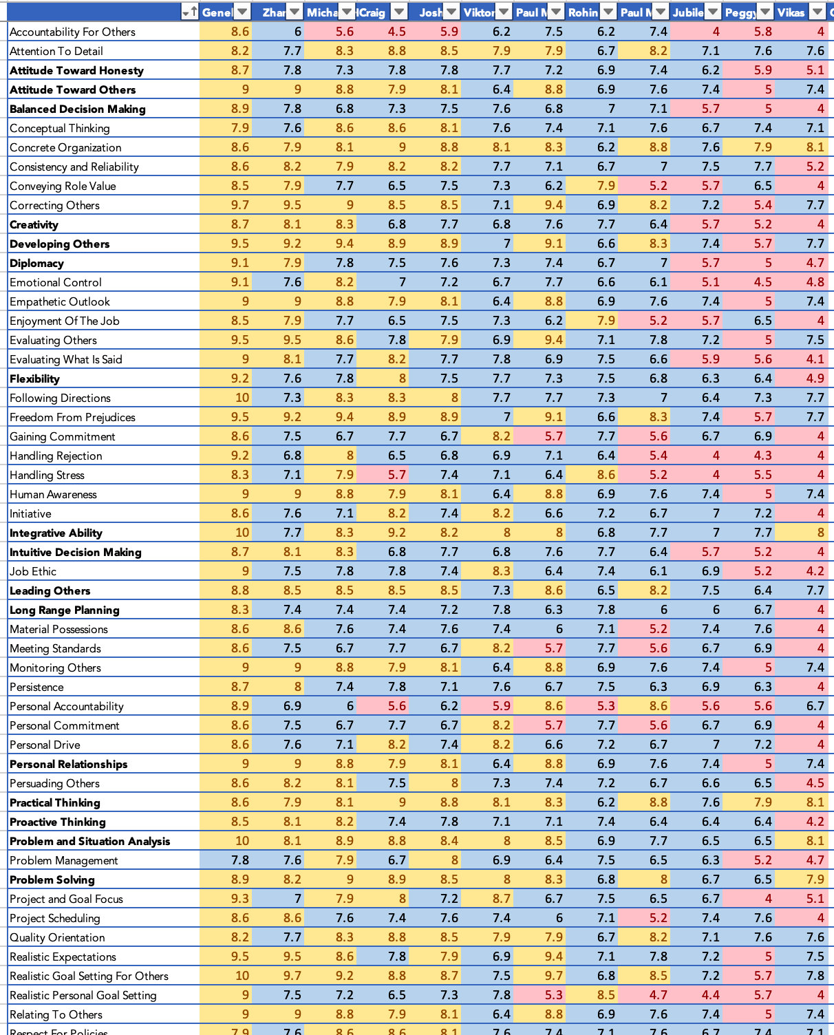

Hi,
Did you want to create a Chart?

Hi,
First and foremost, transform your data into a 3 column one - Name, Skills and Values. This can be done using the "Unpivot Other Columns" feature in Power Query. Once done, create a Pivot Table and a Pivot chart from there.
Hope this helps.