Define a Button with Different Image and text In UWP?

Gourav Singhal 41 Reputation points
2022-10-11T12:57:54.567+00:00

Hi,

I want to create a custom button with image and text. But the image and text can be different for buttons. Like, I want to use this button at 4 places in my app and text and image can be different. I tried to create custom style. But I can set only one variable by binding it to Source. But I am not sure how I can add variable to both Image and text.

    <Style x:Key="RoundButtonStyle" TargetType="Button">  
            <Setter Property="Template">  
                <Setter.Value>  
                    <ControlTemplate TargetType="Button">  
                        <Grid x:Name="RootGrid" Background="{TemplateBinding Background}">  
      
                            <VisualStateManager.VisualStateGroups>  
                                </VisualStateGroup>  
                            </VisualStateManager.VisualStateGroups>  
      
                            <Border x:Name="hello" CornerRadius="30" BorderBrush="#000000" BorderThickness="1,1,1,1" >  
                                 <StackPanel Orientation=Horizontal">  
                                  <Image Source="ms-appx:///apg.jpg" />  
                                <ContentPresenter x:Name="ContentPresenter" AutomationProperties.AccessibilityView="Raw" BorderBrush="{TemplateBinding BorderBrush}" Foreground="{TemplateBinding Foreground}" BorderThickness="{TemplateBinding BorderThickness}" ContentTemplate="{TemplateBinding ContentTemplate}" ContentTransitions="{TemplateBinding ContentTransitions}" Content="{TemplateBinding Content}" HorizontalContentAlignment="{TemplateBinding HorizontalContentAlignment}" Padding="{TemplateBinding Padding}" VerticalContentAlignment="{TemplateBinding VerticalContentAlignment}"/>  
                                 </StackPanel>  
      
                            </Border>  
                        </Grid>  
                    </ControlTemplate>  
                </Setter.Value>  
            </Setter>  
        </Style>  

This above code is in CustomStyle file. Now, I am using this like this:

                    <Button x:Name="GoogleButton" Grid.Row="4" VerticalAlignment="Top" Content="Heyyy" Width="266" Height="58" Margin="0,10,0,0" Style="{StaticResource RoundButtonStyle}" Click="OnGoogleButtonClicked">  

I can pass String in Content prop of Button. Hence, I can change text with different button, but I have to keep the image fixed, no way to change it for now. (see code in <border> in style give above)

Please suggest me some way.

Thanks in advance.

Developer technologies | Universal Windows Platform (UWP)
{count} votes

Accepted answer
  1. Anonymous
    2022-10-13T08:17:47.53+00:00

    Hello,

    Welcome to Microsoft Q&A!

    Based on your scenario, you could extending an existing button control with additional dependency properties for Image. So you don't need to create duplicate code when create different buttons.

    I made a simple sample to achieve this and here are my steps that you could follow.

    1) Right click on your project, then go Add > New Item. Choose to create a new class and name it as RoundButton
    2) Let RoundButton inherit from Button and create a dependency property called IconImage.

    RoundButton.cs :

    public class RoundButton:Button  
    {  
        public RoundButton()  
        {  
            this.DefaultStyleKey = typeof(RoundButton);  
    
        }  
    
        public BitmapImage IconImage  
        {  
            get { return (BitmapImage)GetValue(IconImageProperty); }  
            set { SetValue(IconImageProperty, value); }  
        }  
    
        // Using a DependencyProperty as the backing store for IconImage.  This enables animation, styling, binding, etc...  
        public static readonly DependencyProperty IconImageProperty =  
            DependencyProperty.Register("IconImage", typeof(BitmapImage), typeof(RoundButton), new PropertyMetadata(null));  
    }  
    

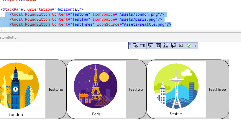
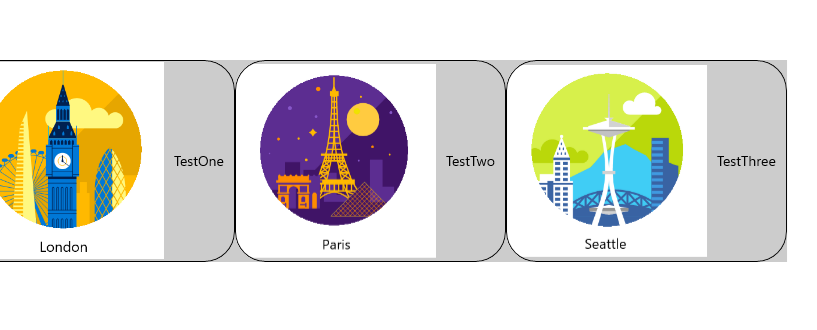
    3) Put the custom style for RoundButton in the Application Resrouce in App.xaml. Then bind the dependency property to the image. Also, do not forget to make sure all the Button types are changed to RoundButton. (Please remove all the ASTERISK in the Xaml style)

    <Style TargetType="local:RoundButton">  
           <Setter Property="Template">  
             <Setter.Value>  
               <ControlTemplate TargetType="local:RoundButton">  
                 <Grid x:Name="RootGrid" **Background="{TemplateBinding **Background}">  
    
                                    <VisualStateManager.VisualStateGroups>  
                                        </VisualStateGroup>  
                                    </VisualStateManager.VisualStateGroups>  
    
                        <Border x:Name="hello" CornerRadius="30" BorderBrush="#000000" BorderThickness="1,1,1,1" >  
                                        <StackPanel Orientation="Horizontal">  
                                            <**mage Source="{TemplateBinding IconImage}" Width="200" Height="200"/>  
                                                   <ContentPresenter x:Name="ContentPresenter"   
                                                              AutomationProperties.AccessibilityView="Raw"   
                                                              BorderBrush="{TemplateBinding BorderBrush}"  
                                                              Foreground="{TemplateBinding Foreground}"  
                                                              BorderThickness="{TemplateBinding BorderThickness}"  
                                                              ContentTemplate="{TemplateBinding ContentTemplate}"  
                                                              ContentTransitions="{TemplateBinding ContentTransitions}"  
                                                              Content="{TemplateBinding Content}"   
                                                              HorizontalContentAlignment="{TemplateBinding HorizontalContentAlignment}"   
                                                              Padding="{TemplateBinding Padding}"  
                                                              VerticalContentAlignment="{TemplateBinding VerticalContentAlignment}"/>  
                                          </StackPanel>  
                          </Border>  
                   </Grid>  
                 </ControlTemplate>  
               </Setter.Value>  
             </Setter>  
    </Style>  
    

    4) Use RoundButton in the MainPage

    MainPage Xaml:

      <StackPanel Orientation="Horizontal">  
            <local:RoundButton Content="TestOne" IconImage="{Binding FirstImage}"/>  
            <local:RoundButton Content="TestTwo" IconImage="{Binding SecondImage}"/>  
            <local:RoundButton Content="TestThree" IconImage="{Binding ThirdImage}"/>  
        </StackPanel>  
    

    MainPage Code:

     public sealed partial class MainPage : Page  
        {  
            public MainViewModel _viewModel = new MainViewModel();  
            public MainPage()  
            {  
                this.InitializeComponent();  
    
                this.DataContext = _viewModel;  
            }  
    
        }  
        public class MainViewModel   
        {  
            public BitmapImage FirstImage { get; set; }  
            public BitmapImage SecondImage { get; set; }  
            public BitmapImage ThirdImage { get; set; }  
    
            public MainViewModel()  
            {  
                FirstImage = new BitmapImage(new Uri("ms-appx:///Assets/london.png"));  
                SecondImage = new BitmapImage(new Uri("ms-appx:///Assets/paris.png"));  
                ThirdImage = new BitmapImage(new Uri("ms-appx:///Assets/seattle.png"));  
            }  
        }  
    

    The result:

    250022-image.png

    Thank you.


    If the answer is the right solution, please click "Accept Answer" and kindly upvote it. If you have extra questions about this answer, please click "Comment".
    Note: Please follow the steps in our documentation to enable e-mail notifications if you want to receive the related email notification for this thread.

    1 person found this answer helpful.

0 additional answers

Sort by: Most helpful

Your answer

Answers can be marked as Accepted Answers by the question author, which helps users to know the answer solved the author's problem.