SQL Server Reporting Services
A SQL Server technology that supports the creation, management, and delivery of both traditional, paper-oriented reports and interactive, web-based reports.
3,061 questions
This browser is no longer supported.
Upgrade to Microsoft Edge to take advantage of the latest features, security updates, and technical support.
' cx='32' cy='32' r='32' /%3E%3Ctext x='50%25' y='55%25' dominant-baseline='middle' text-anchor='middle' fill='%23FFF' %3EAD%3C/text%3E%3C/svg%3E)
Hi All,
I am trying to create a chart that looks like this:
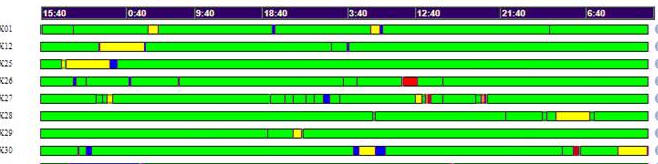
Each bar represents an object over time with each color representing a state change. For example , when the segment is green = good, yellow = warning, red = bad, etc. The segment color is sized based on the amount of time along the x-axis when the object was in that state.
Is it possible to create a chart of this style in SSRS? How?
Thanks for your help.
--Dan

Hi @Abrams, Dan ,
The object that is best for this task is Range Bar Chart. First you needed to precalculate "segment", "from time" and "to time". Then put time on X axis and "segment" as series, where range top and bottom value were from and to times. It made kind of gant chart that rearranged to what you needed by setting DrawSideBySide option. Colors were made by setting expression for series filling, like:
=SWITCH(Fields!Segment.Value="Good","Green",Fields!Segment.Value="Warning","Yellow",Fields!Segment.Value="Bad","Red")
Best Regards,
Joy
If the answer is the right solution, please click "Accept Answer" and kindly upvote it. If you have extra questions about this answer, please click "Comment".
Note: Please follow the steps in our documentation to enable e-mail notifications if you want to receive the related email notification for this thread.
Hi Joy,
Success!
I have figured out how to get this to work.
It has to do with the "Series Groups" value. This value must be set to the "Start" value, i.e., the Start Date of the range.
Originally, I had it set to the Status value, because I wanted the Status to show up in the Legend. I have since disabled the legend, and created a separate table with a "Legend".
So, using my sample data from above, the steps are:
--Dan
Hi Joy,
Thanks for getting back to me.
I tried this, but it doesn't work. I set DrawSideBySide=False and used "Start" and "End" as my "Top" and "Bottom" values. "Start" and "End" are SQL Server datetime datatypes.
I am finding that the segment does not repeat itself once it has been drawn.
The example below shows my "Desired" outcome vs. what the Range-Bar chart is producing ("Actual")
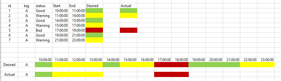
As you can see, The "Actual" segment is not repeating the "Good" or "Warning" segments after the first time they are painted. It is properly positioning the "Bad" segment in the correct starting location, and the length of the segment is correct.
The problem is that segments don't repeat after the first time they are encountered.
Any help you can provide would be most appreciated.
--Dan