Azure IoT Central
An Azure hosted internet of things (IoT) application platform.
364 questions
This browser is no longer supported.
Upgrade to Microsoft Edge to take advantage of the latest features, security updates, and technical support.
' cx='32' cy='32' r='32' /%3E%3Ctext x='50%25' y='55%25' dominant-baseline='middle' text-anchor='middle' fill='%23FFF' %3EC%3C/text%3E%3C/svg%3E)
Hi,
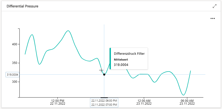
I would like to change some aspects of a line chart in an IoT-Central dashboard.
Any help is greatly appreciated.

Thank you @Sander van de Velde | MVP for providing your insights on this topic.
@Christian , Greetings! I am following up to check if the response below has helped you. Azure IoT Central dashboard does not offer many customizations to the chart. Please provide you feedback to Azure IoT Central ideas page and kindly share the link here so that we can upvote the request and track it.
----------
Kindly accept answer or upvote if the response is helpful so that it would benefit other community members facing the same issue. I highly appreciate your contribution to the community.
' cx='32' cy='32' r='32' /%3E%3Ctext x='50%25' y='55%25' dominant-baseline='middle' text-anchor='middle' fill='%23FFF' %3EAM%3C/text%3E%3C/svg%3E)
@Christian This issue is similar to https://learn.microsoft.com/en-us/answers/questions/1100913/index.html
See LeelaRajeshSayana-MSFT and Sander's suggestions.
If the suggestions answers your query, do click Accept Answer and Up-Vote for the same. And, if you have any further query do let us know.

Hello @Christian ,
I tried to figure out how much customization there is but the IoT Central Dashboard is quite limited regarding tweaking the visual components.
The documentation is not that elaborate either.
I recommend the two links regarding technical help and giving feedback.
The team seems to be actively following the Customer feedback so turn your question into a new feature request.
Please share it here so we can track and upvote it.