SQL Server Reporting Services
A SQL Server technology that supports the creation, management, and delivery of both traditional, paper-oriented reports and interactive, web-based reports.
This browser is no longer supported.
Upgrade to Microsoft Edge to take advantage of the latest features, security updates, and technical support.
' cx='32' cy='32' r='32' /%3E%3Ctext x='50%25' y='55%25' dominant-baseline='middle' text-anchor='middle' fill='%23FFF' %3EBO%3C/text%3E%3C/svg%3E)
I want to create a column chart where each bar has distinct counts.
For example:
Bar 1: Count items with Priority 1
Bar 2: Count items with Priority 2
now the tricky part, I think:
Bar 3: Count items produced by company X of any Priority (not just 1 or 2)
Bar 4: Count items produced by company Y of any Priority (not just 1 or 2)
Bar 5: Count items available within 2 weeks from ANY company (not just X or Y) or Priority (not just 1 or 2)
Maybe the term "metrics" is better than "categories"
' cx='32' cy='32' r='32' /%3E%3Ctext x='50%25' y='55%25' dominant-baseline='middle' text-anchor='middle' fill='%23FFF' %3EA%3C/text%3E%3C/svg%3E)
Hi @Brett Ossman
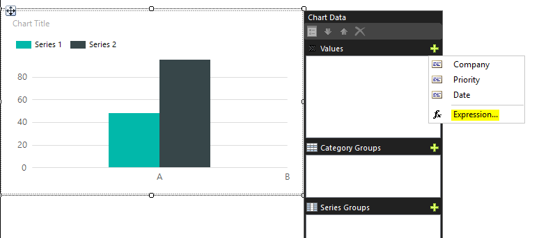
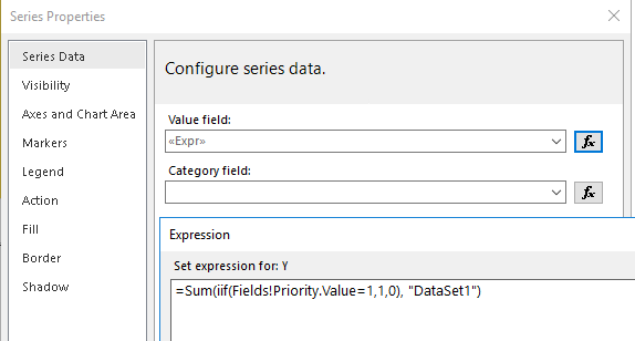
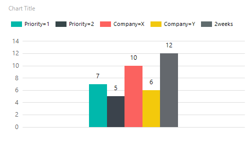
First insert a Column Chart. Double-clicking on the chart will bring up a window for setting the chart data. Please remove the Details in Category Groups, and we add expressions directly in the Values window.
First add the first expression with count Priority=1: =Sum(iif(Fields!Priority.Value=1,1,0), "DataSet1").
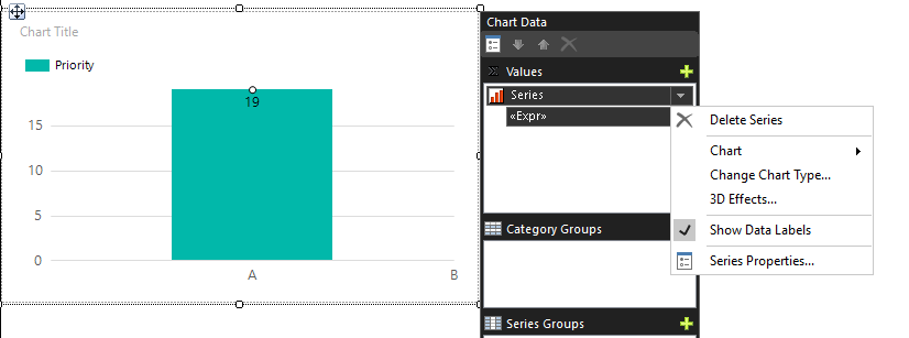
For the convenience of observation, we select Custom legend text in the Legend window and fill in "Priority=1".

Click OK, it will be as shown in the picture, we can click "Show data label" to display the result of the expression.
We can add the rest of the tags in turn as above.
Priority=2:
=Sum(iif(Fields!Priority.Value=2,1,0), "DataSet1")

Company=X:
=Sum(iif(Fields!Company.Value="X",1,0), "DataSet1")

Company=Y:
=Sum(iif(Fields!Company.Value="Y",1,0), "DataSet1")

2weeks:
=Sum(iif(DateDiff(DateInterval.Weekday,Fields!Date.Value,today() )<2,1,0), "DataSet1")
There is a difference between DateInterval.Weekday and DateInterval.WeekOfYear, you can choose the result you want to achieve.
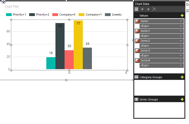
Preview:
Best regards,
Aniya

Hi @Brett Ossman ,
What data and fields does your original table contain? What does your chart look like currently?
I will do some tests if you could provide some test data.
Best Regards,
Joy
Thanks for the feedback.
I can build a chart say counting for each Priority, no problem.
My question involves counting items based on totally different criteria which may have nothing to do with each other.
Could take me a while to get you some test data.
I would would to create some.
For confidentiality/legal reasons, I just can't give you a sample of ours.
For now, I'll wait and see if anyone has actually done one of these, but thanks again. :-)
Here's a simpler one that would probably point me in the right direction.
A table of first and last names. One field/column for each.
Create one chart that has three columns.
Column 1: Counts names = Sam
Column 2: Counts names = Granger
Column 3: Counts names = Brad Johnson
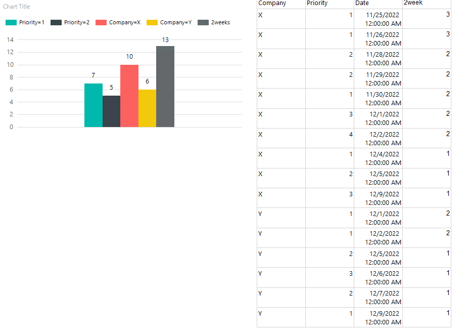
Hi @Brett Ossman
Do you want to show like this? I did a sample test, on the right is my original data.
Best regards,
Aniya
Yes,
That's what I'm after.
How do I chart that?
Thanks
The Values list was key for me.
I thought I tried that, but obviously got something wrong.
Thanks again.