Hello community,
I have two navigation bars (top navigation and sidebar navigation). I am trying to re-position the sidebar navigation from side to the top when in mobile view. i.e. when in laptop or desktop view the sidebar navigation position is at the side of the screen. Then when in mobile view, I want the sidebar navigation to be at the top, just below the top navigation. I tried this and when I switch to mobile view, the sidebar navigation which moves at the top gives an irregular display.
Please how can I get a better and professional display?
<html xmlns="http://www.w3.org/1999/xhtml">
<head runat="server">
<meta charset="utf-8" />
<meta name="viewport" content="width=device-width, initial-scale=1, shrink-to-fit=no" />
<link rel="stylesheet" href="https://cdnjs.cloudflare.com/ajax/libs/font-awesome/5.15.3/css/all.min.css" integrity="sha512-iBBXm8fW90+nuLcSKlbmrPcLa0OT92xO1BIsZ+ywDWZCvqsWgccV3gFoRBv0z+8dLJgyAHIhR35VZc2oM/gI1w==" crossorigin="anonymous" referrerpolicy="no-referrer" />
<link rel="stylesheet" href="https://pro.fontawesome.com/releases/v5.10.0/css/all.css" intergrity="sha384-AYmEC3Yw5cVb3ZcuHt0A9w35dYTsvhLPVnYs9eStHfGJv0vKxVfELGroGkvsg+p" crossorigin="anonymous" />
<link rel="stylesheet" href="https://cdnjs.cloudflare.com/ajax/libs/font-awesome/4.7.0/css/font-awesome.min.css" />
<link rel="stylesheet" href="https://cdn.jsdelivr.net/npm/bootstrap@4.5.3/dist/css/bootstrap.min.css" integrity="sha384-TX8t27EcRE3e/ihU7zmQxVncDAy5uIKz4rEkgIXeMed4M0jlfIDPvg6uqKI2xXr2" crossorigin="anonymous" />
<link href="https://fonts.googleapis.com/css2?family=Roboto:wght@500&display=swap" rel="stylesheet" />
<link href='https://fonts.googleapis.com/css?family=Nunito' rel='stylesheet' />
<script src="http://code.jquery.com/jquery-1.11.0.min.js"></script>
<link href="css/bootstrap.min.css" rel="stylesheet" />
<link href="css/bootstrap.css" rel="stylesheet" />
<title>General</title>
<style type="text/css">
@import url('https://fonts.cdnfonts.com/css/proxima-nova-2?styles=44818,44819,44822,44823,44817,44820,44821,44812,44813,44814,44815,44810');
@import url('https://fonts.cdnfonts.com/css/graphik?styles=44660,44666,44654,44656,44658,44662,44652,44650,44664');
.wrapper {
background-repeat: no-repeat;
height: 100%;
background-position: center;
background-size: cover;
overflow: hidden;
position: relative;
width: 100%;
}
.footer {
width: 100%;
position: fixed !important;
}
.page-footer {
background-size: cover;
width: 100vw;
z-index: 100;
left: 0;
margin: 0 auto;
background-repeat: no-repeat;
}
.navbar-nav {
margin-left: auto;
}
#navbarNav li a {
color: #011B33;
font-family: 'Graphik', sans-serif;
font-size: 11pt;
font-weight: 500;
}
#Navigate li a {
color: #011B33;
font-size: 4.0vmin;
text-decoration: none;
font-family: 'Graphik', sans-serif;
}
#Navigate li a:hover {
color: steelblue;
font-weight: 500;
}
.nav-item {
float: right;
font-family: 'Graphik', sans-serif;
}
.navbar-nav .active {
color: #145c7c;
}
#navbarNav li a:hover {
color: steelblue;
}
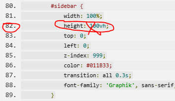
#sidebar {
width: 100%;
height: 100vh;
top: 0;
left: 0;
z-index: 999;
color: #011B33;
transition: all 0.3s;
font-family: 'Graphik', sans-serif;
}
#sidebar ul li a {
padding: 10px;
display: block;
font-size: 12pt;
font-weight: 500;
font-family: 'Graphik', sans-serif;
}
.sidenav-item {
text-decoration: none;
}
#Textsearch {
border-radius: 20px;
border: 1px solid #d8e1e2;
display: block;
box-sizing: border-box;
}
@media screen and (min-width: 360px) and (max-width:640px) {
#sidebar {
margin-top: -30%;
}
.guidecontent {
margin-top: -30%;
}
}
.nav-tabs li.active a {
color: steelblue;
}
#newclients {
font-weight: 500;
background-color: #145c7c;
border-color: none;
font-size: 11pt;
}
</style>
</head>
<body>
<form id="form1" runat="server">
<div class="wrapper">
<div class="top">
<nav class="navbar navbar-expand-lg navbar-dark fixed-top" id="header" style="background: #ffffff; border-bottom: 0.5px solid #d8e1e2;">
<button class="navbar-toggler" type="button" data-toggle="collapse" data-target="#navbarNav" aria-controls="navbarNav" aria-expanded="false" aria-label="Toggle navigation" style="background-color: transparent; border-color: none; font-size: 14pt; border-width: 0px; color: #000000;">
<span class=""><i class="fa fa-bars" aria-hidden="true" style="color: #000000;"></i></span>
</button>
<div class="collapse navbar-collapse" id="navbarNav" style="width: 100%;">
<ul class="navbar-nav">
<li class="nav-item">
<a class="nav-link active" href="#">
<i class="far fa-home" aria-hidden="true" style="margin: 0 7px; font-size: 11pt;"></i>Home</a>
</li>
<li class="nav-item">
<a class="nav-link" href="#">
<i class="far fa-address-book" aria-hidden="true" style="margin: 0 7px; font-size: 11pt;"></i>Contact</a>
</li>
<li class="nav-item">
<a class="nav-link" href="#">
<i class="far fa-sign-in" aria-hidden="true" style="margin: 0 7px; font-size: 11pt;"></i>Login</a>
</li>
<li class="nav-item">
<asp:Button ID="newclients" runat="server" CssClass="btn btn-primary" Text="Create a free account" />
</li>
</ul>
</div>
</nav>
</div>
<br />
<div class="line" style="padding: 12px;"></div><br />
<div class="midbody" style="margin: 0 auto; padding: 5px;">
<div style="margin: 0 auto; padding: 20px;">
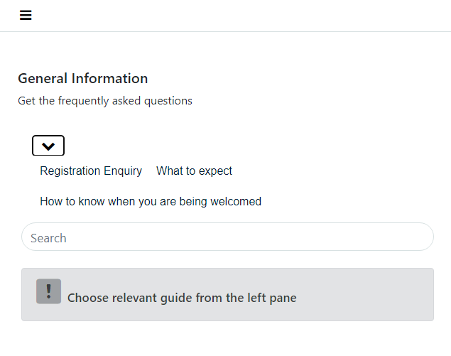
<h5>General Information</h5>
<asp:Label ID="info" runat="server" Text="Get the frequently asked questions"></asp:Label>
</div>
<div class="row" style="width: 100%; margin: 0 auto; padding: 10px; font-size: 16px; color: rgb(73, 85, 115);">
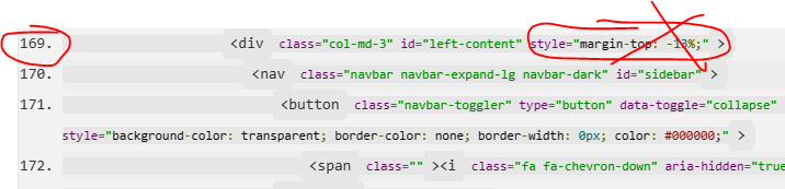
<div class="col-md-3" id="left-content" style="margin-top: -13%;">
<nav class="navbar navbar-expand-lg navbar-dark" id="sidebar">
<button class="navbar-toggler" type="button" data-toggle="collapse" data-target="#Navigate" aria-controls="Navigate" aria-expanded="false" aria-label="Toggle navigation" style="background-color: transparent; border-color: none; border-width: 0px; color: #000000;">
<span class=""><i class="fa fa-chevron-down" aria-hidden="true" style="color: #000000;"></i></span>
</button>
<div class="collapse navbar-collapse" id="Navigate" style="background: #ffffff;">
<ul class="nav nav-tabs" id="myTab" style="border-bottom: none;">
<li class="nav-item">
<a href="#individual-user" class="sidenav-item">Registration Enquiry</a>
</li>
<li class="nav-item">
<a href="#document-security" class="sidenav-item">What to expect</a>
</li>
<li class="nav-item">
<a href="#document-encoding" class="sidenav-item">How to know when you are being welcomed</a>
</li>
</ul>
</div>
</nav>
</div>
<div class="col-md-7">
<div class="guidecontent">
<div class="searchtextbox">
<asp:TextBox ID="Textsearch" runat="server" Text="" Width="100%" CssClass="form-control" Font-Size="13pt"
placeholder="Search"></asp:TextBox>
</div>
<br />
<div class="heading">
<div id="dvMessage" runat="server" class="alert alert-secondary">
<i class="fad fa-exclamation-square" aria-hidden="true" style="font-size: 30pt;"></i>
<label style="font-weight: 600; font-size: 13pt;">Choose relevant guide from the left pane</label>
</div>
</div>
<div class="resume" id="individual-user">
<h5>Where can I sign up?</h5>
<p>
You can start by registering onnthe platform - <a href="#">www.website.com</a><br />
Get on the bus with us, and experience a great deal of hospitality on your student trips.
</p>
</div>
<div class="resume" id="document-security">
<h5>What kind of thing item should I expect?</h5>
<label>
The services we offer will only speak for itself
</label>
<label>
1. We take our work seriously, and are ready to give you the best service.<br />
2. We take our work seriously, and are ready to give you the best service.<br />
2. We take our work seriously, and are ready to give you the best service.<br />
2. We take our work seriously, and are ready to give you the best service.<br />
</label>
</div>
<div class="resume" id="document-encoding">
<h5>How can I know when I am being welcome into a new place?</h5>
<p>We make provision to help students and institiutions in Africa get a feel of a new environment, when they arrive.</p>
<p>
Every image is unique to an organization; each individual.
</p>
</div>
</div>
</div>
</div>
</div>
</div>
</form>
<script src="https://code.jquery.com/jquery-3.3.1.slim.min.js" integrity="sha384-q8i/X+965DzO0rT7abK41JStQIAqVgRVzpbzo5smXKp4YfRvH+8abtTE1Pi6jizo" crossorigin="anonymous"></script>
<script src="https://cdnjs.cloudflare.com/ajax/libs/popper.js/1.14.3/umd/popper.min.js" integrity="sha384-ZMP7rVo3mIykV+2+9J3UJ46jBk0WLaUAdn689aCwoqbBJiSnjAK/l8WvCWPIPm49" crossorigin="anonymous"></script>
<script src="https://stackpath.bootstrapcdn.com/bootstrap/4.1.3/js/bootstrap.min.js" integrity="sha384-ChfqqxuZUCnJSK3+MXmPNIyE6ZbWh2IMqE241rYiqJxyMiZ6OW/JmZQ5stwEULTy" crossorigin="anonymous"></script>
<script src="https://cdnjs.cloudflare.com/ajax/libs/malihu-custom-scrollbar-plugin/3.1.5/jquery.mCustomScrollbar.concat.min.js"></script>
<script src="js/bootstrap.js"></script>
<script src="js/bootstrap.min.js"></script>
<script type="text/javascript">
$('.resume').hide()
$('a[href^="#"]').on('click', function (event) {
$('.resume').hide()
$('.heading').hide()
var target = $(this).attr('href');
$('.resume' + target).toggle();
})
</script>
</body>
</html>

' cx='32' cy='32' r='32' /%3E%3Ctext x='50%25' y='55%25' dominant-baseline='middle' text-anchor='middle' fill='%23FFF' %3ELH%3C/text%3E%3C/svg%3E)