Azure Monitor
An Azure service that is used to collect, analyze, and act on telemetry data from Azure and on-premises environments.
3,645 questions
This browser is no longer supported.
Upgrade to Microsoft Edge to take advantage of the latest features, security updates, and technical support.

Hello ,
scenario :
Production IIS server are running in the azure virtual machine, I configure the CPU utilization dashboard for monitoring purpose, but in the dashboard random time interval dashed line show in the azure dashboard. May I know what dash line is indicates and how can resolve the issues ASAP.
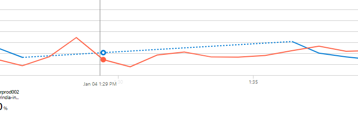

I am not familiar with this particular dashboard but it appears to indicate a data gap for the system or CPU in blue. The dashed line being an assumed or calculated value to fill the gap. Though I am not sure what would cause the missing data.
But during the time gap, i check the CPU utilization of the vm , it is working fine , upto 1.50% cpu utilization is there. My question is the dashed line missing issuse is problem from my setup or else the azure side backend issuse.

Hi @Jagadeeskumar Lenin ,
As per this Azure document, Azure metrics charts use dashed line style to indicate that there is a missing value (also known as “null value”) between two known time grain data points. This behavior is by design. It is useful for identifying missing data points. The line chart is a superior choice for visualizing trends of high-density metrics but may be difficult to interpret for the metrics with sparse values, especially when corelating values with time grain is important. The dashed line makes reading of these charts easier but if your chart is still unclear, consider viewing your metrics with a different chart type.
For more information with regards to it, please refer https://learn.microsoft.com/en-us/azure/azure-monitor/essentials/metrics-troubleshoot#chart-shows-dashed-line.