SQL Server Reporting Services
A SQL Server technology that supports the creation, management, and delivery of both traditional, paper-oriented reports and interactive, web-based reports.
3,061 questions
This browser is no longer supported.
Upgrade to Microsoft Edge to take advantage of the latest features, security updates, and technical support.
' cx='32' cy='32' r='32' /%3E%3Ctext x='50%25' y='55%25' dominant-baseline='middle' text-anchor='middle' fill='%23FFF' %3EK%3C/text%3E%3C/svg%3E)
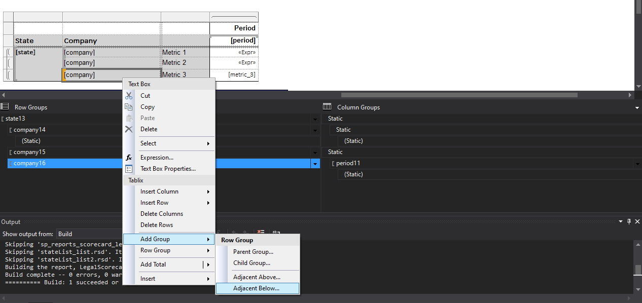
I have a matrix that is structured like the image below.
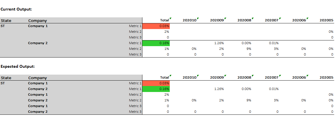
My current and expected outputs are provided below.
I am wondering what the easiest way would be to build a table like the expected output. My initial thought was to build individual tables for each metric. I can do this but is there a better way to modify the groupings so that I can display each metric between servicers versus grouping by state and then servicer where the metrics are split?
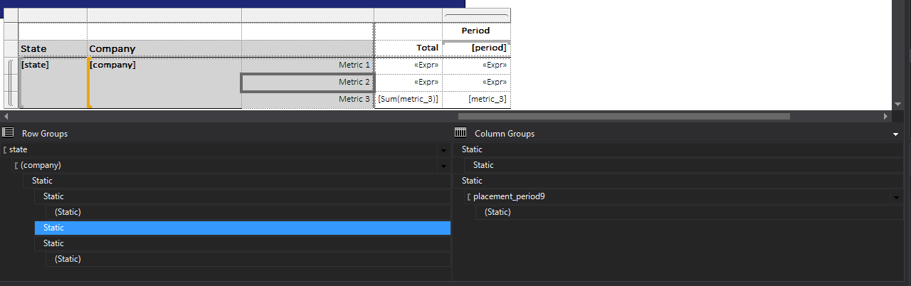
Upon researching solutions I became aware of the option when adding a group to use Adjacent Below... This allowed me to keep my state grouping, and create a new group on company and each individual metric without having to create a new matrix for each metric. This will ultimately lead to the expected output. Here is a screenshot of the new test table that produced results similar to the expected output. Note, I say similar because I left off the total field in this test.