Xamarin
A Microsoft open-source app platform for building Android and iOS apps with .NET and C#.
5,363 questions
This browser is no longer supported.
Upgrade to Microsoft Edge to take advantage of the latest features, security updates, and technical support.

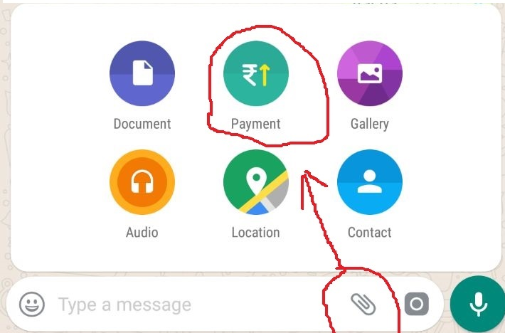
I am creating an application that has a chat option, I want an option like WhatsApp that shows an expanded menu, I am thinking of doing it with the expander but I do not get the desired result, you also have to take into account that I use for the position when the keyboard pops up, could someone guide me?
 xmlns: android = "clr-namespace: Xamarin.Forms.PlatformConfiguration.AndroidSpecific; assembly = Xamarin.Forms.Core"
 android: Application.WindowSoftInputModeAdjust = "Resize"
' cx='32' cy='32' r='32' /%3E%3Ctext x='50%25' y='55%25' dominant-baseline='middle' text-anchor='middle' fill='%23FFF' %3ELL%3C/text%3E%3C/svg%3E)
Hello,
Welcome to our Microsoft Q&A platform!
Do you want to acheve the result like following GIF?
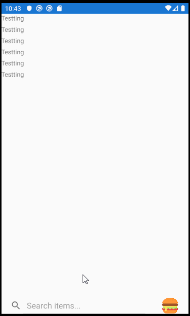
If so, you can create an custom ContentView for this needs. I add an searchbar for testing, You can add custom Entry that you want.
   <ContentView xmlns="http://xamarin.com/schemas/2014/forms"
                xmlns:x="http://schemas.microsoft.com/winfx/2009/xaml"
                x:Class="CustomSearcnBar.View1">
     <ContentView.Content>
         <StackLayout>

               <Frame x:Name="myFrame" HeightRequest="200" HorizontalOptions="CenterAndExpand" CornerRadius="20" IsVisible="false">
                   <Grid >
                       <Grid.ColumnDefinitions>
                           <ColumnDefinition Width="*"/>
                           <ColumnDefinition Width="*"/>
                           <ColumnDefinition Width="*"/>
                       </Grid.ColumnDefinitions>
                       <Grid.RowDefinitions>
                           <RowDefinition Height="*" />
                           <RowDefinition Height="*" />
                       </Grid.RowDefinitions>


                       <Image Grid.Column="0" Grid.Row="0"  Source="power.png"></Image>
                       <Image Grid.Column="1" Grid.Row="0"  Source="power.png"></Image>
                       <Image Grid.Column="2" Grid.Row="0"  Source="power.png"></Image>
                       <Image Grid.Column="0" Grid.Row="1"  Source="power.png"></Image>
                       <Image Grid.Column="1" Grid.Row="1"  Source="power.png"></Image>
                       <Image Grid.Column="2" Grid.Row="1"  Source="power.png"></Image>

                   </Grid>
               </Frame>
               <Grid HeightRequest="35">
                   <Grid.ColumnDefinitions>
                       <ColumnDefinition Width="8*"/>
                       <ColumnDefinition Width="2*"/>
                   </Grid.ColumnDefinitions>

                   <SearchBar Grid.Column="0" Placeholder="Search items..." />
                   <Image Grid.Column="1" Source="hamburger.png">
                       <Image.GestureRecognizers>
                           <TapGestureRecognizer Tapped="TapGestureRecognizer_Tapped"/>
                       </Image.GestureRecognizers>
                   </Image>
               </Grid>
           </StackLayout>
     </ContentView.Content>
   </ContentView>
Here is contentView's background code. When you click the Image, the expander's view will appear. When click it again, this view will be hide.
   public partial class View1 : ContentView
       {
           public View1()
           {
               InitializeComponent();
           }

           private void TapGestureRecognizer_Tapped(object sender, EventArgs e)
           {
               myFrame.IsVisible = !myFrame.IsVisible;
           }
       }
Then We can use it in the ContentPage.
   <StackLayout  VerticalOptions="FillAndExpand" HorizontalOptions="FillAndExpand">
           <Label Text="Testting"></Label>
           <Label Text="Testting"></Label>
           <Label Text="Testting"></Label>
           <Label Text="Testting"></Label>
           <Label Text="Testting"></Label>
           <Label Text="Testting"></Label>

           <customsearcnbar:View1 VerticalOptions="EndAndExpand"></customsearcnbar:View1>
       </StackLayout>
Best Regards,
Leon Lu
If the response is helpful, please click "Accept Answer" and upvote it.
Note: Please follow the steps in our documentation to enable e-mail notifications if you want to receive the related email notification for this thread.