Hi Microsoft Team,
We are in the process of implementing a custom dark mode sign-in process to align with our website branding using Azure Entra External ID. While configuring the custom CSS, we encountered a few styling elements that seem difficult to modify, and we’d like your guidance on how to proceed.
Input Placeholder Styling:
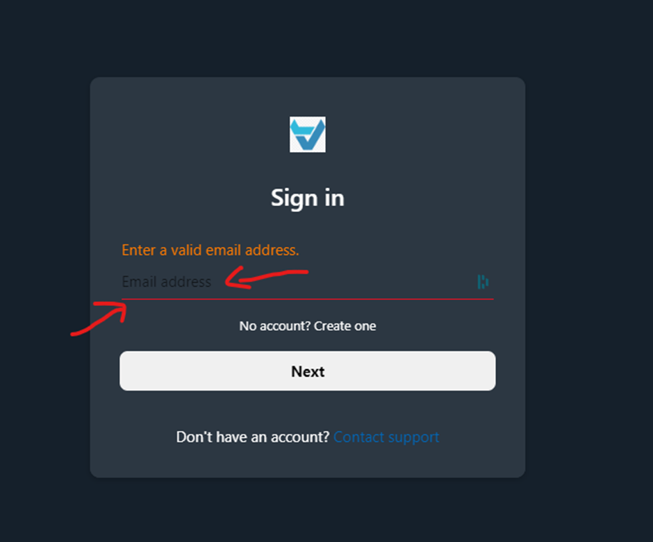
- In the screenshot attached, is it possible to change the color of the input placeholder text? If so, what is the recommended way to achieve this using custom CSS for the sign-in form?
- Additionally, when users encounter an error with their entry, can we modify the border color of the input field to match the error message color (as shown above)?

Identity Banner Styling:
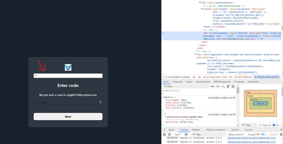
- For the identity banner (screenshot attached), can we modify the background color using custom CSS? If yes, could you guide us on how to achieve this?

Class Inconsistency on Reset Password Page:
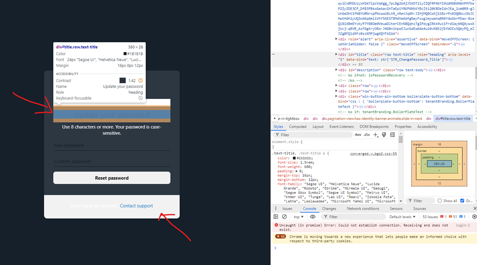
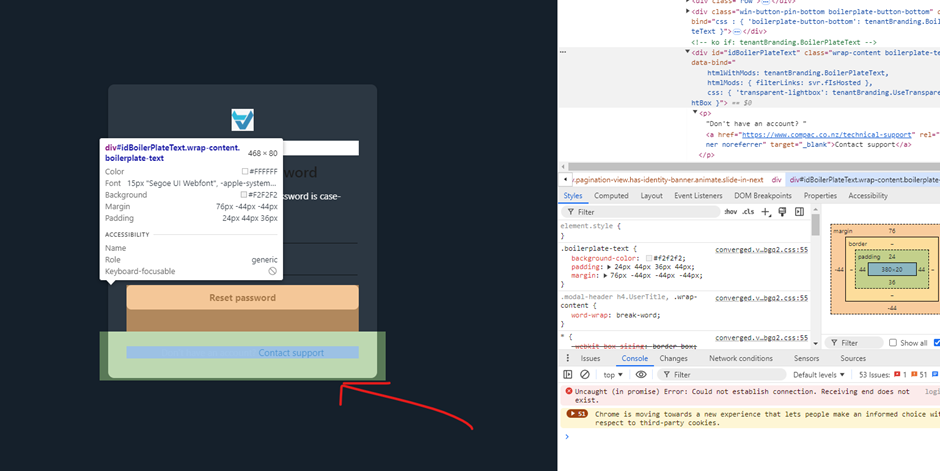
- In the reset password page, the elements for the title and boilerplate text are structured differently compared to the sign-in and sign-up pages. The reset page lacks the
ext-boilerplate-text class (it only uses boilerplate-text), making it difficult to style this page consistently with our other pages, as we only target elements with the ext- prefix.
- Is this difference in class names by design, or could it be an oversight? If intentional, what would be the best way to ensure consistent styling across all pages?


We appreciate your support in resolving these issues and aligning the user experience with our brand. Screenshots are attached for reference.
