Developer technologies | Windows Presentation Foundation
A part of the .NET Framework that provides a unified programming model for building line-of-business desktop applications on Windows.
This browser is no longer supported.
Upgrade to Microsoft Edge to take advantage of the latest features, security updates, and technical support.
' cx='32' cy='32' r='32' /%3E%3Ctext x='50%25' y='55%25' dominant-baseline='middle' text-anchor='middle' fill='%23FFF' %3EH%3C/text%3E%3C/svg%3E)
Hello,
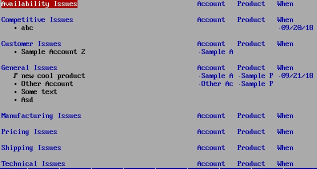
I'm looking for a table control that allows to control sub-tables within a table. See the attached screen dump from an old DOS application where this can be done. The 3 columns at the right are all same, but the left most column is different for every sub-table. My question is whether anyone knows a table control that can do this.
I could use the existing table control and have panels with one table control in it on it's own. But then it gets really hard to resize the sub-table vertically when new items are added.
Thanks, Haddock

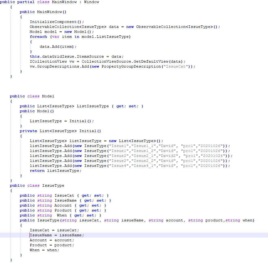
I make a sample for you as below, please check and let me know if I misunderstand your question.
The xaml code is:
 <Window.Resources>
        <Style x:Key="ExpanderStyle" TargetType="{x:Type Expander}">
            <Setter Property="IsExpanded" Value="True"></Setter>
            <Setter Property="Template">
                <Setter.Value>
                    <ControlTemplate TargetType="{x:Type Expander}">
                        <Grid>
                            <Grid.RowDefinitions>
                                <RowDefinition></RowDefinition>
                                <RowDefinition Name="ContentRow" Height="0"></RowDefinition>
                            </Grid.RowDefinitions>
                            <Border Grid.Row="0" Name="border" BorderThickness="0,0,0,0">
                                <WrapPanel>
                                    <ContentPresenter  Margin="20 10 0 10"  VerticalAlignment="Center"  ContentSource="Header"  RecognizesAccessKey="True" />
                                </WrapPanel>
                            </Border>
                            <ContentPresenter Grid.Row="1"></ContentPresenter>
                        </Grid>
                        <ControlTemplate.Triggers>
                            <Trigger Property="IsExpanded" Value="true">
                                <Setter TargetName="ContentRow" Property="Height" Value="{Binding ElementName=Content, Path=DesiredHeight}" />
                            </Trigger>
                            <Trigger Property="IsExpanded" Value="false">
                                <Setter TargetName="border" Property="BorderThickness" Value="0 0 0 1" />
                            </Trigger>
                        </ControlTemplate.Triggers>
                    </ControlTemplate>
                </Setter.Value>
            </Setter>
        </Style>
        <Style x:Key="GroupHeaderStyle" TargetType="{x:Type GroupItem}">
            <Setter Property="Template">
                <Setter.Value>
                    <ControlTemplate TargetType="{x:Type GroupItem}">
                        <Expander IsExpanded="True" Style="{StaticResource ExpanderStyle}">
                            <Expander.Header>
                                <WrapPanel>
                                    <TextBlock Text="{Binding Path=Name}" Width="200" HorizontalAlignment="Left"/>
                                    <TextBlock Text="Account" Width="200"/>
                                    <TextBlock Text="Product" Width="200" />
                                    <TextBlock Text="When"  Width="200" />
                                </WrapPanel>
                            </Expander.Header>
                            <Expander.Content>
                                <ItemsPresenter />
                            </Expander.Content>
                        </Expander>
                    </ControlTemplate>
                </Setter.Value>
            </Setter>
        </Style>

    </Window.Resources>
    <Grid>
        <DataGrid  Name="dataGridIssue"  AutoGenerateColumns="False" RowHeaderWidth="0" HorizontalGridLinesBrush="{x:Null}" VerticalGridLinesBrush="{x:Null}" Background="{x:Null}">
            <DataGrid.GroupStyle>
                <GroupStyle ContainerStyle="{StaticResource GroupHeaderStyle}">
                    <GroupStyle.Panel>
                        <ItemsPanelTemplate>
                            <DataGridRowsPresenter/>
                        </ItemsPanelTemplate>
                    </GroupStyle.Panel>
                </GroupStyle>
            </DataGrid.GroupStyle>
            <DataGrid.Columns>
                <DataGridTextColumn Binding="{Binding Path=IssueName}" Width="200"></DataGridTextColumn>
                <DataGridTextColumn Binding="{Binding Path=Account}" Width="200"></DataGridTextColumn>
                <DataGridTextColumn Binding="{Binding Path=Product}" Width="200"></DataGridTextColumn>
                <DataGridTextColumn Binding="{Binding Path=When}" Width="200"></DataGridTextColumn>
            </DataGrid.Columns>
        </DataGrid>
    </Grid>
The cs code is:
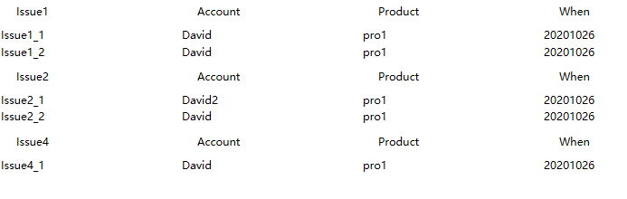
The result picture is:
If the response is helpful, please click "Accept Answer" and upvote it.
Note: Please follow the steps in our documentation to enable e-mail notifications if you want to receive the related email notification for this thread.
Hello Daisy,
thanks for your effort! I'm new to C# and .NET. That's why I thought that it cannot be done with the standard table control as with most other GUI frameworks anyway. But it can be done :-)
Regards, Haddock