Windows Forms
A set of .NET Framework managed libraries for developing graphical user interfaces.
1,873 questions
This browser is no longer supported.
Upgrade to Microsoft Edge to take advantage of the latest features, security updates, and technical support.
' cx='32' cy='32' r='32' /%3E%3Ctext x='50%25' y='55%25' dominant-baseline='middle' text-anchor='middle' fill='%23FFF' %3EH%3C/text%3E%3C/svg%3E)
Hi,
My form contains a tab control and I want to be able to adjust the colors and the font color of the tabs. This must depend on certain conditions. As a first step, I want to make with owner draw tabs exactly the same as if Drawmode = normal is set. I can't find anywhere how to do this. As soon as you get started with Drawmode = OwnerdrawFixed, the tabs get ugly.
This I have found so far:
TabControlCharts.DrawItem += new DrawItemEventHandler(tabControl1_DrawItem_1);

    private void tabControl1_DrawItem_1(object sender, DrawItemEventArgs e)
    {
        var tabControl = sender as TabControl;
        var tabPage = tabControl.TabPages[e.Index];

        var format = new StringFormat
        {
            FormatFlags = StringFormatFlags.NoWrap,
            Trimming = StringTrimming.None
        };

        // DrawString
        //using (var brush = new SolidBrush(Color.Black))
        //    e.Graphics.DrawString(tabPage.Text, e.Font, brush, tabControl.GetTabRect(e.Index), format);

        // DrawText
        var flags = TextFormatFlags.HorizontalCenter | TextFormatFlags.VerticalCenter | TextFormatFlags.SingleLine;
        TextRenderer.DrawText(e.Graphics, tabPage.Text, e.Font, e.Bounds, Color.Black, flags);
    }
Unfortunately, the result does not resemble Drawmode = OwnerdrawFixed.
Greetings

Except for the MouseOver, the TabControl is the same for me, OwnerDrawFixed or not (Windows 10, .NET .4.7.2)
' cx='32' cy='32' r='32' /%3E%3Ctext x='50%25' y='55%25' dominant-baseline='middle' text-anchor='middle' fill='%23FFF' %3ETY%3C/text%3E%3C/svg%3E)
TabControl in winform provides few modifiable items, and as you can see, modifying the text color in this way does not look pretty.
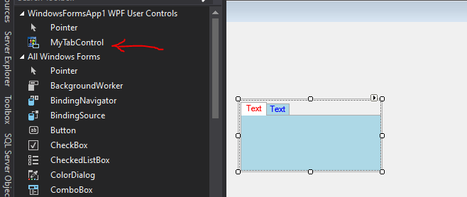
A possible alternative is to create a UserControl (WPF) and place a TabControl control, customizing its properties will be much more flexible.
<UserControl x:Class="WindowsFormsApp1.MyTabControl"
             xmlns="http://schemas.microsoft.com/winfx/2006/xaml/presentation"
             xmlns:x="http://schemas.microsoft.com/winfx/2006/xaml"
             xmlns:mc="http://schemas.openxmlformats.org/markup-compatibility/2006"
             xmlns:d="http://schemas.microsoft.com/expression/blend/2008"
             xmlns:local="clr-namespace:WindowsFormsApp1"
             mc:Ignorable="d"
             d:DesignHeight="100" d:DesignWidth="200">
    <UserControl.Resources>
        <Style x:Key="TabItemText" TargetType="{x:Type TextBlock}">
            <Style.Triggers>
                <DataTrigger Binding="{Binding IsSelected, RelativeSource={RelativeSource AncestorType=TabItem}}" Value="True">
                    <Setter Property="Foreground" Value="Black"/>
                </DataTrigger>
                <DataTrigger Binding="{Binding IsSelected, RelativeSource={RelativeSource AncestorType=TabItem}}" Value="False">
                    <Setter Property="Foreground" Value="LightBlue"/>
                </DataTrigger>
            </Style.Triggers>
        </Style>
    </UserControl.Resources>
    <Grid>
        <TabControl x:Name="tabControl" Background="LightBlue" HorizontalAlignment="Left" Height="100" Margin="2,3,0,0" VerticalAlignment="Top" Width="200">
            <TabItem  Background="LightBlue" >
                <TabItem.Header>
                    <StackPanel Orientation="Vertical">
                        <TextBlock Text="Text" Margin="0,0,0,0" VerticalAlignment="Center" Foreground="Red" />
                    </StackPanel>
                </TabItem.Header>
            </TabItem>
            <TabItem  Background="LightBlue" >
                <TabItem.Header>
                    <StackPanel Orientation="Vertical">
                        <TextBlock Text="Text" Margin="0,0,0,0" VerticalAlignment="Center" Foreground="Blue" />
                    </StackPanel>
                </TabItem.Header>
            </TabItem>
        </TabControl>

    </Grid>
</UserControl>
Build the project, and then it will appear in the ToolBox.
If the response is helpful, please click "Accept Answer" and upvote it.
Note: Please follow the steps in our documentation to enable e-mail notifications if you want to receive the related email notification for this thread.