Developer technologies | Windows Presentation Foundation
A part of the .NET Framework that provides a unified programming model for building line-of-business desktop applications on Windows.
This browser is no longer supported.
Upgrade to Microsoft Edge to take advantage of the latest features, security updates, and technical support.
' cx='32' cy='32' r='32' /%3E%3Ctext x='50%25' y='55%25' dominant-baseline='middle' text-anchor='middle' fill='%23FFF' %3ETJ%3C/text%3E%3C/svg%3E)
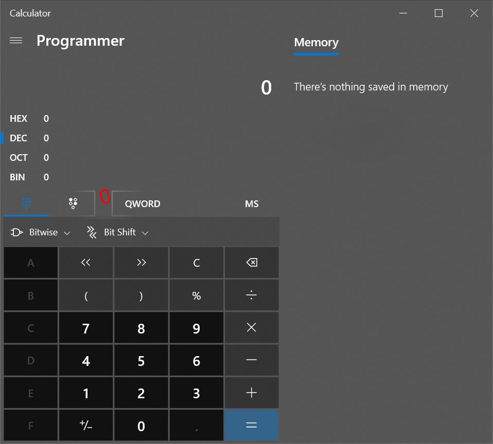
So I am very new to WPF and XAML and I am looking to get the kind of look and feel that you see with Windows Calculator. If you open Windows Calculator on Windows 10, you'll notice that the button borders light up depending on where the mouse is. Hovering over the button makes it change shade. From all of the stuff I've done with WPF (which isn't much), I am assuming that the buttons in Windows Calculator aren't typical buttons. Does anyone know what control is being used here and how I can replicate it in my own apps?

@Tyson Jones
The effect you want should be Reveal Highlight in UWP, right?There is no such ThemeSource in WPF, but you can create a custom BorderBrush to implement light effect.
The custom BorderBrush code is:
 public class RevealBorderBrushExtension : MarkupExtension
    {
        public Color FallbackColor { get; set; } = Colors.White;
        public Color Color { get; set; } = Colors.White;
        public Transform Transform { get; set; } = Transform.Identity;
        public Transform RelativeTransform { get; set; } = Transform.Identity;
        public double Opacity { get; set; } = 1.0;
        public double Radius { get; set; } = 100.0;
        public override object ProvideValue(IServiceProvider serviceProvider)
        {
            if (!(serviceProvider.GetService(typeof(IProvideValueTarget)) is IProvideValueTarget service)) return null;
            if (service.TargetObject.ToString().EndsWith("SharedDp")) return this;
            if (!(service.TargetObject is FrameworkElement element)) return this;
            if (DesignerProperties.GetIsInDesignMode(element)) return new SolidColorBrush(FallbackColor);

            var window = Window.GetWindow(element);
            if (window == null) return this;
            var brush = CreateBrush(window, element);
            return brush;
        }

        private Brush CreateBrush(Window window, FrameworkElement element)
        {
            var brush = new RadialGradientBrush(Colors.White, Colors.Transparent)
            {
                MappingMode = BrushMappingMode.Absolute,
                RadiusX = Radius,
                RadiusY = Radius,
                Opacity = Opacity,
                Transform = Transform,
                RelativeTransform = RelativeTransform,
            };
            window.MouseMove += OnMouseMove;
            window.Closed += OnClosed;
            return brush;

            void OnMouseMove(object sender, MouseEventArgs e)
            {
                var position = e.GetPosition(element);
                brush.GradientOrigin = position;
                brush.Center = position;
            }

            void OnClosed(object o, EventArgs eventArgs)
            {
                window.MouseMove -= OnMouseMove;
                window.Closed -= OnClosed;
            }
        }
    }
To implement it in xaml like below:
 <StackPanel Background="Black">
        <Border BorderThickness="2" Width="100" Height="100" Margin="10">
            <Border.BorderBrush>
                <local:RevealBorderBrush Color="White" FallbackColor="Gray" />
            </Border.BorderBrush>
        </Border>
        <Border BorderThickness="2" Width="100" Height="100">
            <Border.BorderBrush>
                <local:RevealBorderBrush Color="White" FallbackColor="Gray" />
            </Border.BorderBrush>
        </Border>
    </StackPanel>
The result picture is:

If the response is helpful, please click "Accept Answer" and upvote it.
Note: Please follow the steps in our documentation to enable e-mail notifications if you want to receive the related email notification for this thread.
That is exactly what I was looking for! Thank you so much!

You can see the MS sample Calculator Demo with similar buttons as Calc on my Windows 10 OS (1909)
' cx='32' cy='32' r='32' /%3E%3Ctext x='50%25' y='55%25' dominant-baseline='middle' text-anchor='middle' fill='%23FFF' %3EE%3C/text%3E%3C/svg%3E)
hi @TysonJones-3879
you can use nuget package
Thanks for your responses everyone. Sadly, your suggestions don't have the particular style I'm looking for. Look at my images below. The red circles are where the cursor was when I took the screenshots (my cursor wasn't captured). The lighting up of the borders is what I'm looking for. The second image shows this in the Windows 10 Start Menu.

' cx='32' cy='32' r='32' /%3E%3Ctext x='50%25' y='55%25' dominant-baseline='middle' text-anchor='middle' fill='%23FFF' %3EHL%3C/text%3E%3C/svg%3E)
Hi, @TysonJones-3879 .
The DropShadowEffect Class in WPF has a bitmap effect that paints a drop shadow around the target texture.
I make a demo to implement the button shadow effect like below:
Xaml code is:
<Window.Resources>
        <Style TargetType="Button">
            <Setter Property="Width" Value="95"/>
            <Setter Property="Height" Value="90"/>
            <Setter Property="Margin" Value="3,3,3,3"/>
            <Setter Property="Template" >
                <Setter.Value>
                    <ControlTemplate TargetType="{x:Type Button}">
                        <Border BorderBrush="{TemplateBinding Control.BorderBrush}" BorderThickness="0" CornerRadius="4" Background="WhiteSmoke" Name="Part_Background">
                            <ContentPresenter Content="{TemplateBinding ContentControl.Content}" HorizontalAlignment="Center" VerticalAlignment="Center" />
                        </Border>
                        <ControlTemplate.Triggers>
                            <Trigger Property="UIElement.IsMouseOver" Value="True">
                                <Setter Property="Border.Background" TargetName="Part_Background" Value="LightGray"/>
                                <Setter Property="UIElement.Effect">
                                    <Setter.Value>
                                        <DropShadowEffect BlurRadius="5" Color="Blue" Direction="0" Opacity="0.4" RenderingBias="Performance" ShadowDepth="-4"  />
                                    </Setter.Value>
                                </Setter>
                            </Trigger>
                            <Trigger Property="ButtonBase.IsPressed" Value="True">
                                <Setter Property="Border.Background" TargetName="Part_Background" Value="Silver"/>
                                <Setter Property="UIElement.Effect">
                                    <Setter.Value>
                                        <DropShadowEffect BlurRadius="5" Color="Red" Direction="0" Opacity="0.8" RenderingBias="Performance" ShadowDepth="-4"  />
                                    </Setter.Value>
                                </Setter>
                            </Trigger>
                        </ControlTemplate.Triggers>
                    </ControlTemplate>
                </Setter.Value>
            </Setter>
        </Style>
    </Window.Resources>
    <Grid Name="MyGrid" ShowGridLines="False" UseLayoutRounding="True">
            <Grid.ColumnDefinitions>
                <ColumnDefinition />
                <ColumnDefinition />
                <ColumnDefinition />
                <ColumnDefinition />
            </Grid.ColumnDefinitions>
            <Grid.RowDefinitions>
                <RowDefinition/>
                <RowDefinition/>
                <RowDefinition/>
                <RowDefinition/>
            </Grid.RowDefinitions>
            <Button >7</Button>
            <Button Grid.Column="1">8</Button>
            <Button Grid.Column="2">9</Button>
            <Button Grid.Row="1" Grid.Column="0">4</Button>
            <Button Grid.Row="1" Grid.Column="1">5</Button>
            <Button Grid.Row="1" Grid.Column="2">6</Button>
            <Button Grid.Row="2" Grid.Column="0">1</Button>
            <Button Grid.Row="2" Grid.Column="1">2</Button>
            <Button Grid.Row="2" Grid.Column="2">3</Button>
        </Grid>
Did it give you any help? If it does not, please give me more description to analyze.