SQL Server Reporting Services
A SQL Server technology that supports the creation, management, and delivery of both traditional, paper-oriented reports and interactive, web-based reports.
This browser is no longer supported.
Upgrade to Microsoft Edge to take advantage of the latest features, security updates, and technical support.
' cx='32' cy='32' r='32' /%3E%3Ctext x='50%25' y='55%25' dominant-baseline='middle' text-anchor='middle' fill='%23FFF' %3EK%3C/text%3E%3C/svg%3E)
(This is the first time I post so I hope this is the right place for this post)
I need to create a dashboard with a bar chart for the sum of the different record types(A,B,C,...) by month.
So I have months as the X axis.
The sum is the number of cases as the Y values.
The problem is that for every individual record the types can be two or more as in (A,R).
So I thought of 2 different ways to hande it:
What I was wondering for number one is, is there a way to then separate the value with multiple types and somehow separate the types in a way that can be shown in the chart bar as 2 different bars? (ex: january we have one record of 2 types so I should have 2 bars of the same height)
If this isn't possible, I was thinking of the second option but when I put them both in the group series they both get mixed or concatenated (as we can see in the legend).
If both aren't plausible, could you suggest a solution that would allow me to get the wanted results
Thanks in advance!
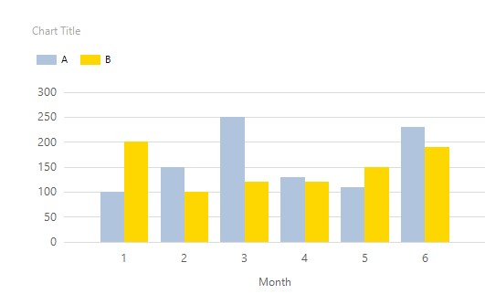
EDIT: I don't know if I made things more complex than they are, but basically what I would want is to be able to have two group series independently shown on the graph like "Groupe1 value a Groupe1 value b Groupe2 value aa Groupe2 value bb..."

Hi @ktbma ,
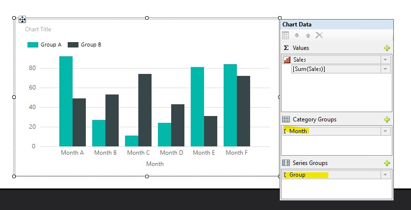
I am not sure if my understanding is correct. If you just want to display the different values of the two groups on the chart, you only need to add a grouping field on the "Series Group". If I misunderstand what you mean, please feel free to correct me.
To be honest, I suggest that you provide specific test data and the renderings you want, so that it is easy to resolve your issue.
Best Regard,
Joy
If the answer is helpful, please click "Accept Answer" and upvote it.
Note: Please follow the steps in our documentation to enable e-mail notifications if you want to receive the related email notification for this thread.
Hello,
For some reason, I couldn't comment your answer even if it was in the limit.
So I decided to submit an answer instead, waiting for it to be moderated.
Hello @Joyzhao-MSFT
I actually already did this step; months and sum of values by category , maybe I was a bit vague in my post I tweaked it a bit but as you asked I'll give more details here:
An example of my data:

So the values for the row with 1 as id is put in the graph as two records for C aswell as D.
I don't know if I'm making myself clear here, don't hesitate if there's still some things to adress.
-as for the second case:
This was considered in the case where the first option wasn't possible (because I don't know how doable it is to manipulate values)
so our data would be in this new case:
Id,month,year,....,Type,TypeX
1,'february',2021,....,'C','D'
2,'march',2021,....,'X',NULL
...
The problem is when you put 2 grp series they are not independent. How can I have the graph shown?
I suggest you first learn about category groups and Series groups. According to my understanding, you want to display the month of 2020 and the month of 2021 in Category Groups, while the Series Groups display Type and TypeX. I think this is impossible to achieve in a bar chart. Nevertheless, I did the test locally and it was impossible to achieve as I said.