Xamarin
A Microsoft open-source app platform for building Android and iOS apps with .NET and C#.
5,326 questions
This browser is no longer supported.
Upgrade to Microsoft Edge to take advantage of the latest features, security updates, and technical support.
' cx='32' cy='32' r='32' /%3E%3Ctext x='50%25' y='55%25' dominant-baseline='middle' text-anchor='middle' fill='%23FFF' %3EL%3C/text%3E%3C/svg%3E)
Hello,
How can I make my menu items extendable?
Here is my AppShell.xaml
  <?xml version="1.0" encoding="UTF-8"?>
 <Shell xmlns="http://xamarin.com/schemas/2014/forms"
        xmlns:x="http://schemas.microsoft.com/winfx/2009/xaml"
        xmlns:local="clr-namespace:MyTestApplication.Views"
        xmlns:viewModels="clr-namespace:MyTestApplication.ViewModels;assembly=MyTestApplication"
        Title="MyTestApplication"
        x:Class="MyTestApplication.AppShell">

     <Shell.Resources>
         <ResourceDictionary>
             <Style x:Key="BaseStyle" TargetType="Element">
                 <Setter Property="Shell.BackgroundColor" Value="{StaticResource Primary}" />
                 <Setter Property="Shell.ForegroundColor" Value="White" />
                 <Setter Property="Shell.TitleColor" Value="White" />
                 <Setter Property="Shell.DisabledColor" Value="#B4FFFFFF" />
                 <Setter Property="Shell.UnselectedColor" Value="#95FFFFFF" />
                 <Setter Property="Shell.TabBarBackgroundColor" Value="{StaticResource Primary}" />
                 <Setter Property="Shell.TabBarForegroundColor" Value="White"/>
                 <Setter Property="Shell.TabBarUnselectedColor" Value="#95FFFFFF"/>
                 <Setter Property="Shell.TabBarTitleColor" Value="White"/>
             </Style>
             <Style TargetType="TabBar" BasedOn="{StaticResource BaseStyle}" />
             <Style TargetType="FlyoutItem" BasedOn="{StaticResource BaseStyle}" />

             <Style Class="MenuItemLayoutStyle" TargetType="Layout" ApplyToDerivedTypes="True">
                 <Setter Property="VisualStateManager.VisualStateGroups">
                     <VisualStateGroupList>
                         <VisualStateGroup x:Name="CommonStates">
                             <VisualState x:Name="Normal">
                                 <VisualState.Setters>
                                     <Setter TargetName="FlyoutItemLabel" Property="Label.TextColor" Value="{StaticResource Primary}" />
                                 </VisualState.Setters>
                             </VisualState>
                         </VisualStateGroup>
                     </VisualStateGroupList>
                 </Setter>
             </Style>
         </ResourceDictionary>
     </Shell.Resources>


     <FlyoutItem Title="Home" Icon="home.png">
             <ShellContent Route="MainPage" ContentTemplate="{DataTemplate local:MainPage}" />
         </FlyoutItem>
         <FlyoutItem Title="Settings" Icon="setting.png">
             <ShellContent Route="SettingsPage" ContentTemplate="{DataTemplate local:SettingsPage}" />
         </FlyoutItem>

     <MenuItem Icon="logout.png" Text="Logout" StyleClass="MenuItemLayoutStyle" Clicked="OnMenuItemClicked">
     </MenuItem>

     <TabBar >
         <ShellContent Route="LoginPage" ContentTemplate="{DataTemplate local:LoginPage}" />
     </TabBar>

 </Shell>
This is my AppShell.xaml.cs
public partial class AppShell : Xamarin.Forms.Shell
{
public List<ElseMenuItem> FlyoutItems { get; set; } = new List<ElseMenuItem>();

public AppShell()
     {
         InitializeComponent();
     }
     private async void OnMenuItemClicked(object sender, EventArgs e)
     {
         await Shell.Current.GoToAsync("//LoginPage");
     }
 }
' cx='32' cy='32' r='32' /%3E%3Ctext x='50%25' y='55%25' dominant-baseline='middle' text-anchor='middle' fill='%23FFF' %3ELL%3C/text%3E%3C/svg%3E)
Hello,
Welcome to our Microsoft Q&A platform!
Do you want to achieve result like the following screenshot?
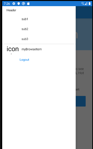
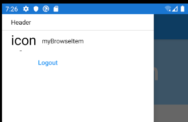
Here is my layout achievement.
   <?xml version="1.0" encoding="UTF-8"?>
   <Shell xmlns="http://xamarin.com/schemas/2014/forms"
          xmlns:x="http://schemas.microsoft.com/winfx/2009/xaml"
          xmlns:local="clr-namespace:AppShell.Views" xmlns:controls="clr-namespace:AppShell"
          Title="AppShell"
           Shell.ItemTemplate="{StaticResource FlyoutTemplateSelector}"
          x:Class="AppShell.AppShell">

       <Shell.Resources>
           <ResourceDictionary>
               <Style x:Key="BaseStyle" TargetType="Element">
                   <Setter Property="Shell.BackgroundColor" Value="{StaticResource Primary}" />
                   <Setter Property="Shell.ForegroundColor" Value="White" />
                   <Setter Property="Shell.TitleColor" Value="White" />
                   <Setter Property="Shell.DisabledColor" Value="#B4FFFFFF" />
                   <Setter Property="Shell.UnselectedColor" Value="#95FFFFFF" />
                   <Setter Property="Shell.TabBarBackgroundColor" Value="{StaticResource Primary}" />
                   <Setter Property="Shell.TabBarForegroundColor" Value="White"/>
                   <Setter Property="Shell.TabBarUnselectedColor" Value="#95FFFFFF"/>
                   <Setter Property="Shell.TabBarTitleColor" Value="White"/>
               </Style>
               <Style TargetType="TabBar" BasedOn="{StaticResource BaseStyle}" />
               <Style TargetType="FlyoutItem" BasedOn="{StaticResource BaseStyle}" />

               <!--
               Default Styles for all Flyout Items
               https://learn.microsoft.com/xamarin/xamarin-forms/app-fundamentals/shell/flyout#flyoutitem-and-menuitem-style-classes
               -->
               <Style Class="FlyoutItemLabelStyle" TargetType="Label">
                   <Setter Property="TextColor" Value="White"></Setter>
               </Style>
               <Style Class="FlyoutItemLayoutStyle" TargetType="Layout" ApplyToDerivedTypes="True">
                   <Setter Property="BackgroundColor" Value="LightBlue"></Setter>
                   <Setter Property="VisualStateManager.VisualStateGroups">
                       <VisualStateGroupList>
                           <VisualStateGroup x:Name="CommonStates">
                               <VisualState x:Name="Normal">
                                   <VisualState.Setters>
                                       <Setter Property="BackgroundColor" Value="White" />
                                       <Setter TargetName="FlyoutItemLabel" Property="Label.TextColor" Value="{StaticResource Primary}" />
                                   </VisualState.Setters>
                               </VisualState>
                               <VisualState x:Name="Selected">
                                   <VisualState.Setters>
                                       <Setter Property="BackgroundColor" Value="{StaticResource Primary}" />
                                   </VisualState.Setters>
                               </VisualState>
                           </VisualStateGroup>
                       </VisualStateGroupList>
                   </Setter>
               </Style>

               <!--
               Custom Style you can apply to any Flyout Item
               -->
               <Style Class="MenuItemLayoutStyle" TargetType="Layout" ApplyToDerivedTypes="True">
                   <Setter Property="VisualStateManager.VisualStateGroups">
                       <VisualStateGroupList>
                           <VisualStateGroup x:Name="CommonStates">
                               <VisualState x:Name="Normal">
                                   <VisualState.Setters>
                                       <Setter TargetName="FlyoutItemLabel" Property="Label.TextColor" Value="{StaticResource Primary}" />
                                   </VisualState.Setters>
                               </VisualState>
                           </VisualStateGroup>
                       </VisualStateGroupList>
                   </Setter>
               </Style>

                 <DataTemplate x:Key="FlyoutItemTemplate">
                       <Grid>
                           <Grid.ColumnDefinitions>
                               <ColumnDefinition Width="0.25*" />
                               <ColumnDefinition Width="0.75*" />
                           </Grid.ColumnDefinitions>
                           <Label Text="{Binding Icon}"

                          HeightRequest="45"
                          Margin="20,0,0,0"
                          FontSize="30"
                          TextColor="Black"
                          VerticalTextAlignment="Center" />
                           <Label Grid.Column="1"
                          Text="{Binding Title}"
                          TextColor="Black"
                          VerticalTextAlignment="Center" />
                       </Grid>
                   </DataTemplate>

                   <DataTemplate x:Key="FlyoutHeaderTemplate">
                       <StackLayout Orientation="Vertical">
                       <Label HeightRequest="35"
                          Margin="20,0,0,0"
                          Text="{Binding Title}"
                          TextColor="Black"
                          VerticalTextAlignment="Center" >
                           <Label.GestureRecognizers>
                               <TapGestureRecognizer Tapped="TapGestureRecognizer_Tapped"></TapGestureRecognizer>
                           </Label.GestureRecognizers>

                       </Label>
                   </StackLayout>
                   </DataTemplate>

                   <controls:FlyoutItemTemplateSelector
               x:Key="FlyoutTemplateSelector"
               NavigationHeaderTemplate="{StaticResource FlyoutHeaderTemplate}"
               NavigationItemTemplate="{StaticResource FlyoutItemTemplate}" />
           </ResourceDictionary>


       </Shell.Resources>

       <!--
           When the Flyout is visible this defines the content to display in the flyout.
           FlyoutDisplayOptions="AsMultipleItems" will create a separate flyout item for each child element
           https://learn.microsoft.com/dotnet/api/xamarin.forms.shellgroupitem.flyoutdisplayoptions?view=xamarin-forms
       -->
       <FlyoutItem Title="Domestic"  Shell.TabBarIsVisible="False" FlyoutDisplayOptions="AsMultipleItems" x:Name="domestic" Style="{StaticResource BaseStyle}">

           <ShellContent Title="Header"  ContentTemplate="{DataTemplate local:AboutPage}"   />
           <ShellContent Title="sub1" IsVisible="{Binding Changed}" ContentTemplate="{DataTemplate local:AboutPage}"   />
           <ShellContent Title="sub2" IsVisible="{Binding Changed}" ContentTemplate="{DataTemplate local:AboutPage}"   />
           <ShellContent Title="sub3" IsVisible="{Binding Changed}"  ContentTemplate="{DataTemplate local:AboutPage}"   />
       </FlyoutItem>

       <FlyoutItem  x:Name="myBrowseItem" Title="myBrowseItem" Icon="icon_feed.png">
           <ShellContent Route="ItemsPage" ContentTemplate="{DataTemplate local:ItemsPage}" />
       </FlyoutItem>

       <!-- When the Flyout is visible this will be a menu item you can tie a click behavior to  -->
       <MenuItem Text="Logout" StyleClass="MenuItemLayoutStyle" Clicked="OnMenuItemClicked">
       </MenuItem>

       <TabBar>
           <ShellContent Route="LoginPage" ContentTemplate="{DataTemplate local:LoginPage}" />
       </TabBar>

   </Shell>
Here is all of background code. When click the Label. sub item will disappear or appear.
   public partial class AppShell : Xamarin.Forms.Shell
       {
           Person person;
           public AppShell()
           {
               InitializeComponent();
               Routing.RegisterRoute(nameof(ItemDetailPage), typeof(ItemDetailPage));
               Routing.RegisterRoute(nameof(NewItemPage), typeof(NewItemPage));
               person =    new Person();
               this.BindingContext = person;
           }

           private async void OnMenuItemClicked(object sender, EventArgs e)
           {
               await Shell.Current.GoToAsync("//LoginPage");
           }

           private void TapGestureRecognizer_Tapped(object sender, EventArgs e)
           {
               person.Changed = !person.Changed;
           }
       }

       public class Person : INotifyPropertyChanged
       {

           bool _changed = false;
           public bool Changed
           {
               get
               {
                   return _changed;
               }

               set
               {
                   if (_changed != value)
                   {
                       _changed = value;
                       OnPropertyChanged("Changed");

                   }
               }

           }


           public event PropertyChangedEventHandler PropertyChanged;

           protected virtual void OnPropertyChanged(string propertyName)
           {
               PropertyChanged?.Invoke(this, new PropertyChangedEventArgs(propertyName));
           }

       }


   }
Best Regards,
Leon Lu
If the response is helpful, please click "Accept Answer" and upvote it.
Note: Please follow the steps in our documentation to enable e-mail notifications if you want to receive the related email notification for this thread.
I have not heard from you for a couple of days.