Azure Cost Management
A Microsoft offering that enables tracking of cloud usage and expenditures for Azure and other cloud providers.
2,355 questions
This browser is no longer supported.
Upgrade to Microsoft Edge to take advantage of the latest features, security updates, and technical support.
' cx='32' cy='32' r='32' /%3E%3Ctext x='50%25' y='55%25' dominant-baseline='middle' text-anchor='middle' fill='%23FFF' %3EDW%3C/text%3E%3C/svg%3E)
Hi,
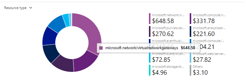
Recently our team trying to use AIRS Cube V2 to make data insights, but we have some problem to grouping the correct resource together. For example, Kusto has multiple resource to support them running, a Kusto that required VM, Bandwidth, Gateway and Storage, we want to count them together as one resource.
And we see Azure portal has a graph title called "Resource Type", it is exactly what we are looking for. We also heard Azure Portal is also using Airs Cube DB.
Our question is how did Azure Portal calculate and grouping the correct Resource Type? Or maybe I can get a contact to the right person to ask?
Please help,
Thank you so much.

Thanks for the post @Diqing Wu ,
AFAIK, the graph you are referencing is powered by the Azure Cost Management service which has the native ability to visualize and analyze usage cost data using one/many of the supported dimensions/attributes including resource type, resource groups etc.
If you haven't already, I recommend watching this 8 min tutorial on Grouping and filtering options in Cost Analysis.
Also recommend checking out this section of the FAQ for additional guidance.

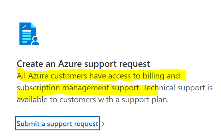
For more questions, raise a billing support request to engage the right billing experts to provide additional guidance.
Hope this helps but don't hesitate to ping if you have any follow-up questions.
Cheers.