Microsoft 365 and Office | Excel | For business | Windows
A family of Microsoft spreadsheet software with tools for analyzing, charting, and communicating data
This browser is no longer supported.
Upgrade to Microsoft Edge to take advantage of the latest features, security updates, and technical support.
' cx='32' cy='32' r='32' /%3E%3Ctext x='50%25' y='55%25' dominant-baseline='middle' text-anchor='middle' fill='%23FFF' %3ET%3C/text%3E%3C/svg%3E)
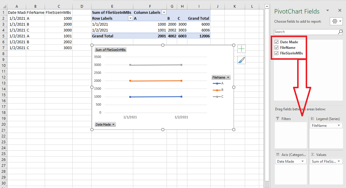
Hello I have Excel 2016 and have the following data:
DateMade - FileName - FileSizeInMBs
01/01/2021 - A 1000
01/01/2021 - B 2000
01/01/2021 - C 3000
01/02/2021 - A 1001
01/02/2021 - B 2002
01/02/2021 - C 3003
etc...
I want to track each unique FileName's growth over time.
How do I make a line chart that does this with labels?
Thanks in advance.

Hi @techresearch7777777 ,
You can try to create a Pivot Chart as shown in the following picture:
Just checking in to see if the result was you need. Please let us know if you would like further assistance.
If the response is helpful, please click "Accept Answer" and upvote it.
Note: Please follow the steps in our documentation to enable e-mail notifications if you want to receive the related email notification for this thread.
Awesome it worked for me!
(I had a hunch it needed some type of pivot table-chart.)
That's exactly what I was aiming for.
Thanks bunch emizhang-msft for your quick and perfectly detailed-easy to follow solution.