Xamarin
A Microsoft open-source app platform for building Android and iOS apps with .NET and C#.
5,332 questions
This browser is no longer supported.
Upgrade to Microsoft Edge to take advantage of the latest features, security updates, and technical support.
' cx='32' cy='32' r='32' /%3E%3Ctext x='50%25' y='55%25' dominant-baseline='middle' text-anchor='middle' fill='%23FFF' %3EA%3C/text%3E%3C/svg%3E)
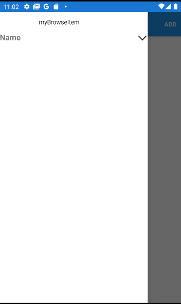
How to generate dynamic menu items in Xamarin forms shell item like below screenshot when click hamburger menu ![113208-image.png][1] [1]: /api/attachments/113208-image.png?platform=QnA My AppShell code <Shell.Resources> <ResourceDictionary> <Color x:Key="SelectedThemeColor">#0AB9E2</Color> <Color x:Key="UnSelectedColor">#5C5C5C</Color> <Color x:Key="BackGroundColor">#ffffff</Color> <Style x:Key="BaseStyle" TargetType="Element"> <Setter Property="Shell.BackgroundColor" Value="{StaticResource BackGroundColor}"/> <Setter Property="Shell.ForegroundColor" Value="{StaticResource SelectedThemeColor}"/> <Setter Property="Shell.UnselectedColor" Value="{StaticResource UnSelectedColor}"/> <Setter Property="Shell.TitleColor" Value="{StaticResource SelectedThemeColor}"/> <Setter Property="Shell.TabBarBackgroundColor" Value="{StaticResource BackGroundColor}"/> <Setter Property="Shell.TabBarForegroundColor" Value="{StaticResource SelectedThemeColor}"/> <Setter Property="Shell.TabBarUnselectedColor" Value="{StaticResource UnSelectedColor}"/> <Setter Property="Shell.TabBarTitleColor" Value="{StaticResource SelectedThemeColor}"/> </Style> <Style TargetType="FlyoutItem" BasedOn="{StaticResource BaseStyle}"/> </ResourceDictionary> </Shell.Resources> <FlyoutItem FlyoutDisplayOptions="AsSingleItem"> <Tab Title="Home" Icon="Home.png"> <ShellContent ContentTemplate="{DataTemplate views:HomePage}"/> </Tab> <Tab Title="Categories" Icon="categories.png"> <ShellContent ContentTemplate="{DataTemplate views:HomeCategoryPage}"/> </Tab> <Tab Title="Brands" Icon="brands.png"> <ShellContent ContentTemplate="{DataTemplate views:HomeBrandPage}"/> </Tab> <Tab Title="Account" Icon="account.png"> <ShellContent ContentTemplate="{DataTemplate views:HomeAccountPage}"/> </Tab> <Tab Title="Cart" Icon="cart.png"> <ShellContent ContentTemplate="{DataTemplate views:HomeCartPage}"/> </Tab> </FlyoutItem>
' cx='32' cy='32' r='32' /%3E%3Ctext x='50%25' y='55%25' dominant-baseline='middle' text-anchor='middle' fill='%23FFF' %3ELL%3C/text%3E%3C/svg%3E)
Hello,
Welcome to our Microsoft Q&A platform!
Do you want to achieve the result like following screenshot?
 Click after
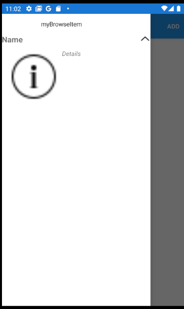
If so, you can put Expander to MenuItem. Here is Expander 's document.
   <MenuItem Text="Logout" StyleClass="MenuItemLayoutStyleSeparator" Clicked="OnMenuItemClicked">
           <Shell.MenuItemTemplate>
               <DataTemplate>
                   <Expander>
                       <Expander.Header>
                           <Grid>
                               <Label Text="Name"
                      FontAttributes="Bold"
                      FontSize="Medium" />
                               <Image Source="expand.png"
                      HorizontalOptions="End"
                      VerticalOptions="Start">
                                   <Image.Triggers>
                                       <DataTrigger TargetType="Image"
                                    Binding="{Binding Source={RelativeSource AncestorType={x:Type Expander}}, Path=IsExpanded}"
                                    Value="True">
                                           <Setter Property="Source"
                                   Value="collapse.png" />
                                       </DataTrigger>
                                   </Image.Triggers>
                               </Image>
                           </Grid>
                       </Expander.Header>
                       <Expander.ContentTemplate>
                           <DataTemplate>
                               <Grid Padding="10">
                                   <Grid.ColumnDefinitions>
                                       <ColumnDefinition Width="Auto" />
                                       <ColumnDefinition Width="Auto" />
                                   </Grid.ColumnDefinitions>
                                   <Image Source="icon_about.png"
                                          Aspect="AspectFill"
                                          HeightRequest="120"
                                          WidthRequest="120" />
                                   <Label Grid.Column="1"
                                       Text="Details"
                                       FontAttributes="Italic" />
                               </Grid>
                           </DataTemplate>
                       </Expander.ContentTemplate>
                   </Expander>
               </DataTemplate>
           </Shell.MenuItemTemplate>
       </MenuItem>
If you use Expander ,please add Forms.SetFlags("Expander_Experimental"); to OnCreate method of MainActivity.cs.
   public class MainActivity : global::Xamarin.Forms.Platform.Android.FormsAppCompatActivity
       {
           protected override void OnCreate(Bundle savedInstanceState)
           {
               TabLayoutResource = Resource.Layout.Tabbar;
               ToolbarResource = Resource.Layout.Toolbar;

               base.OnCreate(savedInstanceState);

               //add here
               Forms.SetFlags("Expander_Experimental");
               Xamarin.Essentials.Platform.Init(this, savedInstanceState);
               global::Xamarin.Forms.Forms.Init(this, savedInstanceState);
               LoadApplication(new App());
           }
      }
   }
Here is my use image.


Here is my AppShell.xaml
   <?xml version="1.0" encoding="UTF-8"?>
   <Shell xmlns="http://xamarin.com/schemas/2014/forms"
          xmlns:x="http://schemas.microsoft.com/winfx/2009/xaml"
          xmlns:local="clr-namespace:AppShell.Views" xmlns:controls="clr-namespace:AppShell"
          Title="AppShell"
           Shell.ItemTemplate="{StaticResource FlyoutTemplateSelector}"
          x:Class="AppShell.AppShell">

       <Shell.Resources>
           <ResourceDictionary>
               <Style x:Key="BaseStyle" TargetType="Element">
                   <Setter Property="Shell.BackgroundColor" Value="{StaticResource Primary}" />
                   <Setter Property="Shell.ForegroundColor" Value="White" />
                   <Setter Property="Shell.TitleColor" Value="White" />
                   <Setter Property="Shell.DisabledColor" Value="#B4FFFFFF" />
                   <Setter Property="Shell.UnselectedColor" Value="#95FFFFFF" />
                   <Setter Property="Shell.TabBarBackgroundColor" Value="{StaticResource Primary}" />
                   <Setter Property="Shell.TabBarForegroundColor" Value="White"/>
                   <Setter Property="Shell.TabBarUnselectedColor" Value="#95FFFFFF"/>
                   <Setter Property="Shell.TabBarTitleColor" Value="White"/>
               </Style>
               <Style TargetType="TabBar" BasedOn="{StaticResource BaseStyle}" />
               <Style TargetType="FlyoutItem" BasedOn="{StaticResource BaseStyle}" />

               <!--
               Default Styles for all Flyout Items
               https://learn.microsoft.com/xamarin/xamarin-forms/app-fundamentals/shell/flyout#flyoutitem-and-menuitem-style-classes
               -->
               <Style Class="FlyoutItemLabelStyle" TargetType="Label">
                   <Setter Property="TextColor" Value="White"></Setter>
               </Style>
               <Style Class="FlyoutItemLayoutStyle" TargetType="Layout" ApplyToDerivedTypes="True">
                   <Setter Property="BackgroundColor" Value="LightBlue"></Setter>
                   <Setter Property="VisualStateManager.VisualStateGroups">
                       <VisualStateGroupList>
                           <VisualStateGroup x:Name="CommonStates">
                               <VisualState x:Name="Normal">
                                   <VisualState.Setters>
                                       <Setter Property="BackgroundColor" Value="White" />
                                       <Setter TargetName="FlyoutItemLabel" Property="Label.TextColor" Value="{StaticResource Primary}" />
                                   </VisualState.Setters>
                               </VisualState>
                               <VisualState x:Name="Selected">
                                   <VisualState.Setters>
                                       <Setter Property="BackgroundColor" Value="{StaticResource Primary}" />
                                   </VisualState.Setters>
                               </VisualState>
                           </VisualStateGroup>
                       </VisualStateGroupList>
                   </Setter>
               </Style>

              <Style Class="MenuItemLayoutStyleSeparator" TargetType="Layout" ApplyToDerivedTypes="True">
                   <Setter Property="VisualStateManager.VisualStateGroups">
                       <VisualStateGroupList>
                           <VisualStateGroup x:Name="CommonStates">
                               <VisualState x:Name="Normal">
                                   <VisualState.Setters>
                                       <Setter TargetName="FlyoutItemLabel" Property="Label.TextColor" Value="#ffffff" />
                                       <Setter Property="Label.HeightRequest" Value="30" />
                                       <Setter Property="Label.BackgroundColor" Value="#bcbcbc" />
                                   </VisualState.Setters>
                               </VisualState>
                           </VisualStateGroup>
                       </VisualStateGroupList>
                   </Setter>
               </Style>

               <Style x:Key="labelWihteStyle" TargetType="Label">

                   <Setter Property="Label.TextColor" Value="White" />
                   <Setter Property="BackgroundColor" Value="#bcbcbc" />
               </Style>


               <!--
               Custom Style you can apply to any Flyout Item
               -->
               <Style Class="MenuItemLayoutStyle" TargetType="Layout" ApplyToDerivedTypes="True">
                   <Setter Property="VisualStateManager.VisualStateGroups">
                       <VisualStateGroupList>
                           <VisualStateGroup x:Name="CommonStates">
                               <VisualState x:Name="Normal">
                                   <VisualState.Setters>
                                       <Setter TargetName="FlyoutItemLabel" Property="Label.TextColor" Value="White" />
                                       <Setter Property="Label.HeightRequest" Value="30" />
                                       <Setter Property="BackgroundColor" Value="#ff00bc" />
                                   </VisualState.Setters>
                               </VisualState>
                           </VisualStateGroup>
                       </VisualStateGroupList>
                   </Setter>
               </Style>


                 <DataTemplate x:Key="FlyoutItemTemplate">
                       <Grid>
                           <Grid.ColumnDefinitions>
                               <ColumnDefinition Width="0.25*" />
                               <ColumnDefinition Width="0.75*" />
                           </Grid.ColumnDefinitions>
                           <Label Text="{Binding Icon}"

                          HeightRequest="45"
                          Margin="20,0,0,0"
                          FontSize="30"
                          TextColor="Black"
                          VerticalTextAlignment="Center" />
                           <Label Grid.Column="1"
                          Text="{Binding Title}"
                          TextColor="Black"
                          VerticalTextAlignment="Center" />
                       </Grid>
                   </DataTemplate>

                   <DataTemplate x:Key="FlyoutHeaderTemplate">
                       <StackLayout Orientation="Vertical">
                       <Label HeightRequest="35"
                          Margin="20,0,0,0"
                          Text="{Binding Title}"
                          TextColor="Black"
                          VerticalTextAlignment="Center" >
                           <Label.GestureRecognizers>
                               <TapGestureRecognizer Tapped="TapGestureRecognizer_Tapped"></TapGestureRecognizer>
                           </Label.GestureRecognizers>

                       </Label>
                   </StackLayout>
                   </DataTemplate>

                   <controls:FlyoutItemTemplateSelector
               x:Key="FlyoutTemplateSelector"
               NavigationHeaderTemplate="{StaticResource FlyoutHeaderTemplate}"
               NavigationItemTemplate="{StaticResource FlyoutItemTemplate}" />
           </ResourceDictionary>


       </Shell.Resources>

       <!--
           When the Flyout is visible this defines the content to display in the flyout.
           FlyoutDisplayOptions="AsMultipleItems" will create a separate flyout item for each child element
           https://learn.microsoft.com/dotnet/api/xamarin.forms.shellgroupitem.flyoutdisplayoptions?view=xamarin-forms
       -->


       <FlyoutItem  x:Name="myBrowseItem" Title="myBrowseItem" >
           <ShellContent Route="ItemsPage" ContentTemplate="{DataTemplate local:ItemsPage}" />
       </FlyoutItem>

       <!-- When the Flyout is visible this will be a menu item you can tie a click behavior to  -->
       <MenuItem Text="Logout" StyleClass="MenuItemLayoutStyleSeparator" Clicked="OnMenuItemClicked">
           <Shell.MenuItemTemplate>
               <DataTemplate>
                   <Expander>
                       <Expander.Header>
                           <Grid>
                               <Label Text="Name"
                      FontAttributes="Bold"
                      FontSize="Medium" />
                               <Image Source="expand.png"
                      HorizontalOptions="End"
                      VerticalOptions="Start">
                                   <Image.Triggers>
                                       <DataTrigger TargetType="Image"
                                    Binding="{Binding Source={RelativeSource AncestorType={x:Type Expander}}, Path=IsExpanded}"
                                    Value="True">
                                           <Setter Property="Source"
                                   Value="collapse.png" />
                                       </DataTrigger>
                                   </Image.Triggers>
                               </Image>
                           </Grid>
                       </Expander.Header>
                       <Expander.ContentTemplate>
                           <DataTemplate>
                               <Grid Padding="10">
                                   <Grid.ColumnDefinitions>
                                       <ColumnDefinition Width="Auto" />
                                       <ColumnDefinition Width="Auto" />
                                   </Grid.ColumnDefinitions>
                                   <Image Source="icon_about.png"
                                          Aspect="AspectFill"
                                          HeightRequest="120"
                                          WidthRequest="120" />
                                   <Label Grid.Column="1"
                                       Text="Details"
                                       FontAttributes="Italic" />
                               </Grid>
                           </DataTemplate>
                       </Expander.ContentTemplate>
                   </Expander>
               </DataTemplate>
           </Shell.MenuItemTemplate>
       </MenuItem>

       <!--<MenuItem Text="Logout2" StyleClass="MenuItemLayoutStyleSeparator" Clicked="OnMenuItemClicked">

       </MenuItem>-->

       <TabBar>
           <ShellContent Route="LoginPage" ContentTemplate="{DataTemplate local:LoginPage}" />
       </TabBar>


   </Shell>
===================
Update======================
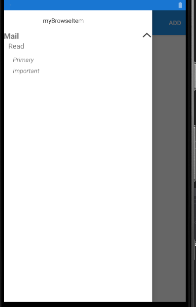
If you want to achieve the above answer, you can use nest expender like following code.
   <?xml version="1.0" encoding="UTF-8"?>
   <Shell xmlns="http://xamarin.com/schemas/2014/forms"
          xmlns:x="http://schemas.microsoft.com/winfx/2009/xaml"
          xmlns:local="clr-namespace:AppShell.Views" xmlns:controls="clr-namespace:AppShell"
          Title="AppShell"
           Shell.ItemTemplate="{StaticResource FlyoutTemplateSelector}"
          x:Class="AppShell.AppShell">

       <Shell.Resources>
           <ResourceDictionary>
               <Style x:Key="BaseStyle" TargetType="Element">
                   <Setter Property="Shell.BackgroundColor" Value="{StaticResource Primary}" />
                   <Setter Property="Shell.ForegroundColor" Value="White" />
                   <Setter Property="Shell.TitleColor" Value="White" />
                   <Setter Property="Shell.DisabledColor" Value="#B4FFFFFF" />
                   <Setter Property="Shell.UnselectedColor" Value="#95FFFFFF" />
                   <Setter Property="Shell.TabBarBackgroundColor" Value="{StaticResource Primary}" />
                   <Setter Property="Shell.TabBarForegroundColor" Value="White"/>
                   <Setter Property="Shell.TabBarUnselectedColor" Value="#95FFFFFF"/>
                   <Setter Property="Shell.TabBarTitleColor" Value="White"/>
               </Style>
               <Style TargetType="TabBar" BasedOn="{StaticResource BaseStyle}" />
               <Style TargetType="FlyoutItem" BasedOn="{StaticResource BaseStyle}" />

               <!--
               Default Styles for all Flyout Items
               https://learn.microsoft.com/xamarin/xamarin-forms/app-fundamentals/shell/flyout#flyoutitem-and-menuitem-style-classes
               -->
               <Style Class="FlyoutItemLabelStyle" TargetType="Label">
                   <Setter Property="TextColor" Value="White"></Setter>
               </Style>
               <Style Class="FlyoutItemLayoutStyle" TargetType="Layout" ApplyToDerivedTypes="True">
                   <Setter Property="BackgroundColor" Value="LightBlue"></Setter>
                   <Setter Property="VisualStateManager.VisualStateGroups">
                       <VisualStateGroupList>
                           <VisualStateGroup x:Name="CommonStates">
                               <VisualState x:Name="Normal">
                                   <VisualState.Setters>
                                       <Setter Property="BackgroundColor" Value="White" />
                                       <Setter TargetName="FlyoutItemLabel" Property="Label.TextColor" Value="{StaticResource Primary}" />
                                   </VisualState.Setters>
                               </VisualState>
                               <VisualState x:Name="Selected">
                                   <VisualState.Setters>
                                       <Setter Property="BackgroundColor" Value="{StaticResource Primary}" />
                                   </VisualState.Setters>
                               </VisualState>
                           </VisualStateGroup>
                       </VisualStateGroupList>
                   </Setter>
               </Style>

              <Style Class="MenuItemLayoutStyleSeparator" TargetType="Layout" ApplyToDerivedTypes="True">
                   <Setter Property="VisualStateManager.VisualStateGroups">
                       <VisualStateGroupList>
                           <VisualStateGroup x:Name="CommonStates">
                               <VisualState x:Name="Normal">
                                   <VisualState.Setters>
                                       <Setter TargetName="FlyoutItemLabel" Property="Label.TextColor" Value="#ffffff" />
                                       <Setter Property="Label.HeightRequest" Value="30" />
                                       <Setter Property="Label.BackgroundColor" Value="#bcbcbc" />
                                   </VisualState.Setters>
                               </VisualState>
                           </VisualStateGroup>
                       </VisualStateGroupList>
                   </Setter>
               </Style>

               <Style x:Key="labelWihteStyle" TargetType="Label">

                   <Setter Property="Label.TextColor" Value="White" />
                   <Setter Property="BackgroundColor" Value="#bcbcbc" />
               </Style>


               <!--
               Custom Style you can apply to any Flyout Item
               -->
               <Style Class="MenuItemLayoutStyle" TargetType="Layout" ApplyToDerivedTypes="True">
                   <Setter Property="VisualStateManager.VisualStateGroups">
                       <VisualStateGroupList>
                           <VisualStateGroup x:Name="CommonStates">
                               <VisualState x:Name="Normal">
                                   <VisualState.Setters>
                                       <Setter TargetName="FlyoutItemLabel" Property="Label.TextColor" Value="White" />
                                       <Setter Property="Label.HeightRequest" Value="30" />
                                       <Setter Property="BackgroundColor" Value="#ff00bc" />
                                   </VisualState.Setters>
                               </VisualState>
                           </VisualStateGroup>
                       </VisualStateGroupList>
                   </Setter>
               </Style>


                 <DataTemplate x:Key="FlyoutItemTemplate">
                       <Grid>
                           <Grid.ColumnDefinitions>
                               <ColumnDefinition Width="0.25*" />
                               <ColumnDefinition Width="0.75*" />
                           </Grid.ColumnDefinitions>
                           <Label Text="{Binding Icon}"

                          HeightRequest="45"
                          Margin="20,0,0,0"
                          FontSize="30"
                          TextColor="Black"
                          VerticalTextAlignment="Center" />
                           <Label Grid.Column="1"
                          Text="{Binding Title}"
                          TextColor="Black"
                          VerticalTextAlignment="Center" />
                       </Grid>
                   </DataTemplate>

                   <DataTemplate x:Key="FlyoutHeaderTemplate">
                       <StackLayout Orientation="Vertical">
                       <Label HeightRequest="35"
                          Margin="20,0,0,0"
                          Text="{Binding Title}"
                          TextColor="Black"
                          VerticalTextAlignment="Center" >
                           <Label.GestureRecognizers>
                               <TapGestureRecognizer Tapped="TapGestureRecognizer_Tapped"></TapGestureRecognizer>
                           </Label.GestureRecognizers>

                       </Label>
                   </StackLayout>
                   </DataTemplate>

                   <controls:FlyoutItemTemplateSelector
               x:Key="FlyoutTemplateSelector"
               NavigationHeaderTemplate="{StaticResource FlyoutHeaderTemplate}"
               NavigationItemTemplate="{StaticResource FlyoutItemTemplate}" />
           </ResourceDictionary>


       </Shell.Resources>

       <!--
           When the Flyout is visible this defines the content to display in the flyout.
           FlyoutDisplayOptions="AsMultipleItems" will create a separate flyout item for each child element
           https://learn.microsoft.com/dotnet/api/xamarin.forms.shellgroupitem.flyoutdisplayoptions?view=xamarin-forms
       -->


       <FlyoutItem  x:Name="myBrowseItem" Title="myBrowseItem" >
           <ShellContent Route="ItemsPage" ContentTemplate="{DataTemplate local:ItemsPage}" />
       </FlyoutItem>

       <!-- When the Flyout is visible this will be a menu item you can tie a click behavior to  -->
       <MenuItem Text="Logout" StyleClass="MenuItemLayoutStyleSeparator" Clicked="OnMenuItemClicked">
           <Shell.MenuItemTemplate>
               <DataTemplate>
                   <Expander>
                       <Expander.Header>
                           <Grid>
                               <Label Text="Mail"
                      FontAttributes="Bold"
                      FontSize="Medium" />
                               <Image Source="expand.png"
                      HorizontalOptions="End"
                      VerticalOptions="Start">
                                   <Image.Triggers>
                                       <DataTrigger TargetType="Image"
                                    Binding="{Binding Source={RelativeSource AncestorType={x:Type Expander}}, Path=IsExpanded}"
                                    Value="True">
                                           <Setter Property="Source"
                                   Value="collapse.png" />
                                       </DataTrigger>
                                   </Image.Triggers>
                               </Image>
                           </Grid>
                       </Expander.Header>
                       <Expander.ContentTemplate>
                           <DataTemplate>
                               <StackLayout Margin="10,0,0,0" >
                                   <Expander>
                                       <Expander.Header>
                                           <Grid>
                                               <Label Text="Read"

                                      FontSize="Body" />

                                           </Grid>
                                       </Expander.Header>
                                       <Expander.ContentTemplate>
                                           <DataTemplate>
                                               <Grid Padding="10">
                                                   <Grid.RowDefinitions>
                                                       <RowDefinition Height="Auto" />
                                                       <RowDefinition Height="Auto" />
                                                   </Grid.RowDefinitions>
                                                   <Label Grid.Row="0"
                                                   Text="Primary  "
                                                   FontAttributes="Italic" />
                                                   <Label Grid.Row="1"
                                                   Text="Important "
                                                   FontAttributes="Italic" />
                                               </Grid>
                                           </DataTemplate>
                                       </Expander.ContentTemplate>
                                   </Expander>


                               </StackLayout>
                           </DataTemplate>
                       </Expander.ContentTemplate>
                   </Expander>
               </DataTemplate>
           </Shell.MenuItemTemplate>
       </MenuItem>

       <!--<MenuItem Text="Logout2" StyleClass="MenuItemLayoutStyleSeparator" Clicked="OnMenuItemClicked">

       </MenuItem>-->

       <TabBar>
           <ShellContent Route="LoginPage" ContentTemplate="{DataTemplate local:LoginPage}" />
       </TabBar>


   </Shell>
Best Regards,
Leon Lu
If the response is helpful, please click "Accept Answer" and upvote it.
Note: Please follow the steps in our documentation to enable e-mail notifications if you want to receive the related email notification for this thread.
' cx='32' cy='32' r='32' /%3E%3Ctext x='50%25' y='55%25' dominant-baseline='middle' text-anchor='middle' fill='%23FFF' %3EX%3C/text%3E%3C/svg%3E)
@Leon Lu (Shanghai Wicresoft Co,.Ltd.)
If I want to generate a submenu with two-level like below, when we click on the header its should have two-level menu options.
-Mail - Header
-Read - submenu
-Primary - child submenu
-Important - child submenu
Appreciate, If you can share a sample for this.
Please see my updated answer, And we cannot share any demo to users by myself. In this thread, we are mainly discussing about this issue(Xamarin Dynamic Bind Menu Items) as indicated by the first post. . It will encourge the person who help you. Then for your new question it would be best if you try to open up a new thread for it. In this way, it will make answer searching in the forum easier and be beneficial to other community members as well.