Thank you both very much for your responses. I've only just figured out what my real problem is, as I was misunderstanding the task given to me.
Okay, so my data not only has varying lengths of time, it also skips a period of 3 years. It goes something like this
8/8/2011
8/12/2011
8/26/2011
9/9/2011
9/23/2011
10/7/2011
11/4/2011
12/19/2011
1/20/2012
7/17/2015
7/31/2015
8/7/2015
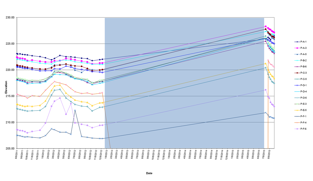
There are more dates from 2012 that I have omitted from this post for simplicity's sake, but as you can see, there is a large time gap from 2012 to 2015 where no measurements were recorded. When I plot the data on a line graph with a date/time axis, this
happens:

The Graph automatically inserts the missing years (the shaded blue area), scrunching up the remaining data on the far right. My task was to figure out a way to remove the inserted years. The graph shown is on a date/time scale. If I change it to text, the
dates change to one point for every 2 or 3 months and don't show the weekly changes to the data we would like to see.
So my real question is, is there a way to keep excel from inserting these missing years automatically?
Thank you!
-Allie

