Hi,
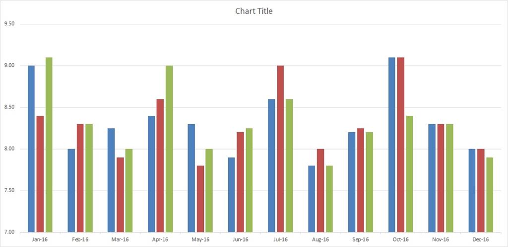
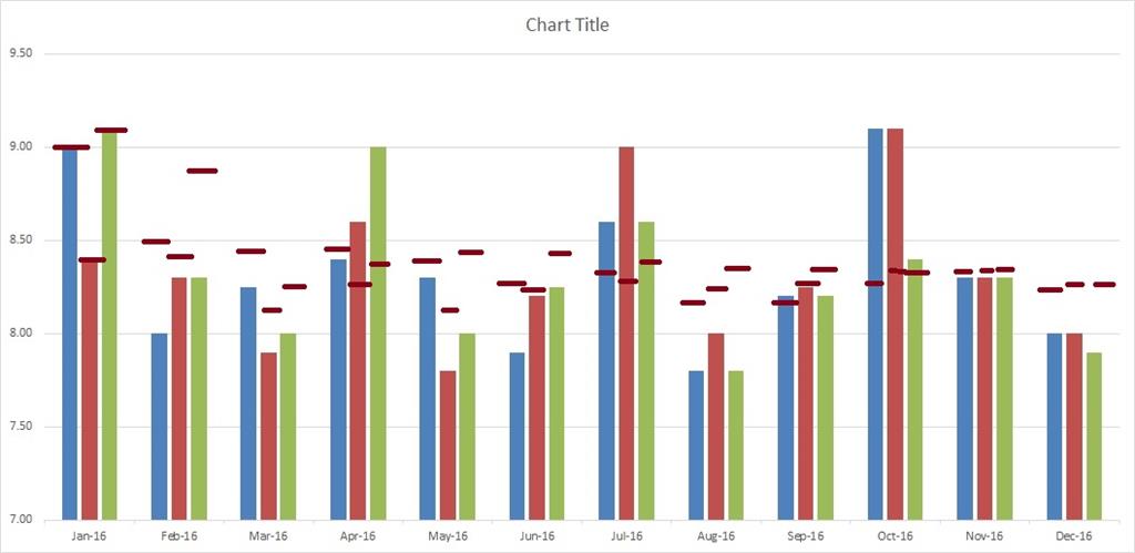
I'm working with the below graph. What I need to do is add a horizontal line across each bar starting in February that marks that color's moving YTD average. So every month we can see which colors exceed the current YTD average and which do not. So my
data table has three extra columns not represented here... Blue YTD, Red YTD and Green YTD. If I select any of those as lines on a combo graph, it draws three continuous lines up and down across all the colored bars, when what I want is just a simple horizontal
line noting where within each bar is the current YTD average.
Does anyone know how to set this up?

What I want (through the magic of MS Paint):

