Hi All
I've read the posts showing how to change a line chart color above/below a zero line or mean line etc, but this one is slightly different.
I want to produce a conditional line chart that is green when my quant model says the stock price is going up and red when my model says the stock price is going down.
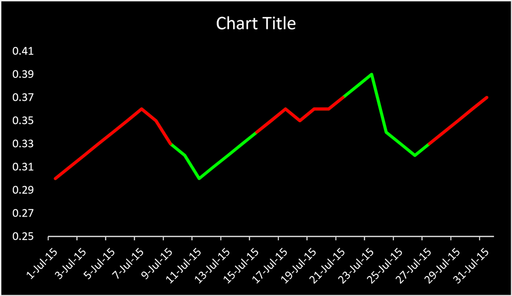
The X data is dates (days of the week) and the Y data is stock prices. I have produced two time series. One is 'all' prices (the green series), and overlaid on top of this is the red series (negative price trend). It should look like this:

Unfortunately, to create this chart it requires me to go through the 'red series' Y data and clear any cells that do not have numbers in them. I then set Select Data > Hidden and Empty Cells > Show empty cells as: Gaps, to produce the above chart.
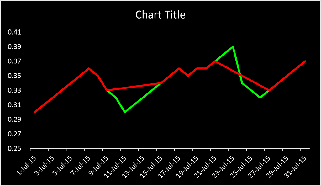
All well and good except that I currently have over 500 stocks in my model, so I need to automate the process. Automation currently means that any cells that do not have numbers in them end up with #NA, which produces this chart:

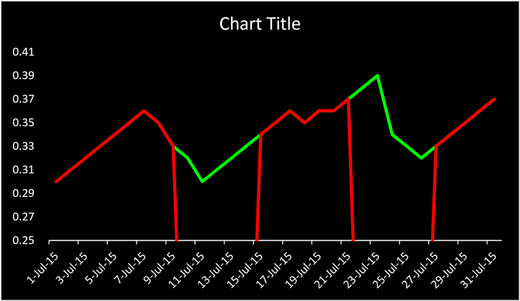
Or with some manipulation of the data to insert "" if it is showing #NA, produces this chart:

Does anyone know how to correct this problem? Either I need some way of cleaning the Y (red) data series such that the process remains automated but somehow 'clears contents' any cells without numbers, or I need some way of manipulating the charts to produce
the top chart above.
The obvious solution would be for Microsoft to change/amend their Excel program to include Select Data > Hidden and Empty Cells > Show error cells as: Gaps. But it is unlikely to happen in my lifetime.
Thanks
Howard
