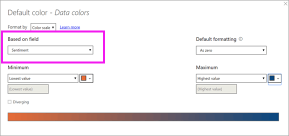
Take a look at the charts available in PowerBI. There is a free desktop download you can use. It has much, MUCH better charting/graphing options than Excel. And it is "open", allowing addons.
Take a look at this page:
https://docs.microsoft.com/en-us/power-bi/visuals/power-bi-visualization-filled-maps-choropleths
starting at "Use the Default color - Data colors screen ... " It shows a this color option that seems to fill your need.

Now the trick is to figure out how to get the color scheme into a chart that uses your numbers ...
.
Gradient Legends 2020 07 25
https://hatfullofdata.blog/power-bi-gradient-legends/
When conditional formatting is applied to a visual it is important to make sure the reader of the report understands what the different colours on the report mean. Is purple good? Is orange ok? In the July 2020 update to Power BI Microsoft introduced a new feature of Gradient Legends to help annotate the colours used in a colour scale conditional formatting.
.
Create and use filled maps (choropleth maps) in Power BI 2019 12 05
https://docs.microsoft.com/en-us/power-bi/visuals/power-bi-visualization-filled-maps-choropleths
A filled map uses shading or tinting or patterns to display how a value differs in proportion across a geography or region. Quickly display these relative differences with shading that ranges from light (less-frequent/lower) to dark (more-frequent/more).
.
.
New Version: Custom Visuals Exploration Tool 2019 05 08 Gil Raviv
https://datachant.com/2019/05/08/new-version-custom-visuals-exploration-tool/
I am happy to announce the release of a new version of the Power BI free template app Custom Visuals Exploration Tool. Download it from AppSource here.
.
- Introduction to Charticulator: Create Custom Visual – in Charticulator, ****Part 1 Jun 18, 2019 Leila Etaati
https://radacad.com/introduction-to-charticulator-create-custom-visual
https://Charticulator.com
In this post, I will show how to use Charticulator for creating a custom visual in Power BI.
Create Bespoke Chart Designs without Programming (MS Research)
Charticulator enables you to compose a wide range of visual representations.
See more examples in our gallery.
Charticulator lets you export chart designs into reusable templates including Microsoft Power BI custom visuals.
. * Load Data - After you load the data, the available columns will be shown on the left side of the page.
. * Start to Create Chart - In each chart, there is an element such as bar, image, text or a symbol (the common symbol is dot or cycle).
. * identify the dimensions like the X axis or Y axis.
.
Tutorial: Developing a Power BI custom visual 2019 03 14
https://docs.microsoft.com/en-us/power-bi/developer/custom-visual-develop-tutorial
We’re enabling developers to easily add custom visuals into Power BI for use in dashboard and reports. To help you get started, we’ve published the code for all of our visualizations to GitHub.
Along with the visualization framework, we’ve provided our test suite and tools to help the community build high-quality custom visuals for Power BI.
This tutorial shows you how to develop a Power BI custom visual named Circle Card to display a formatted measure value inside a circle. The Circle Card visual supports customization of fill color and thickness of its outline
You aren't limited to this set of visuals, custom visuals.
Developers create custom visuals using the custom visuals SDK. These visuals enable business users to see their data in a way that best fits their business. Report authors can then import the custom visual files into their reports and use them as they would any other Power BI visuals. Custom visuals are first class citizens in Power BI and can be filtered, highlighted, edited, shared, and so on.
.
Create Visual/Custom Visual for Power BI: Different Approaches – 6 ways 2019 06 16 Leila Etaati ****https://radacad.com/custom-visual-for-power-bi-different-approches
There is always a need to extend the usage of visuals in Power BI. There are multi ways to do it
. * Using Standard Panel
. * User Market Place Visuals ( Created by Partners)
. * Create Custom Visual with Java Scripts and .net
. * Create Visual Using R/ Python Scripts in Power BI Desktop
. * Create Custom Visual using R
. * Create Custom Visual Using Charticulator
.
