Dear MSN Community,
I've previously posted regarding issues (bugs) with the way the Excel Map chart feature works. I've been putting country risk charts together for a client and I'd like present the data in a map chart. I've found that sometimes it works and sometimes it doesn't requiring you to repeat the process of selecting data in order for it to finally respond. In my previous posts I had issues with getting East and North African countries to display. I eventually got them working by creating them in totally new spreadsheets and then copying/pasting the new chart into my previous spreadsheet (Thank you to Alex Chan for your help here). It seems really inconsistent and I would appreciate Micrsoft looking into this.
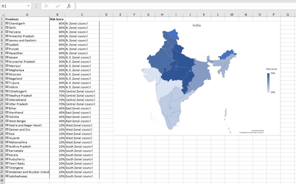
In this following example, this time with India, I'm trying to get my data label (Provinces and data %'s) to appear in white on the map chart, however, they are refusing to appear even though I clicked on all the right areas for them to do so.
Can someone please advise?
Kind regards,
JPR300

