Changing the x-axis in Excel 365 for Mac

Anonymous
2022-05-01T21:38:17+00:00

I am trying to make a simple line chart in Excel 365 for Mac. When the chart is inserted, the values for the x-axis do not seem to relate to the data. That is, a data point of 17 appears to be positioned above the value of 10 on the x-axis. I believe the values on the x-axis are the row numbers. If this is correct, I would like to change the data in the x-axis from "row numbers" to the data column containing "time" values.

I have watched several YouTube videos but what I am supposed to see when I highlight the x-axis and then select "Select Data" does not correspond to what the YouTube video shows. Has anyone experienced this?

Microsoft 365 and Office | Excel | For home | MacOS

Locked Question. This question was migrated from the Microsoft Support Community. You can vote on whether it's helpful, but you can't add comments or replies or follow the question.

0 comments No comments
{count} votes
Answer accepted by question author
  1. Anonymous
    2022-05-03T00:53:04+00:00

    I suggest you try an XY Scatter chart type instead of the Line chart type.

    To do so, select A1:C11, and choose Insert > XY (Scatter) icon dropdown > Scatter with Straight Liners and Markers (or your choice).

    The Line chart type displays the X data as equally-spaced text values.

    The Scatter chart type displays the location of each point according to the numerical values of the X and Y data.

    3 people found this answer helpful.
    0 comments No comments

3 additional answers

Sort by: Most helpful
  1. Anonymous
    2022-05-02T11:47:11+00:00

    Hi ABRXC,

    Thanks for posting in our community and I'm glad to support.

    We went through your post carefully and it seems like the concern is about editing the X-Axis in an Excel line chat. See: Change the scale of the horizontal (category) axis in a chart (microsoft.com)

    We tried to deploy a similar environment to test the issue about "a data point of 17 appears to be positioned above the value of 10 on the x-axis". However, it seems like we failed to perform a similar test . Hence, we'd like to have some screenshots from your side so we can better understand the scenario and make sure we can provide the appropriate suggestions.

    Meanwhile, may I further confirm the issue scenario about the display on your side after you click 'Select Data' for the X-Axis? Some few screenshots would be easy to understand.
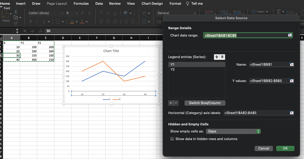
    Your understanding is highly appreciated and hope you a good day!! We will be here for you anytime to offer further support.

    Best Regards,

    Mia

    2 people found this answer helpful.
    0 comments No comments
  2. Anonymous
    2022-05-02T20:50:23+00:00

    I am trying to make the time into the x-axis and do not know how to do that.

    0 comments No comments
  3. Anonymous
    2022-05-06T17:20:23+00:00

    Thank you for the suggestion. In fact I did discover the scatter graph option and was able to graph the data

    0 comments No comments