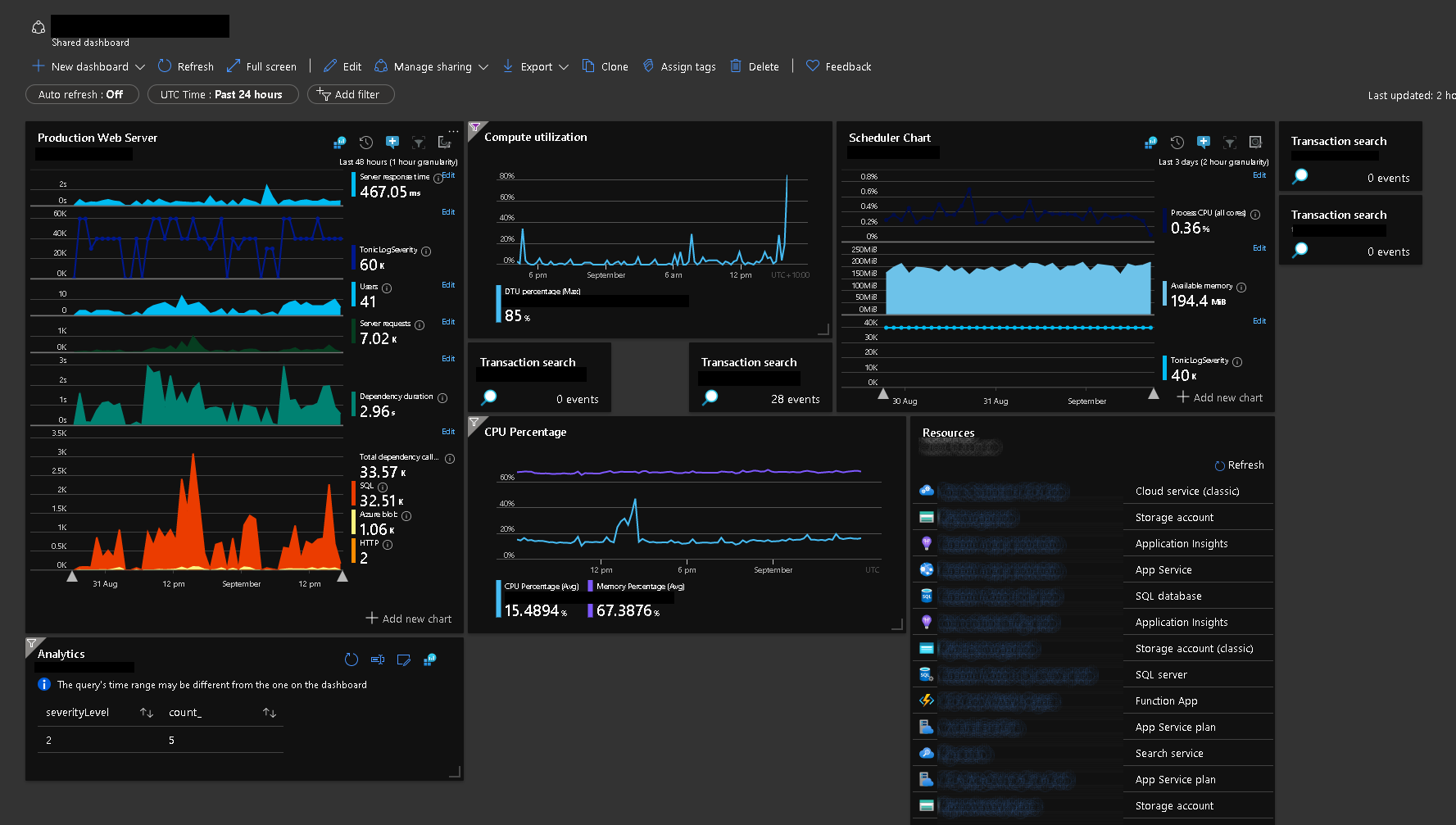
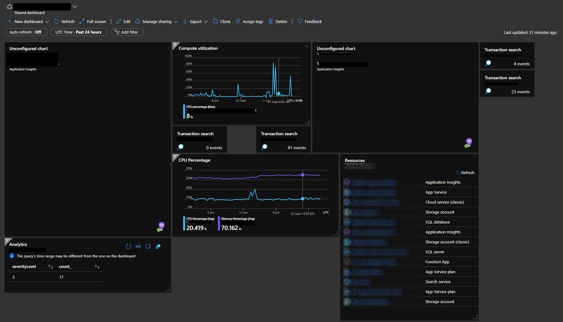
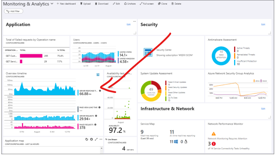
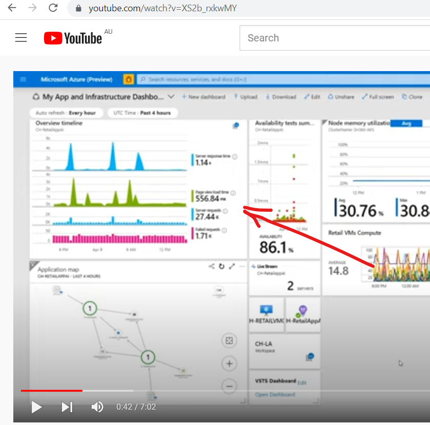
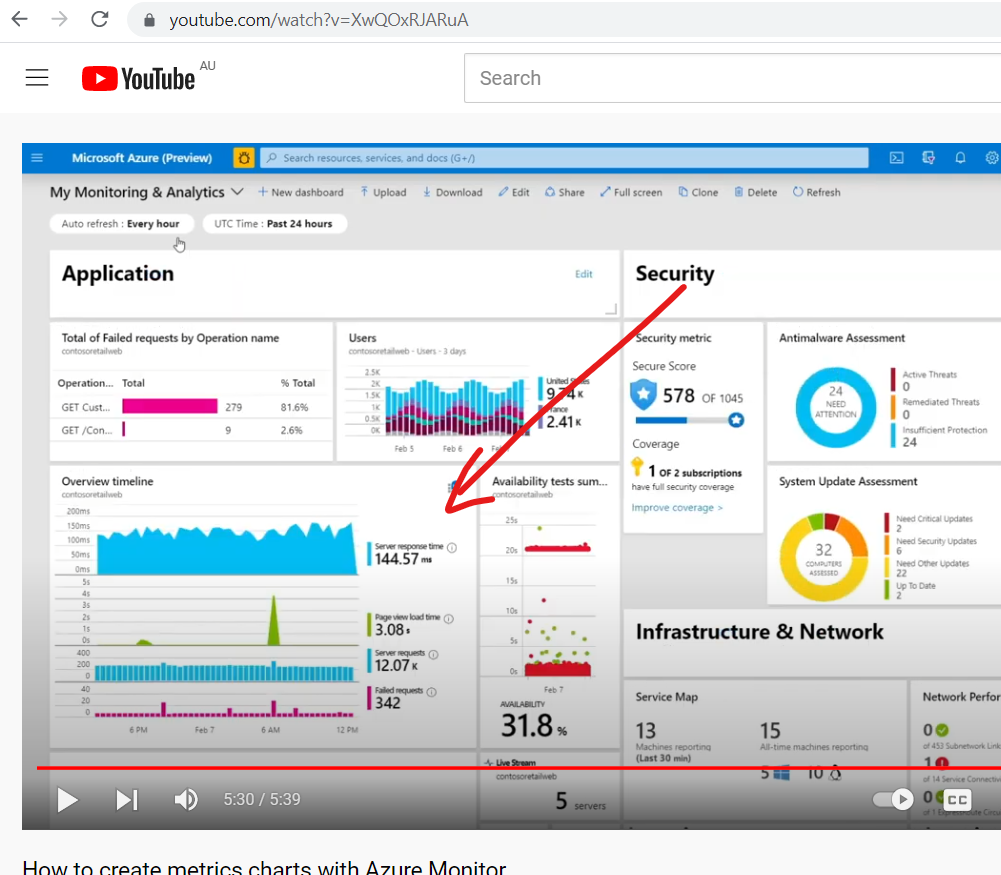
For starters... the chart depicted in the screen shot was constructed at a time when the kusto query language wasn't around. I can't remember the name of the widget, when constructing new dashboards it hasn't been available for a while, but it's continued to function on pre-existing dashboards till now. It was very simple, you dragged it on and selected what you wanted to chart and it just worked, it originally took only a few minutes to set up, there was no need to learn an entirely new complex query language. So there is no kusto query behind the blanked out charts in my screenshot. Sorry if this sounds a little narky, but I feel like I'm explaining your own product to you.
But to answer your question, yes I'm able to create a chart from Application Insights and put it on the dashboard.
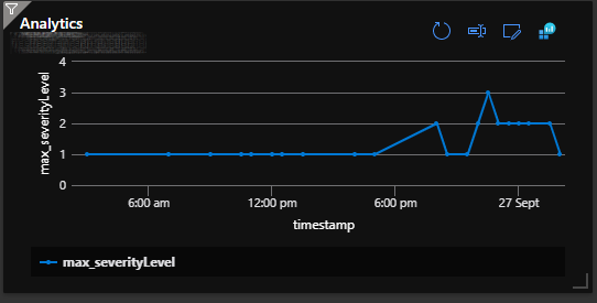
I can create 6 new widgets each with a single chart to replace the non-functional widget with 6 charts within it, the end result up taking about 2-3 times the amount of real estate on the dashboard. So yea I can recreate the charts I need, but it'll take me a lot longer than it originally did to set up (when I was a complete Azure novice) and the end result won't be any where near as good.
You have to ask yourself, where have you guys taken this thing over the last five years, when that's the end user experience. i.e. after 5 years of dev, Azure users wanting charts out of application insights have a much steeper learning curve, need to invest a lot more time to produce basic charts and it culminates in an inferior end result.
