Customize focused state appearance on tab item in Xamarin Forms app, Android implementation

Anders Gustafsson 106 Reputation points
2021-10-12T14:04:59.467+00:00

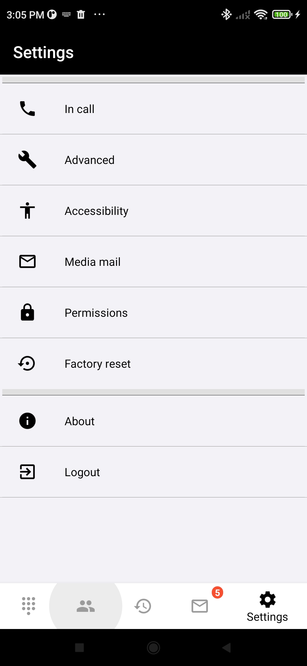
In my cross-platform Xamarin Forms app, specifically on Android, I want to be able to customize the appearance of the items in the navigation bar of the Xamarin.Forms.TabbedPage. In particular, I want to be able to change the background for focused items in the bar from a solid light grey cropped circle (see image below) to a different shape, for example a green rectangular frame (the actual shape is not important).

I know how to change the background for an item depending on state, my problem is I cannot find which style or similar I need to modify to change the background for the navigation items in TabbedPage.

Typically for the Android app project of a Xamarin Forms app, the Tabbar.axml file is contained in the Resources/Layout folder, but any change I make in this file does not seem to apply to the appearance of the navigation tab. For example, I tried to add the following line:

app:tabBackground="@drawable/background_states"  

but I could not see any indication that my change was applied.

I have also tried identifying more generally which Android style to override, but to no avail.

Can anybody give me a push in the right direction for the solution to my problem?

139884-screenshot-2021-10-12-15-05-21-103-senwisemmxtc.jpg

Developer technologies | .NET | Xamarin
0 comments No comments
{count} votes

Accepted answer
  1. Anders Gustafsson 106 Reputation points
    2021-10-15T06:58:31.147+00:00

    From the discussion in the answer from @JarvanZhang , since the tab bar is placed at the bottom of the page the bar is represented by a BottomNavigationView. I therefore need to apply the desired background style via a custom TabbedPage renderer.

    In the renderer, override OnElementChanged as follows:

    protected override void OnElementChanged(ElementChangedEventArgs<TabbedPage> e)  
    {  
        base.OnElementChanged(e);  
      
        if (e.NewElement == null) return;  
      
        // Identify first (only) bottom navigation view in collection of element children.  
        var bottomNavigationView = GetBottomNavigationView(ViewGroup);  
      
        // Apply a custom border style for the item background.  
        bottomNavigationView.ItemBackground =  
            Resources?.GetDrawable(Resource.Drawable.background_states, Context?.Theme);  
    }  
    

    where GetBottomNavigationView is a method for traversing the tree of element children and needs to be separately implemented (left out here for brevity). The drawable resource background_states is the selector used to apply different backgrounds depending on state.

    1 person found this answer helpful.
    0 comments No comments

1 additional answer

Sort by: Most helpful
  1. JarvanZhang 23,971 Reputation points
    2021-10-13T06:55:05.127+00:00

    Hello,​

    Welcome to our Microsoft Q&A platform!

    TabbedPage corresponds to ViewPager on native Android. For ViewPager, the tab bar is displayed by TabLayout. So, we can define the appearance of the tabs via TabLayout. Try to define drawables for different selected state of the tab, and create a selector to consume the drawables. Then specify the selector as the tabBackground in styles.xml.

    Here is the related code, you could refer to it.

    drawable/tab_background.xml

       <?xml version="1.0" encoding="utf-8"?>  
       <selector xmlns:android="http://schemas.android.com/apk/res/android">  
         <item android:drawable="@drawable/tab_selected_background" android:state_selected="true" />  
         
         <item android:drawable="@drawable/tab_unselected_background"   
             android:state_selected="false"   
             android:state_focused="false"   
             android:state_pressed="false" />  
         
         <item  
             android:drawable="@drawable/tab_focused_background"  
             android:state_selected="false"  
             android:state_pressed="true"/>  
       </selector>  
    

    drawable/tab_focused_background.xml

       <?xml version="1.0" encoding="utf-8" ?>  
       <shape xmlns:android="http://schemas.android.com/apk/res/android" >  
         <solid android:color="#00FF00" />  
       </shape>  
    

    styles.xml

       <?xml version="1.0" encoding="utf-8" ?>  
       <resources>  
         ...  
         <style name="Base.Widget.Design.TabLayout" parent="android:Widget">  
           <item name="tabBackground">@drawable/tab_background</item>  
         </style>  
       </resources>  
    

    Best Regards,

    Jarvan Zhang


    If the response is helpful, please click "Accept Answer" and upvote it.

    Note: Please follow the steps in our documentation to enable e-mail notifications if you want to receive the related email notification for this thread.

    1 person found this answer helpful.

Your answer

Answers can be marked as Accepted Answers by the question author, which helps users to know the answer solved the author's problem.