Not Monitored
Tag not monitored by Microsoft.
36,526 questions
This browser is no longer supported.
Upgrade to Microsoft Edge to take advantage of the latest features, security updates, and technical support.

Microsoft Technical Support
Hi, I'm Eiji Yamamoto.
What are three of the contents of the attachment?
Question (1)
How do I display only the value "-50, -100" below y-axis 0?
Question (2)
The y-axis currently shows rungs of -100, -50, 0, 50, 100, but how do I display rungs only at 0?
Question (3)
How do I display data labels that are less than 0 in red, although the number of data labels is 18, 34, -28?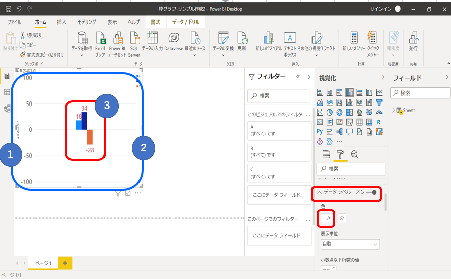
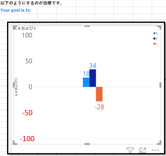
Thank you very much.

Power Bi is not currently supported here on Q&A. The product group for Power Bi actively monitors questions over at
https://community.powerbi.com/
--please don't forget to upvote and Accept as answer if the reply is helpful--
Thanky you for your message.
You're welcome.