Azure Monitor
An Azure service that is used to collect, analyze, and act on telemetry data from Azure and on-premises environments.
3,272 questions
This browser is no longer supported.
Upgrade to Microsoft Edge to take advantage of the latest features, security updates, and technical support.
I'm putting together a dashboard for my application. If I go to my SQL Server database the Overview blade has a doughnut graph of space used vs space allocated
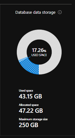
Is there a way I can recreate this graph on my dashboard?
' cx='32' cy='32' r='32' /%3E%3Ctext x='50%25' y='55%25' dominant-baseline='middle' text-anchor='middle' fill='%23FFF' %3EGM%3C/text%3E%3C/svg%3E)
Hi Phil,
Apparently, there's no "pin to dashboard" option for that visual from the Overview blade of an Azure SQL Database Resource (yet).
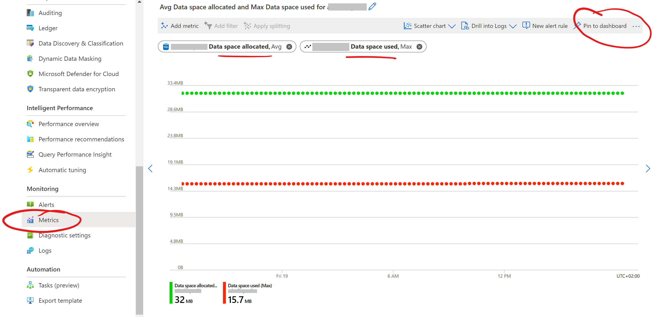
Still, in my lab, I managed to configure the below Metrics Explorer that you can easily pin to an Azure Dashboard. (is not a Pie / Doughnut chart, but should provide the info you need)
BR,
George
Hi George,
Yes, that's what I've had to do.
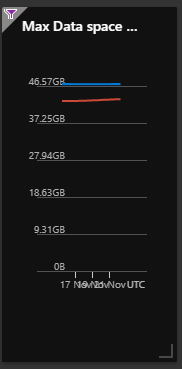
I don't think it's as neat, tbh, although I've overridden the dashboard time to show the last 7 days and it does give me an idea of the trend which the ring graph doesn't.