Microsoft 365 and Office | Development | Other
Building custom solutions that extend, automate, and integrate Microsoft 365 apps.
This browser is no longer supported.
Upgrade to Microsoft Edge to take advantage of the latest features, security updates, and technical support.
' cx='32' cy='32' r='32' /%3E%3Ctext x='50%25' y='55%25' dominant-baseline='middle' text-anchor='middle' fill='%23FFF' %3EFR%3C/text%3E%3C/svg%3E)
Hello,
I have pivot table/chart below; however, the data in the red "oval" is not displaying on the chart. My thought was to include on the chart on a secondary axis. Why would this not display?
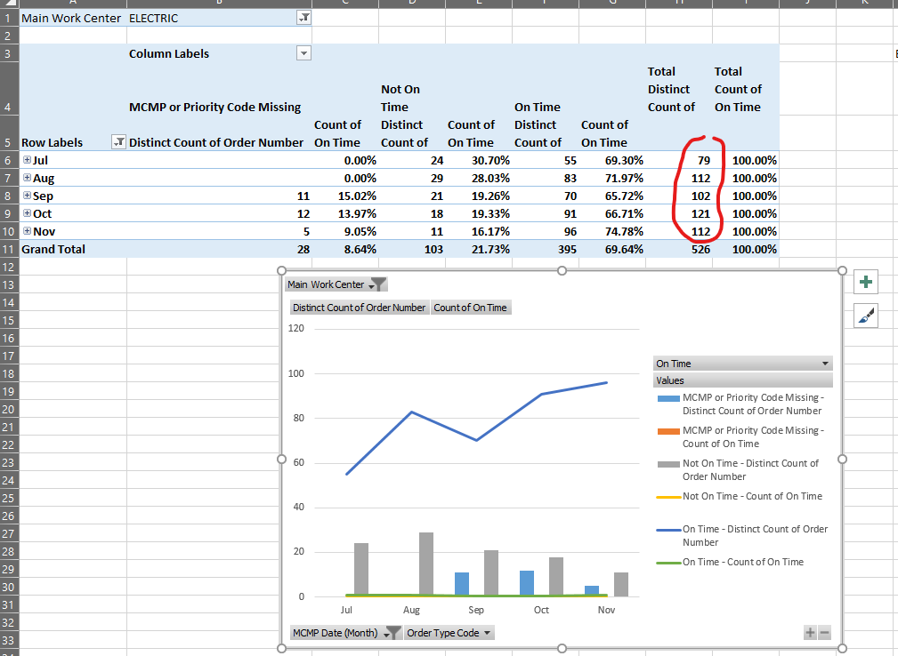
Thanks

I created a Power Pivot Table based on your another thread "Calculation of Percentages in Pivot with Distinct Count", and I could not reproduce your issue.
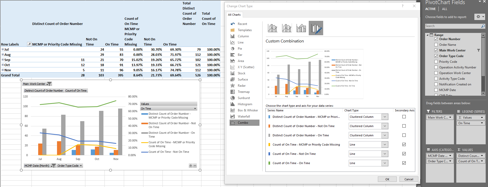
Could you pleae right-click on this chart > Change Chart Type > Combo, then please take a screenshot of your settings like following image?
Please make sure the series of your "Total Distinct Count of" is shown on this interface, and you could tick the box of "Secondary Axis".

If the answer is helpful, please click "Accept Answer" and kindly upvote it. If you have extra questions about this answer, please click "Comment".
Note: Please follow the steps in our documentation to enable e-mail notifications if you want to receive the related email notification for this thread.
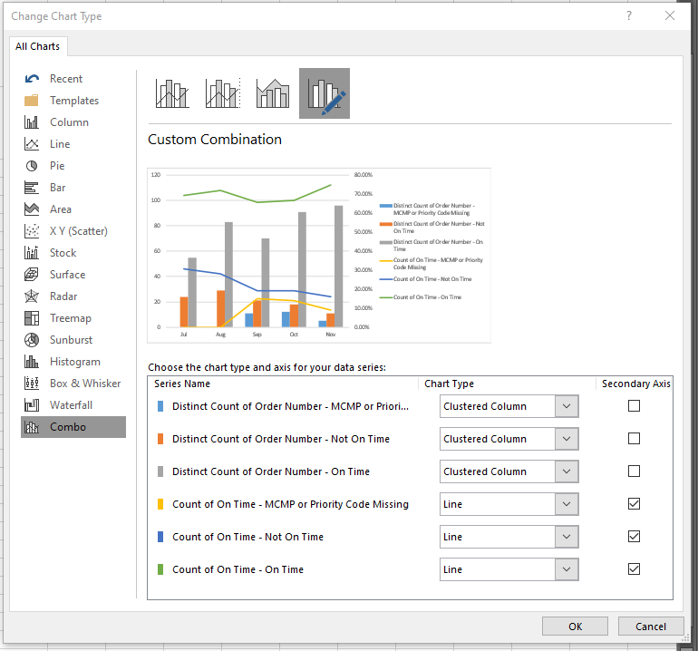
Hello @Emily Hua-MSFT
Following is the screen shot as you requested. As shown, the "Total Distinct Count of Order Number" series is not displaying in the "Choose the type and axis for your data series".
Thanks