Azure Monitor
An Azure service that is used to collect, analyze, and act on telemetry data from Azure and on-premises environments.
3,662 questions
This browser is no longer supported.
Upgrade to Microsoft Edge to take advantage of the latest features, security updates, and technical support.
' cx='32' cy='32' r='32' /%3E%3Ctext x='50%25' y='55%25' dominant-baseline='middle' text-anchor='middle' fill='%23FFF' %3EBG%3C/text%3E%3C/svg%3E)
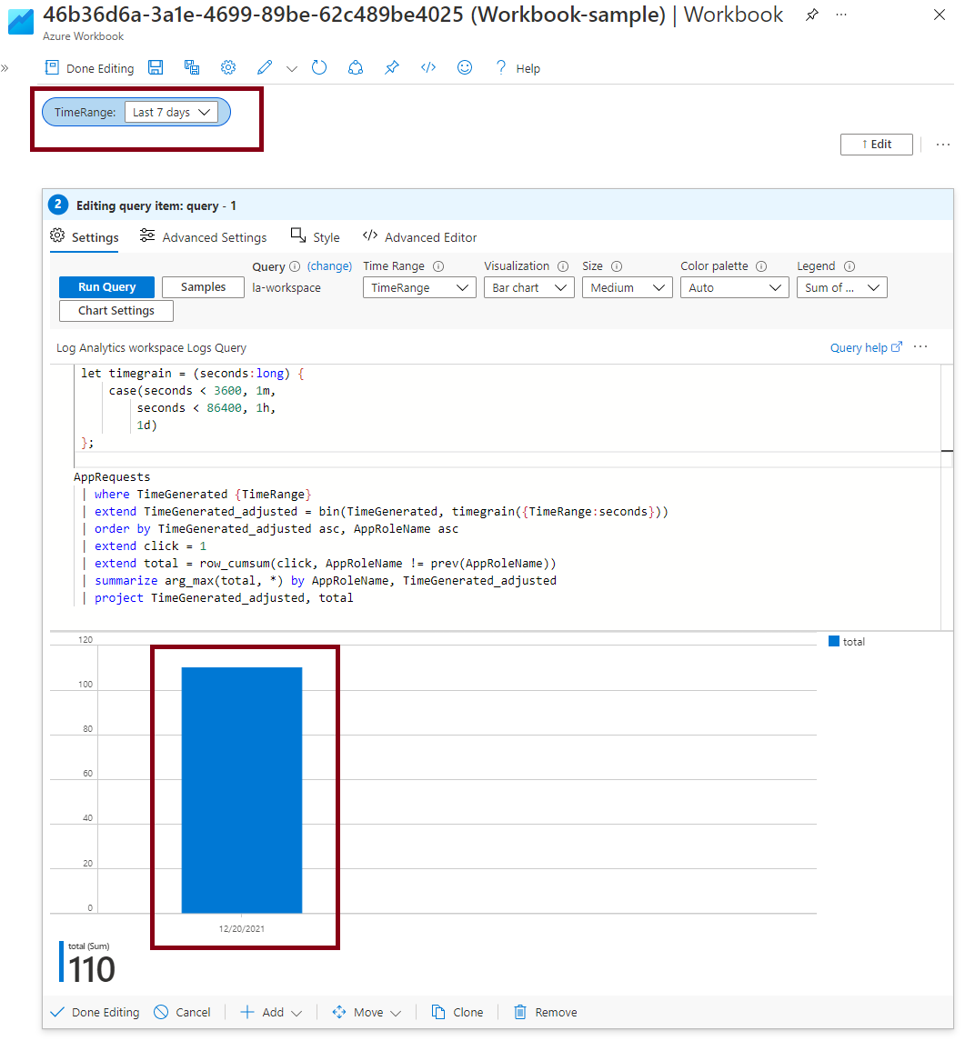
I'm implementing some queries in a workbook and I'm trying to visualize some of them as bar charts. The tables rendered are most of the time : timestamp(1d) - value. However, even though I have a value for each day, the time granularity of the chart displayed is 1h.
Is there a way to force the time granularity in a workbook or am I doing something wrong in my queries ?
Example of one of my query :
let timegrain = (seconds:long) {
    case(seconds < 3600, 1m,
        seconds < 86400, 1h,
        1d)
};

customEvents
| where timestamp {TimeRange}
| extend timestamp_adjusted = bin(timestamp, timegrain({TimeRange:seconds}))
| order by timestamp_adjusted asc, session_Id
| extend click = 1
| extend total=row_cumsum(click, session_Id != prev(session_Id))
| where name contains "go to"
| where operation_Id != prev(session_Id)
| project timestamp_adjusted, tot=total-1;
' cx='32' cy='32' r='32' /%3E%3Ctext x='50%25' y='55%25' dominant-baseline='middle' text-anchor='middle' fill='%23FFF' %3EAM%3C/text%3E%3C/svg%3E)
Welcome to Microsoft Q&A! Thanks for posting the question.
Since you are using the where timestamp {TimeRange} clause, it would bind to the parameter as defined in your workbook. Based on the sample query, this parameter is named "TimeRange". Here is a sample of how it would look like in the workbook.

Based on the user-defined function timegrain and its usage in the query above, the timegrain of the chart/output will depend on the value selected for TimeRange parameter. Can you please ensure that you are selecting the appropriate time range to get the desired result? For example,
1. For granularity of 1 hour, please select a time range < 1 day (4 hours, 12 hours etc.).
2. For granularity of 1 day, please select a range > 1 day (3 days, 7 days etc.).
The below screenshot contains a sample query (somewhat similar to one provided in the question) and shows the impact of different TimeRange value.

Time Range > 1 day
Quick tip: * * For the chart's x-axis legend to show date, please select the **"Chart Setting"* and select "Custom formatting" check box (without making any other changes). Otherwise, the time offset from UTC gets shown as default.
Please let me know if you have any questions.
Please 'Accept as answer' and ‘Upvote’ if it helped so that it can help others in the community looking for help on similar topics.
Thanks for taking the time to answer my question.
I checked that the correct Time Range is selected and I have the same kind of graph that you have (thanks for the tip on the date formatting by the way).
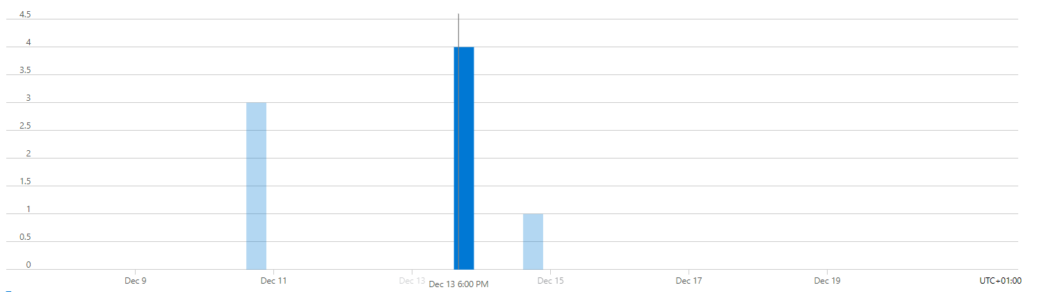
However, it doesn't really fix my issue. I think my original post wasn't so clear so I will try to go into details. The fact is that, for a given value which is supposed to be associated with a day I have this behavior when I hover the graph.
For exemple :


See how, for a same value, it crosses several days and the granularity is still 1h despite the fact that I have a value for each day as said in the original post.
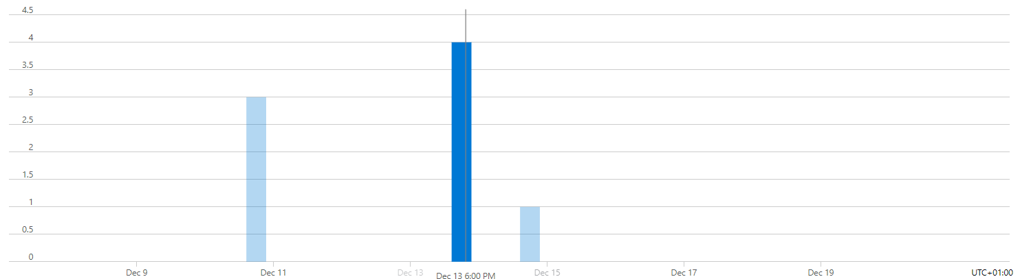
In contrary to the metrics, who properly show the same date for a given value.
For exemple :
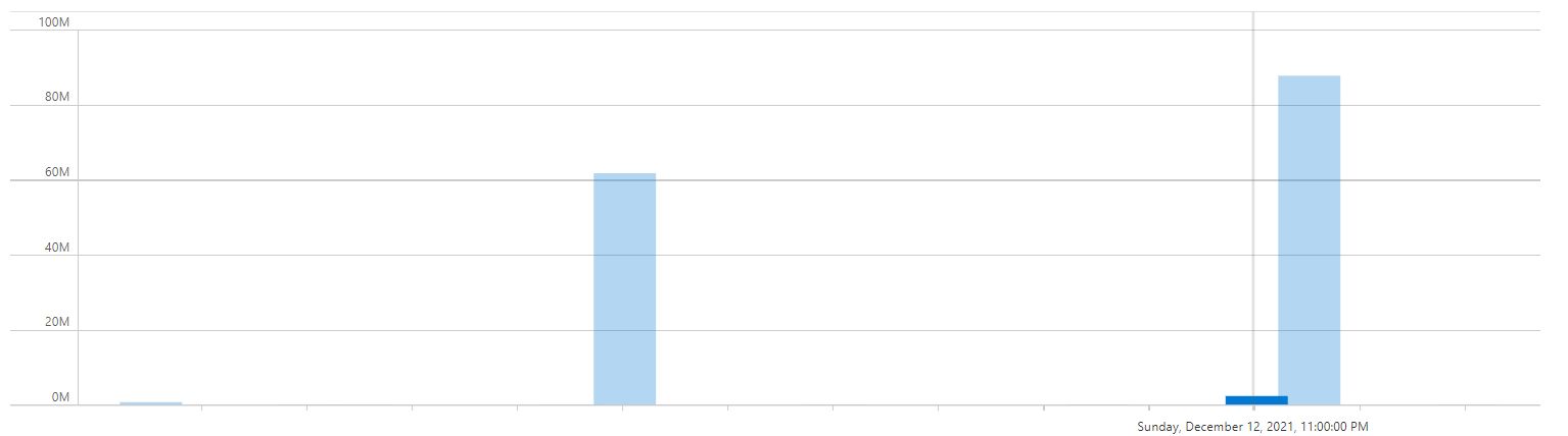
And I don't know if this is linked by any means with this time scale issue but some of the graphs value overlap.
For exemple :
That's why I was wondering if I did something wrong or if there is a way to force the granularity (in the chart settings for exemple) or maybe it's a bug.
As a last resort, I was thinking about converting the date to string to build the graph.
I thank you in advance for your help.
@Baptiste GREAUD , thank you for the reply.
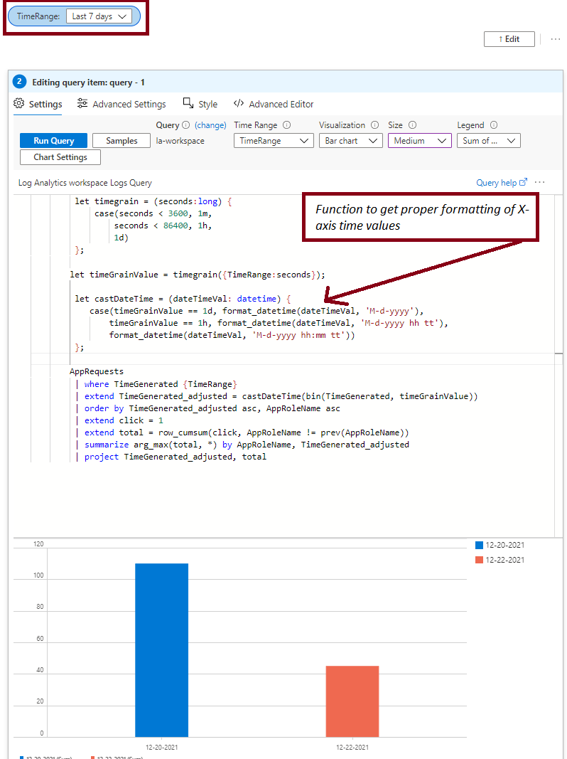
I researched your requirement and here are my findings - the x-axis (time) is behaving as you have demonstrated, when hovering the cursor over the bar, as a continuous series (which disregards the width of the bar.). One of the feasible ways that I came across - was to format the values in X-axis as per the requirement (depending on how you are aggregating the data points - daily, hourly or every minute), so that it becomes a discrete series instead of being treated a continuous one. This is like your suggestion of converting the datetime to string which also solves the issue of X-axis not showing relevant time/date or both. The screenshot below should help explain:
----
I hope this helps you for your requirement. Please let me know if you have any questions.
Please 'Accept as answer' if it helped so that it can help others in the community looking for help on similar topics.