' cx='32' cy='32' r='32' /%3E%3Ctext x='50%25' y='55%25' dominant-baseline='middle' text-anchor='middle' fill='%23FFF' %3ED2%3C/text%3E%3C/svg%3E)

3,034 questions
' cx='32' cy='32' r='32' /%3E%3Ctext x='50%25' y='55%25' dominant-baseline='middle' text-anchor='middle' fill='%23FFF' %3EA%3C/text%3E%3C/svg%3E)
Hello,
Welcome to Microsoft Q&A!
First of all, @Castorix31 has posted a document about XAML style which exactly explains how the style works and effect the control.
To be more specific for your issue, the reason for this behavior is that when your pointer moves over the Button, it triggers the PointerOver state of the Button which will change the background or foreground. And it's same when you pressed it, the Button will trigger Pressed state.
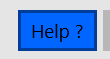
If you want to keep the Button always shows the same look in all visual states, you will need to change the style of the Button.
Here are the steps that you could follow:
- You need to get button style first. Open the Document Outline Window in your VS and find the target button control. Right-click on the button, go to Edit Template -> Edit a copy. Then the VS will create a default style of the button automatically.
- Find the
PointerOver,Pressed,DisabledVisualStates in the added style, and remove these Visual States.
The code looks like this:
    <Page.Resources>
        <Style x:Key="ButtonStyle1" TargetType="Button">
            <Setter Property="Background" Value="{ThemeResource ButtonBackground}"/>
            <Setter Property="BackgroundSizing" Value="OuterBorderEdge"/>
            <Setter Property="Foreground" Value="{ThemeResource ButtonForeground}"/>
            <Setter Property="BorderBrush" Value="{ThemeResource ButtonBorderBrush}"/>
            <Setter Property="BorderThickness" Value="{ThemeResource ButtonBorderThemeThickness}"/>
            <Setter Property="Padding" Value="{StaticResource ButtonPadding}"/>
            <Setter Property="HorizontalAlignment" Value="Left"/>
            <Setter Property="VerticalAlignment" Value="Center"/>
            <Setter Property="FontFamily" Value="{ThemeResource ContentControlThemeFontFamily}"/>
            <Setter Property="FontWeight" Value="Normal"/>
            <Setter Property="FontSize" Value="{ThemeResource ControlContentThemeFontSize}"/>
            <Setter Property="UseSystemFocusVisuals" Value="{StaticResource UseSystemFocusVisuals}"/>
            <Setter Property="FocusVisualMargin" Value="-3"/>
            <Setter Property="Template">
                <Setter.Value>
                    <ControlTemplate TargetType="Button">
                        <ContentPresenter x:Name="ContentPresenter" AutomationProperties.AccessibilityView="Raw" Background="{TemplateBinding Background}" BackgroundSizing="{TemplateBinding BackgroundSizing}" BorderBrush="{TemplateBinding BorderBrush}" BorderThickness="{TemplateBinding BorderThickness}" ContentTemplate="{TemplateBinding ContentTemplate}" CornerRadius="{TemplateBinding CornerRadius}" Content="{TemplateBinding Content}" ContentTransitions="{TemplateBinding ContentTransitions}" HorizontalContentAlignment="{TemplateBinding HorizontalContentAlignment}" Padding="{TemplateBinding Padding}" VerticalContentAlignment="{TemplateBinding VerticalContentAlignment}">
                            <VisualStateManager.VisualStateGroups>
                                <VisualStateGroup x:Name="CommonStates">
                                    <VisualState x:Name="Normal">
                                        <Storyboard>
                                            <PointerUpThemeAnimation Storyboard.TargetName="ContentPresenter"/>
                                        </Storyboard>
                                    </VisualState>
                                    <VisualState x:Name="PointerOver">
                                      <!--code has been removed-->
                                    </VisualState>
                                    <VisualState x:Name="Pressed">
                                       <!--code has been removed-->
                                    </VisualState>
                                    <VisualState x:Name="Disabled">
                                   <!--code has been removed-->
                                    </VisualState>
                                </VisualStateGroup>
                            </VisualStateManager.VisualStateGroups>
                        </ContentPresenter>
                    </ControlTemplate>
                </Setter.Value>
            </Setter>
        </Style>
    </Page.Resources>
And please make sure that you've used the style for the target button.
<Button Style="{StaticResource ButtonStyle1}" />
Now the button won't change its look in all Visual States.
Thank you.
If the answer is the right solution, please click "Accept Answer" and kindly upvote it. If you have extra questions about this answer, please click "Comment".
Note: Please follow the steps in our documentation to enable e-mail notifications if you want to receive the related email notification for this thread.