' cx='32' cy='32' r='32' /%3E%3Ctext x='50%25' y='55%25' dominant-baseline='middle' text-anchor='middle' fill='%23FFF' %3EBB%3C/text%3E%3C/svg%3E)
2,855 questions
' cx='32' cy='32' r='32' /%3E%3Ctext x='50%25' y='55%25' dominant-baseline='middle' text-anchor='middle' fill='%23FFF' %3EHL%3C/text%3E%3C/svg%3E)
I made the following modifications to your code:
1.Add ControlTemplate.Triggers to change the background color of the selected TabItem.
2.Bind the width and height of the Border to the ActualWidth and Actual height of the Grid so that the TabControl fits the window. The Margin of the TabControl is reset to 0.
    <TabControl HorizontalAlignment="Center" HorizontalContentAlignment="Stretch"              **Margin="0,0,0,0"**
                              Name="tabControl1" VerticalAlignment="Top" >
                    <TabItem Header="Dashboard" Name="tabItem1" Background="{DynamicResource Blueish}" Foreground="White"
                               HorizontalContentAlignment="Center" VerticalAlignment="Stretch" Width="180" HorizontalAlignment="Center"
                               FontFamily="Leelawadee UI" FontSize="20" Margin="0,0,0,0" Padding="0,0,0,0">
                        <Border Background="#5252ff" Margin="0,0,0,0" Padding="0,0,0,0" HorizontalAlignment="Center"  VerticalAlignment="Stretch"
 Width="{Binding ElementName=grid,Path=ActualWidth}" Height="{Binding ElementName=grid, Path=ActualHeight}">
3.Centering the TabItem title requires the TabPanel to be centered in the style of the TabControl.
<TabPanel Grid.Row="0" IsItemsHost="true" HorizontalAlignment="Center"/>
4.The background of the border in the TabItem template must be non-empty. Otherwise the border is invisible for mouse interaction. Transparent can also be.
<Border Background="Transparent" >
5.You could create any shape by Path . You can update the Grid in the TabItem template as follows.
<Grid x:Name="g">
                                    <Path  Fill="{TemplateBinding Background}" Margin="0,0,0,-1"
                                               Data="M 20,40 L 0,40 0,40 C 4,40 10,36 10,30 L 10,10 C 10,0 16,0 20,0 L 155,0  C 165,0 173,0 ,175,6 L175,30 C 175,30 175,38 182,40 Z" />
                                </Grid>
Then modify the Margin of TabItem to make them closer.
   <TabItem Header="Invoicing" Name="tabItem2"  Background="{DynamicResource Greenish}" Foreground="White"
                               HorizontalContentAlignment="Center" VerticalAlignment="Stretch" Width="180" HorizontalAlignment="Center"
                               FontFamily="Leelawadee UI" FontSize="20" Margin="-25,0,0,0" Padding="0,0,0,0">
MainWindow.xaml:
<Window.Resources>
        <SolidColorBrush x:Key="PrimaryBG" Color="#ad00ad"/>
        <SolidColorBrush x:Key="Blueish" Color="#5252ff"/>
        <SolidColorBrush x:Key="Greenish" Color="#005757"/>
        <SolidColorBrush x:Key="Blackish" Color="#2e2e00"/>
        <Style x:Key="{x:Type TabControl}" TargetType="{x:Type TabControl}">
            <Setter Property="BorderThickness" Value="0"/>
            <Setter Property="BorderBrush" Value="Transparent"/>
            <Setter Property="Background" Value="Transparent"/>
            <Setter Property="Template">
                <Setter.Value>
                    <ControlTemplate TargetType="TabControl">
                        <Grid>
                            <Grid.RowDefinitions>
                                <RowDefinition Height="Auto"/>
                                <RowDefinition Height="*"/>
                            </Grid.RowDefinitions>
                            <Border BorderThickness="0,0,1,1" BorderBrush="#D0CEBF" Grid.Row="1">
                                <Border BorderThickness="{TemplateBinding BorderThickness}"
                                          BorderBrush="{TemplateBinding BorderBrush}">
                                    <Border Background="{TemplateBinding Background}">
                                        <ContentPresenter ContentSource="SelectedContent"/>
                                    </Border>
                                </Border>
                            </Border>
                            <TabPanel Grid.Row="0" IsItemsHost="true" HorizontalAlignment="Center"/>
                        </Grid>
                    </ControlTemplate>
                </Setter.Value>
            </Setter>
        </Style>
        <Style TargetType="TabItem">
            <Setter Property="BorderThickness" Value="0"/>
            <Setter Property="BorderBrush" Value="Transparent"/>
            <Setter Property="Background" Value="Transparent"/>
            <Setter Property="VerticalContentAlignment" Value="Center"/>
            <Setter Property="HorizontalContentAlignment" Value="Center"/>
            <Setter Property="Template">
                <Setter.Value>
                    <ControlTemplate TargetType="{x:Type TabItem}">
                        <!--In order to click on the blank part of the TabItem can be successfully selected-->
                        <Border Background="Transparent" >
                            <Grid>
                                <Grid x:Name="g">
                                    <Path  Fill="{TemplateBinding Background}" Margin="0,0,0,-1"
                                               Data="M 20,40 L 0,40 0,40 C 4,40 10,36 10,30 L 10,10 C 10,0 16,0 20,0 L 155,0  C 165,0 173,0 ,175,6 L175,30 C 175,30 175,38 182,40 Z" />
                                </Grid>
                                <Border  BorderThickness="{TemplateBinding BorderThickness}"
                                          Padding="{TemplateBinding Padding}">
                                    <ContentPresenter ContentSource="Header"
                                          HorizontalAlignment="{TemplateBinding HorizontalContentAlignment}"
                                          VerticalAlignment="{TemplateBinding VerticalContentAlignment}"/>
                                </Border>
                            </Grid>
                        </Border>
                        <!--Add ControlTemplate.Triggers to change the background color of the selected TabItem.-->
                        <ControlTemplate.Triggers>
                            <Trigger Property="IsSelected" Value="false">
                                <Setter Property="Visibility" TargetName="g" Value="Hidden"/>
                            </Trigger>
                        </ControlTemplate.Triggers>
                    </ControlTemplate>
                </Setter.Value>
            </Setter>
        </Style>
    </Window.Resources>
    <Grid Background="{DynamicResource PrimaryBG}" Name="grid" >
        <TabControl HorizontalAlignment="Center" HorizontalContentAlignment="Stretch"  Margin="0,0,0,0"
                      Name="tabControl1" VerticalAlignment="Top" >
            <TabItem Header="Dashboard" Name="tabItem1" Background="{DynamicResource Blueish}" Foreground="White"
                       HorizontalContentAlignment="Center" VerticalAlignment="Stretch" Width="180" HorizontalAlignment="Center"
                       FontFamily="Leelawadee UI" FontSize="20" Margin="0,0,0,0" Padding="0,0,0,0">
                <Border Background="#5252ff" Margin="0,0,0,0" Padding="0,0,0,0" HorizontalAlignment="Center"  VerticalAlignment="Stretch" Width="{Binding ElementName=grid,Path=ActualWidth}" Height="{Binding ElementName=grid, Path=ActualHeight}">
                    <StackPanel Margin="10">
                        <TextBox Width="200" Height="25"/>
                        <TextBox Width="200" Height="25"/>
                    </StackPanel>
                </Border>
            </TabItem>
            <TabItem Header="Invoicing" Name="tabItem2"  Background="{DynamicResource Greenish}" Foreground="White"
                       HorizontalContentAlignment="Center" VerticalAlignment="Stretch" Width="180" HorizontalAlignment="Center"
                       FontFamily="Leelawadee UI" FontSize="20" Margin="-25,0,0,0" Padding="0,0,0,0">
                <Border Background="#005757" Margin="0,0,0,0" Padding="0,0,0,0" HorizontalAlignment="Center" VerticalAlignment="Stretch" Width="{Binding ElementName=grid,Path=ActualWidth}"  Height="{Binding ElementName=grid, Path=ActualHeight}" >
                    <Button Width="80" Height="25"/>
                </Border>
            </TabItem>
            <TabItem Header="Transactions" Name="tabItem3" Background="{DynamicResource Blackish}" Foreground="White"
                       HorizontalContentAlignment="Center" VerticalAlignment="Stretch" Width="180" HorizontalAlignment="Center"
                       FontFamily="Leelawadee UI" FontSize="20" Margin="-45,0,0,0" Padding="0,0,0,0" >
                <Border Background="#2e2e00" Margin="0,0,0,0" Padding="0,0,0,0" HorizontalAlignment="Center" VerticalAlignment="Stretch" Width="{Binding ElementName=grid,Path=ActualWidth}" Height="{Binding ElementName=grid, Path=ActualHeight}" >
                    <ComboBox Width="300" Height="25"/>
                </Border>
            </TabItem>
        </TabControl>

    </Grid>
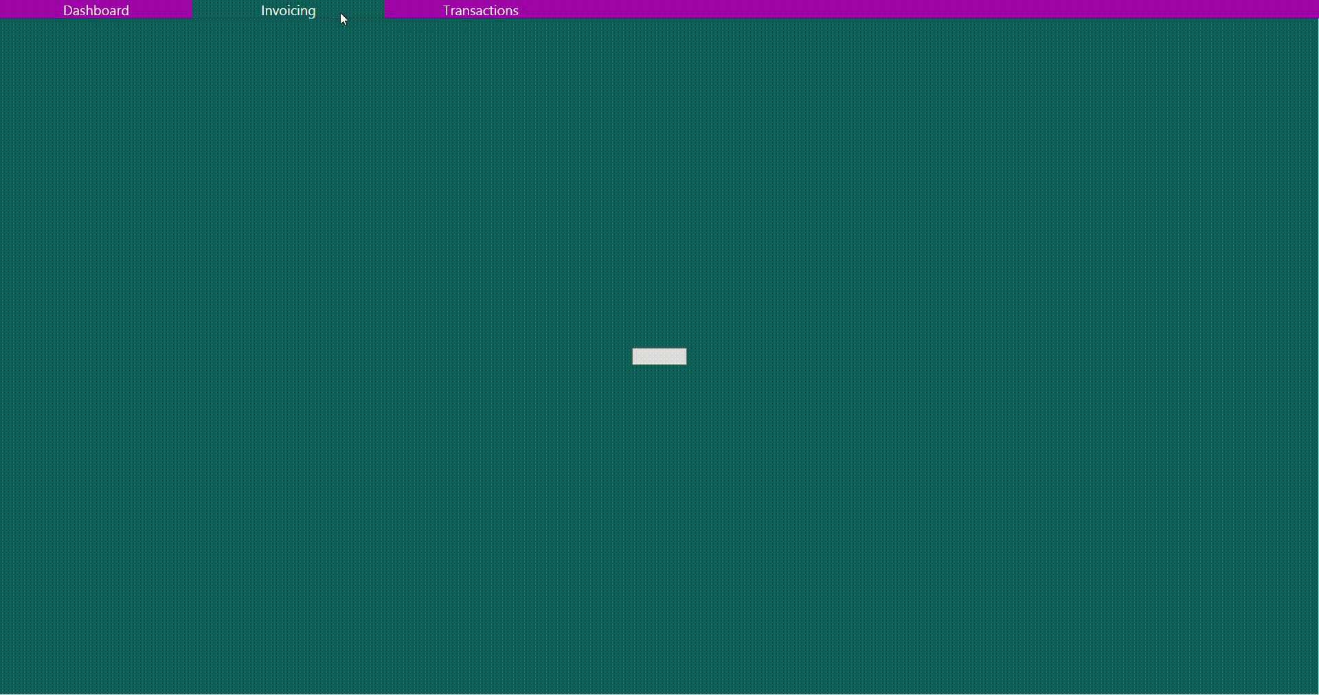
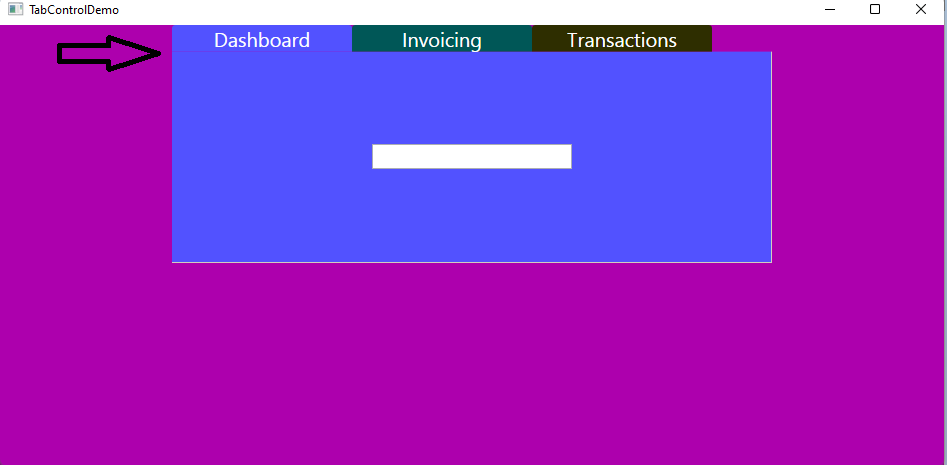
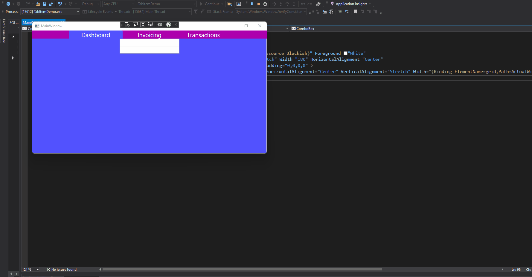
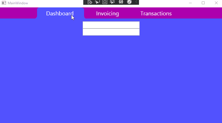
The result:
If the response is helpful, please click "Accept Answer" and upvote it.
Note: Please follow the steps in our documentation to enable e-mail notifications if you want to receive the related email notification for this thread.