Developer technologies | ASP.NET | ASP.NET Core
A set of technologies in the .NET Framework for building web applications and XML web services.
This browser is no longer supported.
Upgrade to Microsoft Edge to take advantage of the latest features, security updates, and technical support.
' cx='32' cy='32' r='32' /%3E%3Ctext x='50%25' y='55%25' dominant-baseline='middle' text-anchor='middle' fill='%23FFF' %3EK%3C/text%3E%3C/svg%3E)
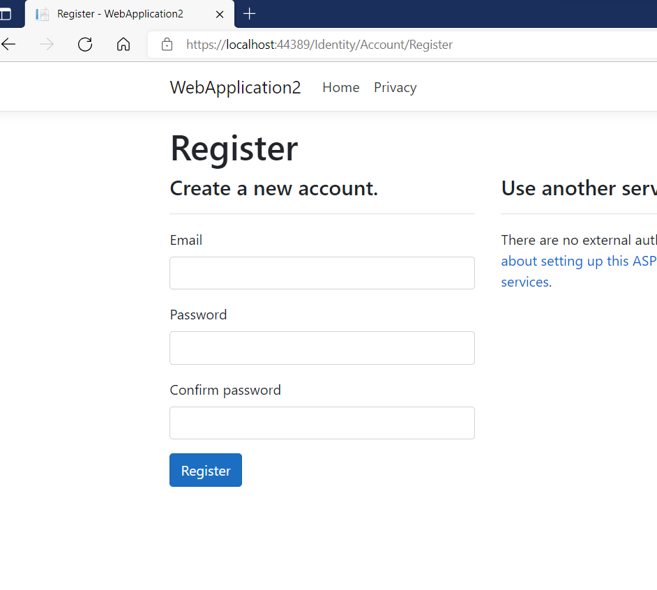
Using VS 2022 created a new project using ASP.NET Core MVC App including the individual account authentication with .NET 6.0 . When I run the application from VS and click on the login/register button the styles look to be broken. There is no gap between the text fields. . Can you please fix this. I tried the same VS 2019 and .NET 5.0 and it looks good. Please see attached screen shots below. The first one is VS 2022 and the second one is VS 2019
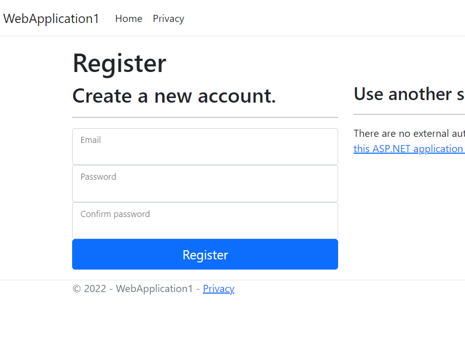
The styles are not broken. The new MVC template is used Bootstrap 5.1. The previous MVC template uses bootstrap 4.3.1.
Definitely the new template doesn't look nice when compared to the previous version, so bootstrap 5.x is causing some issue here.
' cx='32' cy='32' r='32' /%3E%3Ctext x='50%25' y='55%25' dominant-baseline='middle' text-anchor='middle' fill='%23FFF' %3EBS%3C/text%3E%3C/svg%3E)
while it uses bootstrap 5, it is not bootstrap 5, but rather the razor html was also changed to get the more modern look in the latest version of identity. You can scaffold a new login page and restyle.
Yep, looked at the github history for the register page, the class on the div was changed from form-group to form-floating. When I did a scaffold of the register page and put the old style back to from-group it works as expected.