SQL Server Reporting Services
A SQL Server technology that supports the creation, management, and delivery of both traditional, paper-oriented reports and interactive, web-based reports.
3,061 questions
This browser is no longer supported.
Upgrade to Microsoft Edge to take advantage of the latest features, security updates, and technical support.
' cx='32' cy='32' r='32' /%3E%3Ctext x='50%25' y='55%25' dominant-baseline='middle' text-anchor='middle' fill='%23FFF' %3ES%3C/text%3E%3C/svg%3E)
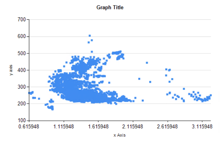
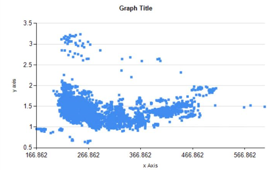
I've created a scatter graph and the y axis seems to format well. I'd like the x axis to be formatted like the right axis.. How would that be done? Visual Studio 2012 Shell integrated is being to review axis properties,and the setup of the y axis seems to match that of the x axis (except the x axis has the scalar radio button option selected in Horizontal Axis properties/Axis options, where that option is not a selection for the y axis).
The below data switches x and y axis values. It is seen the y axis shows a nicely chosen range, but the x axis is not as desired.

Hi @SWil ,
Do you mean axis spacing and axis labels for the Y axis?
Before you format axis labels, you should understand how the chart calculates axis label intervals. This will enable you to set the properties necessary to achieve the axis labeling behavior that you want. See more: How the Chart Calculates Axis Label Intervals.
Best Regards,
Joy
If the answer is the right solution, please click "Accept Answer" and kindly upvote it. If you have extra questions about this answer, please click "Comment".
Note: Please follow the steps in our documentation to enable e-mail notifications if you want to receive the related email notification for this thread.