Microsoft 365 and Office | Excel | For business | Windows
A family of Microsoft spreadsheet software with tools for analyzing, charting, and communicating data
This browser is no longer supported.
Upgrade to Microsoft Edge to take advantage of the latest features, security updates, and technical support.

Hi,
I've seen other similar questions, but have not seen a response that works for me. I created a pivot chart from a pivot table.
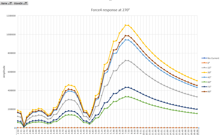
I also created a "regular" scatter-plot chart from a pivot table (before I learned about pivot charts.)

I would like the pivot chart's x-axis to have a similar format to the "regular" chart with equally spaced - by value, not unit - within a given range with editable bounds. The circles will still denote the plot points, but the distance between 2.5 and 3.5 should be equal to the distance between 4.5 and 5.5. The labels should be whole numbers.
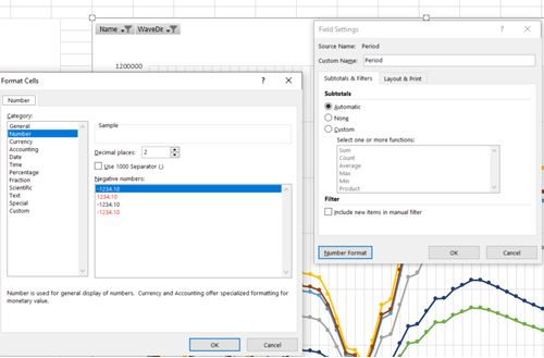
How can I make this happen (preferably using small steps accompanied by pictures?) Here are the format settings for the data set, and changing it to "sum" produces no change to the chart:
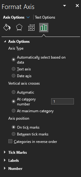
The format axis feature does not give the same choices as that for the scatter plot (with bounds and distribution). I've played with various settings without success.
Thanks, in advance, for your help!

Hi, @modland
I'm working on it and will reply when there is progress.
Hi, @modland
After my tests, I can't achieve your purpose.
Because the horizontal axis of a scatter chart is always a value axis, it can display numeric values or date values (such as days or hours) that are represented as numerical values. To display the numeric values along the horizontal axis with greater flexibility, you can change the scaling options on this axis the same way that you can change the scaling options of a vertical axis.
Because the horizontal axis of a line chart is a category axis, it can be only a text axis or a date axis. A text axis displays text only (non-numerical data or numerical categories that are not values) at evenly spaced intervals. A date axis displays dates in chronological order at specific intervals or base units, such as the number of days, months, or years, even if the dates on the worksheet are not in order or in the same base units.
The scaling options of a category axis are limited compared with the scaling options of a value axis.
For details, please refer to this link: present-your-data-in-a-scatter-chart-or-a-line-chart
If the response is helpful, please click "Accept Answer" and upvote it.
Note: Please follow the steps in our documentation to enable e-mail notifications if you want to receive the related email notification for this thread.
Hi @Ceasar Chen_MSFT ! Thanks for answering.
I've seen the distinction between scatter and line plots, but I want to use the functionality of the pivot table. If I create a regular scatter diagram and add the data, when I change the filters the diagram disappears. It only works with the first option or all options chosen.
However, because the x-axis reads as labels, instead of numbers, regardless of the formatting in either Power Query or Excel, when a pivot table is made into the chart, Excel will not "allow" me to choose a scatter diagram for the pivot chart. There must be a way to either "force" a scatter diagram as a pivot chart option or "trick" the line diagram to recognize numbers.
I see I'm not the only person who struggles with this. And I haven't found an acceptable solution other than just moving the data to Python or MatLab, which are not as easy to use as Power Query and Excel.
Any solutions? Except for this issue, Excel would work for my needs. This seems to be the last step, and I've already invested so much time learning how to make this work so far.
Thanks again!
' cx='32' cy='32' r='32' /%3E%3Ctext x='50%25' y='55%25' dominant-baseline='middle' text-anchor='middle' fill='%23FFF' %3EHS%3C/text%3E%3C/svg%3E)
Excel 365 Pro Plus with Power Pivot and Power Query.
Plot an equivalent X Y Scatter Chart when using Power Pivot.
A workaround to be used in extraordinary circumstances.
https://www.mediafire.com/file/3tf9phkyujo8q6l/03_27_22.xlsx/file
https://www.mediafire.com/file/yq25mll0k9mey4n/03_27_22.pdf/file