Universal Windows Platform (UWP)
A Microsoft platform for building and publishing apps for Windows desktop devices.
2,959 questions
This browser is no longer supported.
Upgrade to Microsoft Edge to take advantage of the latest features, security updates, and technical support.
' cx='32' cy='32' r='32' /%3E%3Ctext x='50%25' y='55%25' dominant-baseline='middle' text-anchor='middle' fill='%23FFF' %3EG%3C/text%3E%3C/svg%3E)
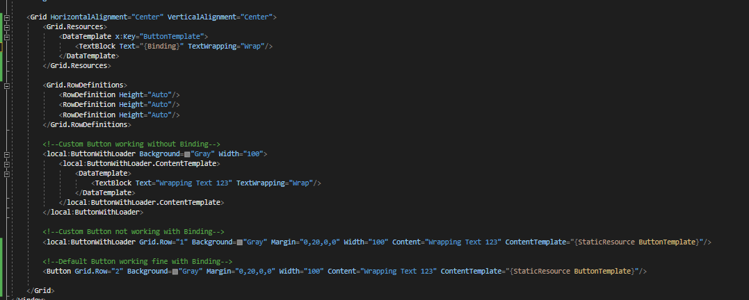
I have tried to override the default Button as ButtonWithLoader. Everything is working fine except a specific case that {Binding} is not working in ContentTemplate.

Please refer to the link below for the complete source code of the above custom control.
' cx='32' cy='32' r='32' /%3E%3Ctext x='50%25' y='55%25' dominant-baseline='middle' text-anchor='middle' fill='%23FFF' %3ERL%3C/text%3E%3C/svg%3E)
Hello,
Welcome to Microsoft Q&A!
The issue is that when you are using binding in the TextBlock, the TextBlock can't find the datacontext for itself. So the binding is actually invalid. You need to explicitly set the binding path and the source for the TextBlock. So you need to give the local:ButtonWithLoader a name and set the path in your code.
Like this:
   <!--Custom Button not working with Binding-->
        <local:ButtonWithLoader x:Name="Myloader" Grid.Row="1" Background="Gray" Margin="0,20,0,0" Width="100" Content="Wrapping Text 123">
            <local:ButtonWithLoader.ContentTemplate>
                <DataTemplate>
                    <TextBlock Text="{Binding Path=Content,ElementName=Myloader}" TextWrapping="Wrap"/>
                </DataTemplate>
            </local:ButtonWithLoader.ContentTemplate>
        </local:ButtonWithLoader>
I've noticed that you've asked the same question on StackOverflow. I'll give an answer there as well.
Update:
I checked your custom style and dig it a little bit, I found that you've already defined the Content property in the style instead of the ContentTemplate property. You added a ProgressRing control in it. I think you want to create a button that could show text and the ProgressRing at the same time, right?
But the code you are using now is trying to assign another DataTemplate to the ContentTemplate property. This will override the content of the Button. The custom grid that you put in the custom style will be covered by the DataTemplate. No matter whether the binding work or not, the ProgressRing won't show. I guess this is not the behavior that you want to get.
If you just want to set string data for the custom Button, Then you should just use the content property instead of adding another DataTemplate which contains just a TextBlock with binding.
  <local:ButtonWithLoader x:Name="Myloader2" Grid.Row="1" IsLoading="True" Background="Gray" Margin="0,20,0,0" Width="100" Content="{Binding text}">

        </local:ButtonWithLoader>
If you have other requirements for the custom button, you should move the custom part of the ContentPresenter.Content of the style, and put them into the ContentTemplate. Like:
 <Grid.Resources>
            <DataTemplate x:Key="ButtonTemplate" >
                <Grid Margin="0,0,-28,0" Padding="{Binding ContentPadding}">
                    <Grid.ColumnDefinitions>
                        <ColumnDefinition Width="Auto" />
                        <ColumnDefinition Width="Auto" />
                    </Grid.ColumnDefinitions>
                    <ContentPresenter x:Name="ButtonContent" Content="{Binding Content,RelativeSource= {RelativeSource Mode=TemplatedParent}}">
                        <ContentPresenter.RenderTransform>
                            <CompositeTransform />
                        </ContentPresenter.RenderTransform>
                    </ContentPresenter>
                    <ProgressRing Margin="10,0,0,0" x:Name="ButtonLoading"
                                  Grid.Column="1"
                                  IsActive="{Binding IsLoading}"
                                  Foreground="{Binding Foreground}"
                                  MinWidth="12" MinHeight="12" Height="18" Width="18">
                        <ProgressRing.RenderTransform>
                            <CompositeTransform />
                        </ProgressRing.RenderTransform>
                    </ProgressRing>
                </Grid>
            </DataTemplate>
        </Grid.Resources>

   <local:ButtonWithLoader x:Name="Myloader"
                                Grid.Row="0"
                                Background="Gray"
                                Margin="0,20,0,0"
                                Width="200"
                                Content="Wrapping Text 123"
                                ContentTemplate="{StaticResource ButtonTemplate}"/>
Thank you.
If the answer is the right solution, please click "Accept Answer" and kindly upvote it. If you have extra questions about this answer, please click "Comment".
Note: Please follow the steps in our documentation to enable e-mail notifications if you want to receive the related email notification for this thread.
@Roy Li - MSFT Thanks for the solution. But this solution is not applicable if I am using the DataTemplate as common resource across multiple buttons. Please check on the following screenshot.
I've updated the answer.
@Roy Li - MSFT Thanks for notify the mistake. I have changed my control style as follow
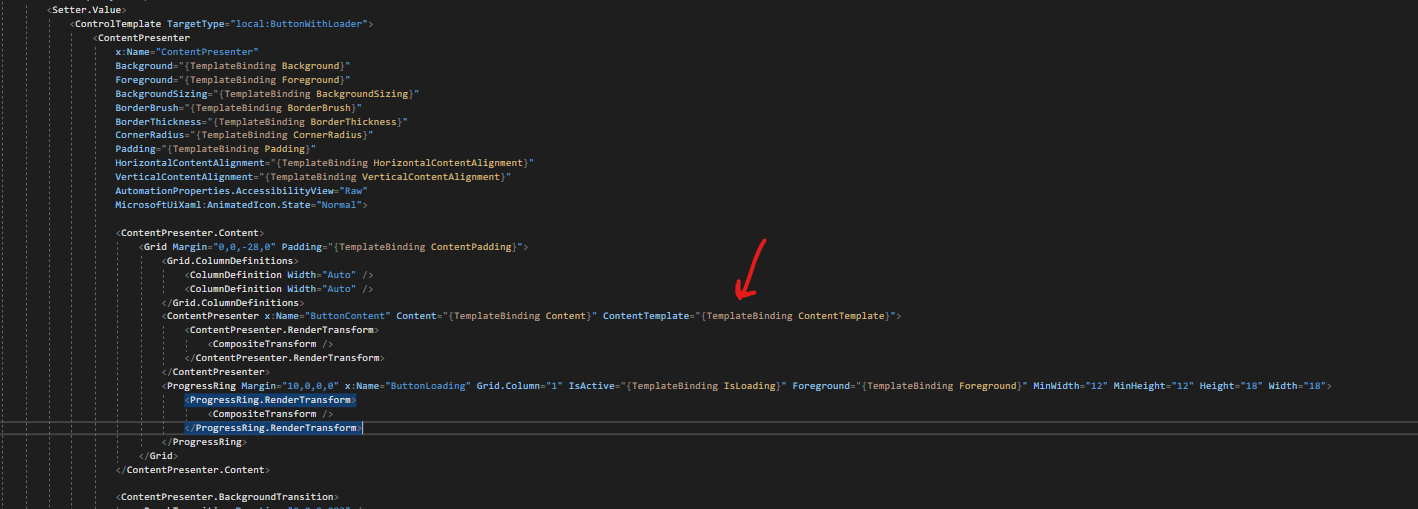
The goal of this custom control is adding ProgressRing by default. Hence i have override the default ContentPresenter named "ContentPresenter" and added the new ContentPresenter named "ButtonContent" along with the needed ProgressRing. What I have to achieve is that I don't need to disturb my control and apply a content with a template into my custom ContentPresenter named "ButtonContent". The example DataTemplate shown in my example is for wrapping the button content by assigning it into a TextBox.
If I move out my custom part of the ContentPresenter.Content of the style, and put them into the ContentTemplate, Then I need to do the same for all the DataTemplate I like to inject into my button which is not adviseable.
Thanks.
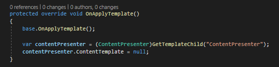
Acheived the same by doing this. Now the ContentTemplate is working fine with Binding and ProgressRing. But I'm not sure why should I null the ContentTemplate of ContentPresenter. :joy