I have a GridLayout of Buttons, one of which has text that wraps to 2 lines. However, this wrapping adds extra space above the Button, causing the Buttons to no longer be vertically aligned. If I place the Button with wrapped text inside a FrameLayout, it looks fine. However, having 1 Button inside a FrameLayout while the others are not makes the code much less efficient, and placing all the Buttons inside a FrameLayout would add a lot of extra elements, possibly hurting performance. Here is the xml for the Button with & without the FrameLayout:
<FrameLayout android:layout_width="wrap_content" android:layout_height="wrap_content" android:layout_column="0" android:layout_row="2">
	<Button style="@style/EntryButton" android:textSize="18dp" android:text="Two Lines"/>
</FrameLayout>

<Button style="@style/EntryButton" android:layout_column="0" android:layout_row="2" android:textSize="18dp" android:text="Two Lines"/>
And here are screenshots (from the Visual Studio 2022 Designer, but the same thing happens when debugging):
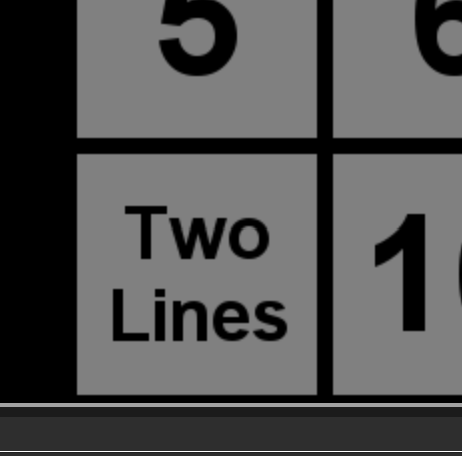
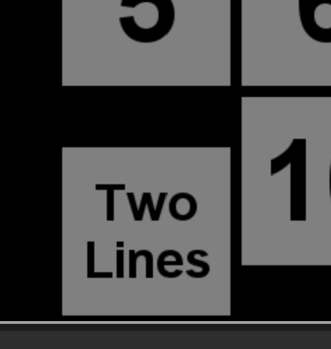
Why is the text wrapping adding extra space only when not inside the FrameLayout, and is there any easy way to avoid this?
' cx='32' cy='32' r='32' /%3E%3Ctext x='50%25' y='55%25' dominant-baseline='middle' text-anchor='middle' fill='%23FFF' %3ENS%3C/text%3E%3C/svg%3E)
' cx='32' cy='32' r='32' /%3E%3Ctext x='50%25' y='55%25' dominant-baseline='middle' text-anchor='middle' fill='%23FFF' %3EA%3C/text%3E%3C/svg%3E)