SQL Server Reporting Services
A SQL Server technology that supports the creation, management, and delivery of both traditional, paper-oriented reports and interactive, web-based reports.
3,061 questions
This browser is no longer supported.
Upgrade to Microsoft Edge to take advantage of the latest features, security updates, and technical support.
' cx='32' cy='32' r='32' /%3E%3Ctext x='50%25' y='55%25' dominant-baseline='middle' text-anchor='middle' fill='%23FFF' %3ELK%3C/text%3E%3C/svg%3E)
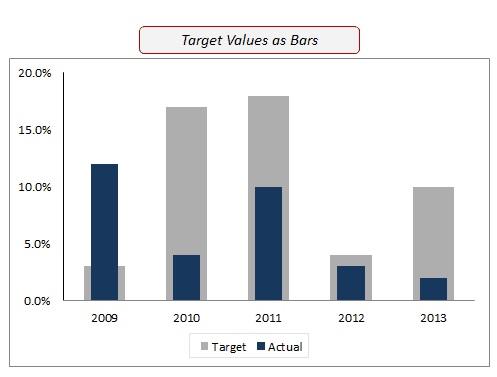
How can I format an SSRS bar chart as in the example below? I have a single dataset that contains sales, goal, year, and month. Currently I have the chart formatted as a bar chart but the sales and goal are side by side. Is it possible to overlap them? Would I need to have a separate dataset for each in order to accomplish this?

Hi @Lela Keller ,
Please refer to: SSRS overlapping column chart.
You could get more creative with the following example: Overlapping Charts in SSRS using Range Charts.
I tested locally:
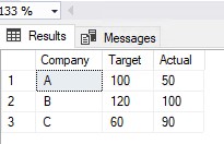
Based on the dataset query, I have a table like this:
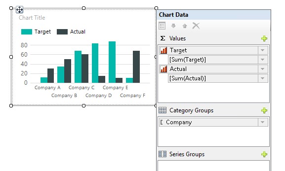
Insert a Colum Chart, set as follows:
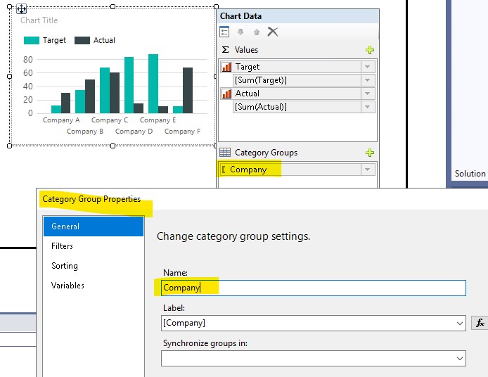
Set Category Group Properties:
Change the expression of Target Series Properties and change the background color to gray::
=Sum(Fields!Target.Value,"Company")
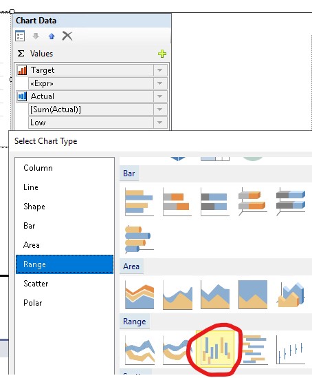
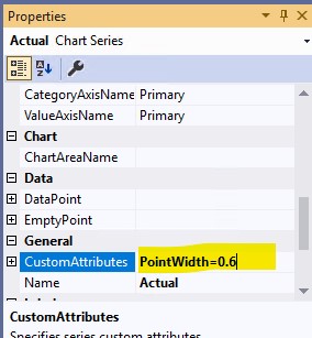
Change the Chart Type of the Actual Series to Range Column, and change the Custom Attributes to PointWidth=0.6:
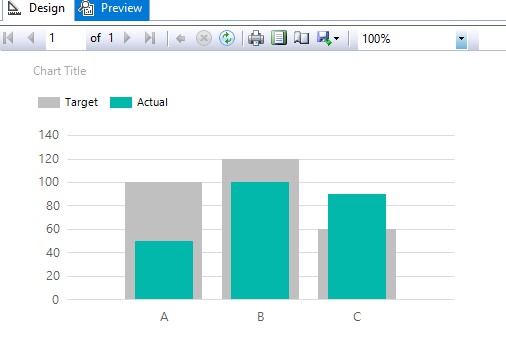
Preview:
If your dataset structure is different from mine, please refer to the link to change the dataset structure using pivot.
Best Regards,
Joy
If the answer is the right solution, please click "Accept Answer" and kindly upvote it. If you have extra questions about this answer, please click "Comment".
Note: Please follow the steps in our documentation to enable e-mail notifications if you want to receive the related email notification for this thread.