Microsoft 365 and Office | Install, redeem, activate | For business | Windows
Processes in Microsoft 365 for setting up Office apps, redeeming product keys, and activating licenses.
This browser is no longer supported.
Upgrade to Microsoft Edge to take advantage of the latest features, security updates, and technical support.
' cx='32' cy='32' r='32' /%3E%3Ctext x='50%25' y='55%25' dominant-baseline='middle' text-anchor='middle' fill='%23FFF' %3EL%3C/text%3E%3C/svg%3E)
NEED TO CREATE GRAPH

Hi @Lily
Welcome to Q&A forum ~
I am working on this issue, any updates, I will post back.
Hi @Lily
As the chart header is PAST PRACTICE TERMS 12 WEEK TREND, and there are 12 Friday dates on X-axis, ars there the date in your source table?
If so, can you show us for better analysis?
At current time, I would suggest you try Pivot Table Chart.
Sales Rep into Filters area, drag the date fields into Rows area, and drag $ PP Term into Values area. 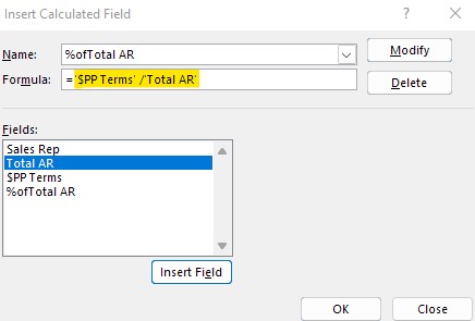
Any misunderstandings, you can let us know.
If the answer is helpful, please click "Accept Answer" and kindly upvote it. If you have extra questions about this answer, please click "Comment".
Note: Please follow the steps in our documentation to enable e-mail notifications if you want to receive the related email notification for this thread.