How to get a button to highlight better on Windows 11

We are a MFC desktop app. Customers are complaining that pressed/pushed button states are nearly indistinguishable from non pressed/pushed button states. On my Windows 10 box, when a button is pushed, the background of the button is a nice easy to see blue color. But, on Windows 11, it barely changes from (253,252,253) to (249,249,249).
In our app, I stepped thru code until I found the button background is displayed in uxtheme::DrawThemeBackground with BP_PUSHBUTTON as the part ID and a state ID of PBS_PRESSED.
I created a stock MFC desktop app and added a button to the AboutDlg and ran it on both my Win10 and Win11 box and I see the same thing with it.
I searched around for a way to change the color theme on the Win11 box but didn't find a setting that helped. I did run Paint and found that pressed buttons in Paint seem to at least have an outline drawn on them.
How do I get a simple MFC app to draw a pressed button so that a user can easily tell it is pressed? Is there some theme setting on Win11 user's should be using?
Hi @RDH ,
I get the following result when I press the button control under win11, is this similar to yours?
Yes, that's what we get. We don't use checkboxes because they need text. And text has to be localized into a lot of languages and that is costly. Plus, sometimes there just isn't a great translation depending on the language or the translated string becomes quite large necessitating more changes to the layout of the window containing the UI (more $$$). However, like with road signs across the world, a picture is worth a thousand words. So, we use buttons with images on them and the background color has always, and easily, shown the user the state of the UI.
Hi @RDH ,
If it is convenient, could you please upload the results under the WIN10 system? If it's a big difference I'll help you report the issue.
Here is what it looks like before the button state is set to pressed and after it is set to pressed.
Figured I'd add the Win10 version.
Hi @Holland, RD (DI SW ME PRD SDE AS) ,
I recommend that you report this issue in DC, and I will help you to report this issue as well
Sign in to comment
3 answers
Sort by: Most helpful
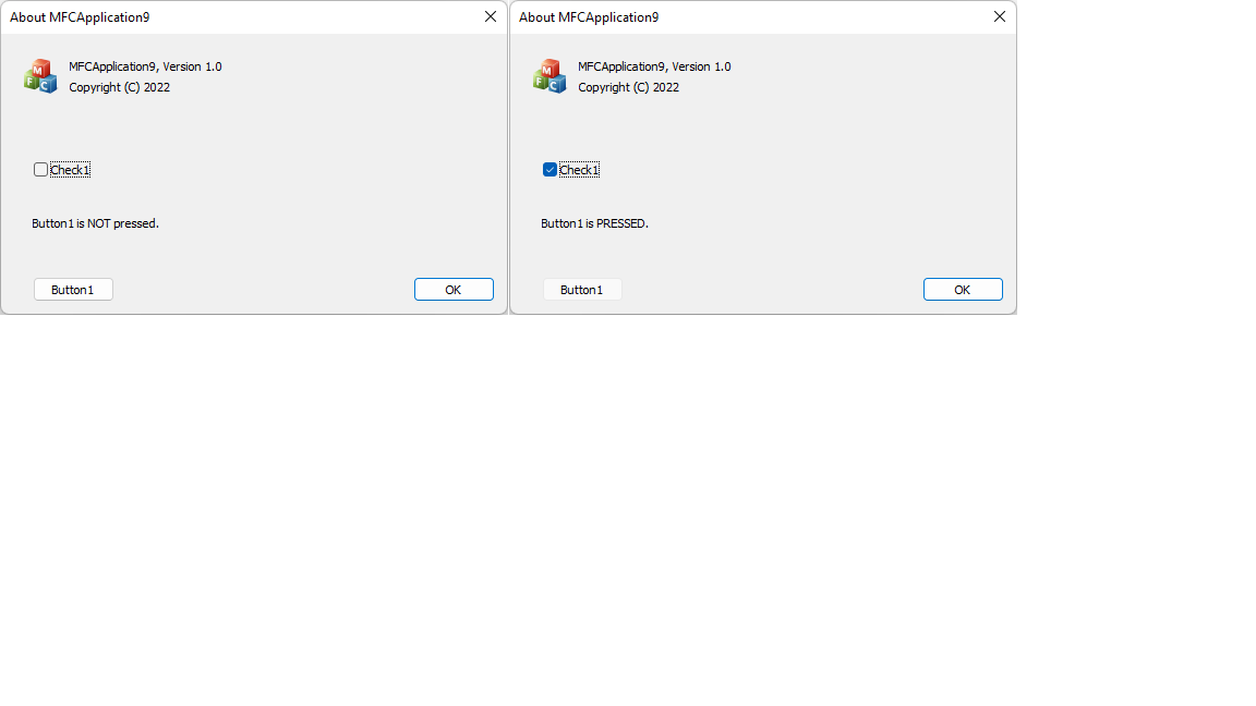
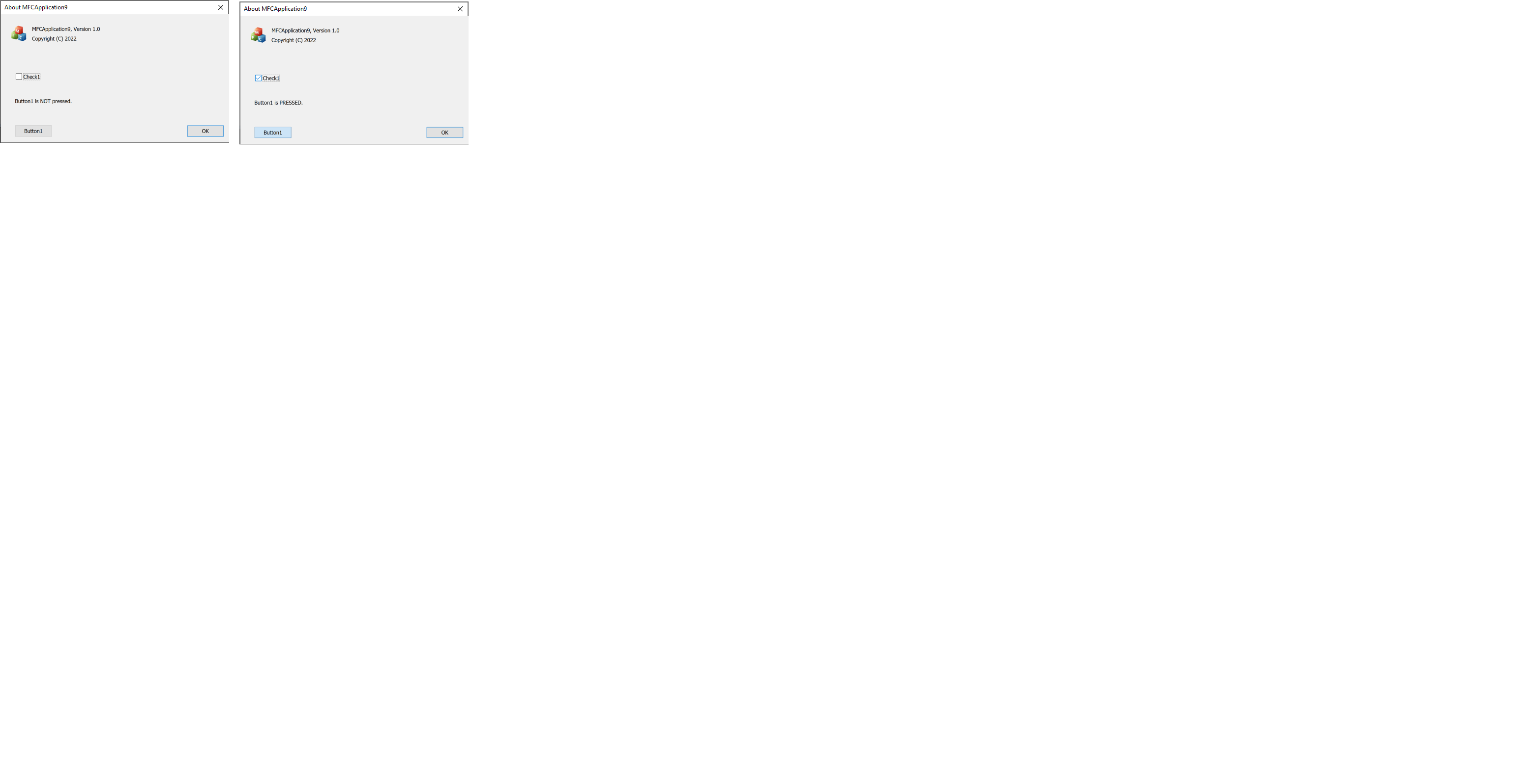
MFC, like all Windows apps, follow the Windows theme. Honestly this is a Win11 theme problem and not something I think your app should work around. You might change the color for the default theme but what happens if the end user is using a custom theme or high contrast or something else? Your app may then look odd.
Personally I think the solution is that you should provide some other indication of a pressed state (for stateful buttons). For the user pressing a button I don't know that it would be a big deal. Do the users honestly get confused when they mouse click on a button and it temporarily changes styling?
But if you really, really want to change the color of the button then you'll have to react to the button clicked event. It has been a really long time since I've had to work with MFC so I found a relatively recent MFC post here on how to do it.
I don't want to to have to write my own theme code for many reasons including what you indicate. And some apps use state buttons to convey information and we are one of them. Think of them as check buttons but with bitmaps on them. Being in the pressed state says "this xxx functionality is turned on".
What seems to be missing in Windows 11 is color. A theme background that changes intensity by a mere 1.5% isn't very useful. According to our users, at least, and I agree. The change is so subtle I wasn't even sure it was changing until I measured the RGB values. Then, I started staring intently when I change the state without blinking and I could tell there was a slight difference.
Many patiently await for restoration of a half decent colour scheme for Windows (12 maybe?) while we put up with the awful pale imitation that we have in Win11.
I fear someone at MS has been intent on clobbering the Windows UI for many years.
Sign in to comment
Hello there,
Did you change colour in you image during deployment?
The CMFCButton class adds functionality to the CButton class such as aligning button text, combining button text and an image, selecting a cursor, and specifying a tool tip. https://learn.microsoft.com/en-us/windows/apps/design/style/color
----------------------------------------------------------------------------------------------------------------
--If the reply is helpful, please Upvote and Accept it as an answer--
Sign in to comment
Hi Limitless,
Odd it is. No "Reply" link under your post but there is under the other posts. So, I just reply here. I am quite familiar with MFC. And in the past we used to draw everything. I don't want to go back to the Win 3.2 days. And, we now build on a toolkit that is built on MFC. It is doing the background drawing using uxtheme APIs which have worked well for a long, long time. We display our PNG images are on top of the button after using theme APIs. We don't put text on buttons for reasons I have already cited.
Why did Microsoft all of a sudden go so bland. I guess color is more expensive than it used to be. I mean really, a tiny change in intensity to show a pressed state is considered as being a modern UI? What was Microsoft thinking?
Sign in to comment
Activity