SQL Server Reporting Services
A SQL Server technology that supports the creation, management, and delivery of both traditional, paper-oriented reports and interactive, web-based reports.
This browser is no longer supported.
Upgrade to Microsoft Edge to take advantage of the latest features, security updates, and technical support.
' cx='32' cy='32' r='32' /%3E%3Ctext x='50%25' y='55%25' dominant-baseline='middle' text-anchor='middle' fill='%23FFF' %3ES%3C/text%3E%3C/svg%3E)
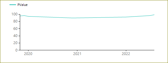
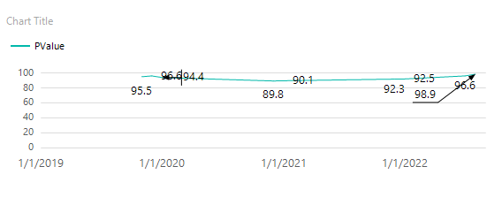
The chart is showing data from 2020 instead of 2019. The chart data should start from 2019.
Please help with this issue.
Note Don't summarize the PValues with Year

Hi @Satish ,
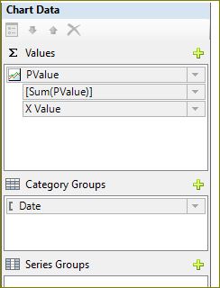
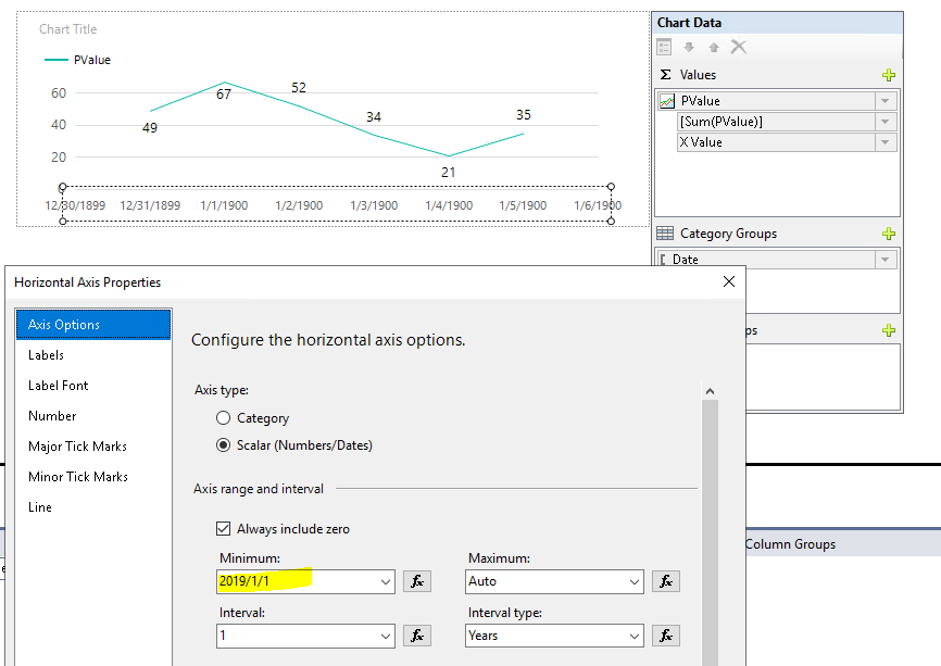
By superseding the automatic labeling features with a manual interval on an axis, the chart must resize all other elements appropriately. As a result, you may encounter unpredictable results with the sizing and positioning of the labels, or the size of other elements on the chart, depending on how many categories are on the category axis.
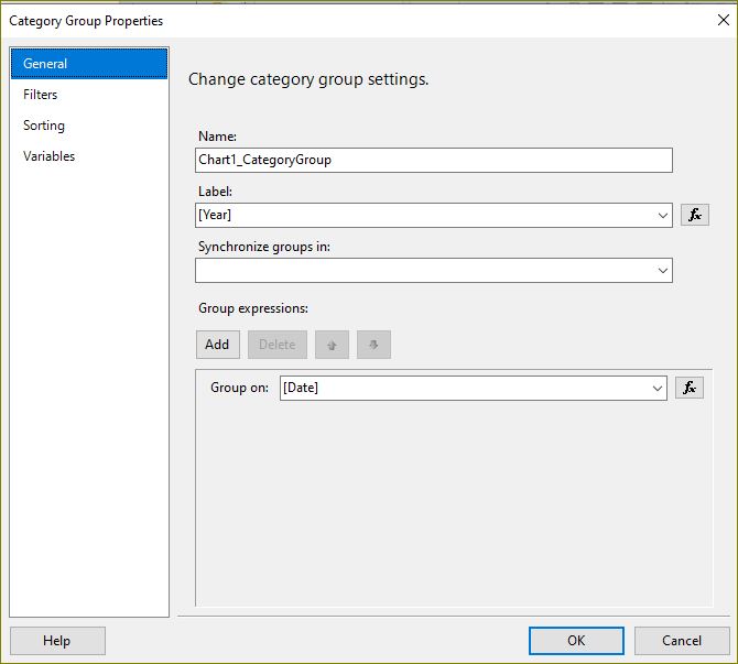
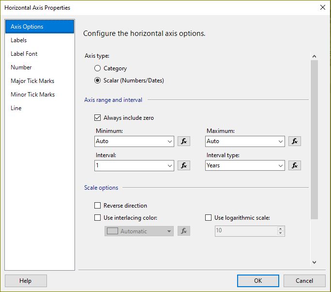
Based on your original data and you set the axis range to autosize, it's clear that it thinks your 2019 data is around 1/1/2020 and omits the 2019 label, this is due to you manually setting the axis interval to "1" ", and the result is automatically generated after setting the minimum and maximum values of the axis range to "Auto". If you want the labels of the category axis to show the year "2019", you just need to manually set the minimum value to "2019/1/1", as shown in the following image:
Best Regards,
Joy
If the answer is the right solution, please click "Accept Answer" and kindly upvote it. If you have extra questions about this answer, please click "Comment".
Note: Please follow the steps in our documentation to enable e-mail notifications if you want to receive the related email notification for this thread.