SQL Server Reporting Services
A SQL Server technology that supports the creation, management, and delivery of both traditional, paper-oriented reports and interactive, web-based reports.
2,878 questions
This browser is no longer supported.
Upgrade to Microsoft Edge to take advantage of the latest features, security updates, and technical support.
' cx='32' cy='32' r='32' /%3E%3Ctext x='50%25' y='55%25' dominant-baseline='middle' text-anchor='middle' fill='%23FFF' %3EMO%3C/text%3E%3C/svg%3E)
Hello guys, noob here!
I need to create a simple column chart in SSRS and I have those data:
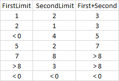
Those values in cells are cluser of "production time" for two different phases of the process. the column "First+Second" adds them up.
basically i've already clustered and i wuold like to obtain a chart in which my x axes has the values [ < 0, 1, 2, 3, 4, 5, 6, 7, 8, >8] and the column shows the count of "FirstLimit" and, above, the "SecondLimit" ....
thanks a lot and I hope to have written something clear :D
' cx='32' cy='32' r='32' /%3E%3Ctext x='50%25' y='55%25' dominant-baseline='middle' text-anchor='middle' fill='%23FFF' %3EAM%3C/text%3E%3C/svg%3E)
Hi @Marco Onnis
In a stacked bar chart, the x-axis is a value axis, displayed as the chart's numeric type values. On the value axis, the scale is always determined by the minimum and maximum numbers in the value field. For more details, you can refer to this link: formatting-axis-labels-on-a-chart-report-builder-and-ssrs.
Best regards,
Aniya