Note
Access to this page requires authorization. You can try signing in or changing directories.
Access to this page requires authorization. You can try changing directories.
Microsoft Expression Blend is a great tool for designing user interfaces. Expression Blend 4 for Windows Phone provides a streamlined development workflow for Windows Phone 7 applications that was previously available for Silverlight and .NET applications only. You can refer to this link to figure out the version of the tool that best suits your purpose, including the option of the free version that is part of the Windows Phone 7 developer toolkit.
I have used Expressions Blend in couple of places in the Chronometer application that I have been building. You will find a series of blog posts on the topic, starting here. I find that Blend is a great way to get the styles for the user interface controls just right – rather than simply using the properties of the control, or hand coding the XAML. For example, in the last post, I had introduced the TimeSpanPicker control for the countdown timer feature of the application. The heart of the control is a TextBox control for the input of the initial value of the timer. If you remember, the default definition, and the default look of the control looked as below:
To make the display of the control consistent with the Stopwatch control, I need to change the background color to black, the font to Courier New, font size to 64, and font color to yellow. I could set most of these properties from the properties toolbox of the control in Visual Studio. However, the font size simply would not take effect. This is likely a bug in the phone toolkit, and I will look into it later. However, this led me to Expression Blend, and I found that you can create user interface styling in a really effective manner in there!
To use Expression Blend for designing the UI, simply right click on the MainPage.xaml file and click the “Open in Expression Blend …” menu as shown below.
This launches Blend in the full design mode for the xaml, as shown below.
You can then navigate to the control you want, by expanding the Objects hierarchy in the bottom left of the tool. Below, I have navigated to the TimeSpanPicker control and have selected it. You can now see the properties of the control in the tool.
Right click on the control, select “Edit Template” and then “Edit a Copy…”, as shown below
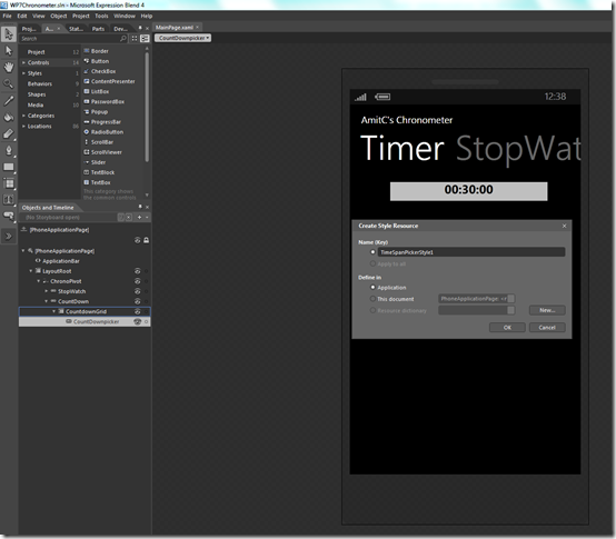
Note that in the dialog box on the right you have two options – to define a new style in the context of the application, or just for the page in question. This determines whether the style definition will go into the App.xaml file or in the MainPage.xaml file. I would really like to define the style so that it is available for the entire application, so I will select the “Application” radio button as shown below.
Notice above that the Object hierarchy on the left now shows the components of the TimeSpanPicker control, and I have selected the DateTimeButton control to really select the specific control I want to change properties of. At this point, the properties palette on the right hand side makes it really easy to change the properties. In the screen below I show how I have changed the font to “Courier New” and the size to “48 points”. (I needed to resize the control size to accommodate the larger size).
Next, I change the text foreground to yellow. For this I select the “Foreground” field in the “Brushes” section at the top right of Blend, and then click the little square button next to “foreground”, select “Custom Expressions” and type “yellow” as shown below. As you see, the text changes to yellow.
To change the background, I click the button next to “Background” and this time I choose “System Resource” and then select “PhoneBackroundBrush” to ensure that the background of the control will match the background of the phone. At this point the control looks exactly the way I wanted it to be!
That’s all we needed to do in Expression Blend. We simply hit “File.Save All” in Expression Blend and exit out of Blend. You will now get a pop-up i informing you that the xaml file was edited outside of Visual Studio, as shown below. We will of course accept this change by clicking “Yes to All”.
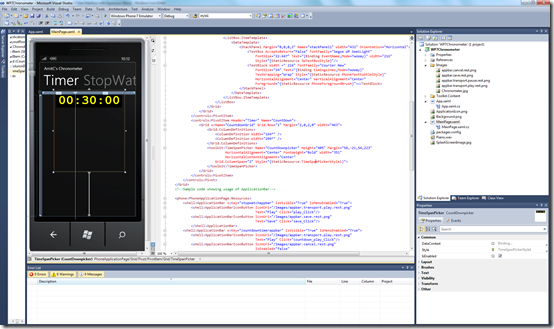
Notice that the designer in Visual Studio immediately displays the control in the new style.
Also, notice that the definition of the TimeSpanPicker control has also been automatically changed to reference the new static resource TimeSpanPickerStyle1 that we had created in Expression Blend!
If you remember, we had chosen to define the new style in the context of the full application. Hence the definition of the above new style is automatically incorporated in the App.xaml file – as shown below
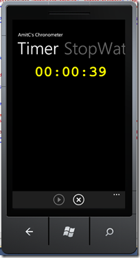
That’s all. We now compile the application and a quick test shows that the timer functionality is working just fine, and the count down timer display shows correctly, and in the intended style, in both portrait and landscape modes
Expression Blend is very powerful designer tool, and it was fun dabbling with it a bit in building the Windows Phone 7 application!
Cheers!


