Building your Dream DevOps Dashboard with the new Azure Preview Portal
Last week at Build 2014, Bill Staples showed off a preview of the new Microsoft Azure portal for the first time. You can jump to his demo in Scott Guthrie’s keynote.
The new portal was built from the ground up to put your applications at the center of the experience. This may sound like an obvious concept, but let us stop for a moment to consider the state of cloud development.
When developing for the cloud today, we are oftentimes managing individual resources (databases, storage, cloud services, virtual machines, and so on). It’s left up to us as cloud developers and IT professionals to piece these resources together in some meaningful way and manage them over time. Have you ever provisioned a cloud resource and later forgot what it’s being used for? Is this resource important, or was it just for testing? Which application was it for? I’m certainly guilty of this. The cloud makes it easy to use resources, and likewise it’s easy to waste them if you aren’t careful.
Furthermore, the planning, development, and testing of those applications is usually done elsewhere, such as within Visual Studio Online. Monitoring the health of those applications and troubleshooting problems might be done in yet another portal, such as with Application Insights. Billing is displayed on a separate page. And so on.
The new portal brings together all of the cloud resources, team members, and lifecycle stages of your application and provides you with a centralized place to plan, develop, test, provision, deploy, scale, and monitor those applications. This approach can help teams embrace a DevOps culture by bringing both development and operations capabilities and perspectives together in a meaningful way.
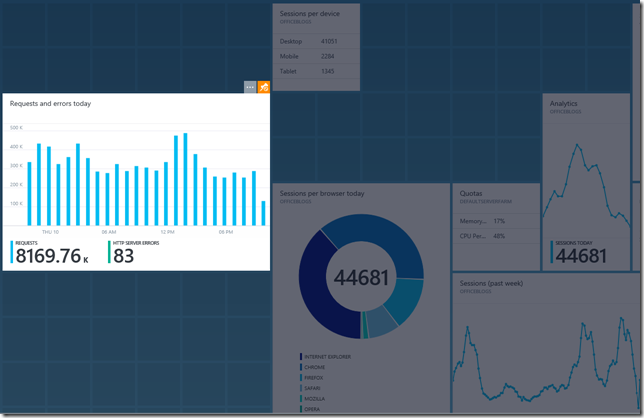
In this post, I want to highlight one of my favorite capabilities of the new portal, which is the ability to create a rich DevOps dashboard for your application such as the one below. Go ahead and click to open the full image. It’s worth it. I’ll wait here.
Pretty nice, huh? Believe it or not, this took us only about 15 minutes to create and fine tune using the new portal. Everything you’re looking at here is real, nothing is faked or demo data. The application in this screenshot happens to be the Office blog (https://blogs.office.com/) which runs on Azure Web Sites. We simply opened up that Azure subscription in the new portal (https://portal.azure.com) and started adding the parts we wanted to visualize.
The new portal allows each user to transform the portal home page (called the Startboard) into their own customized dashboard. You can make it your own and keep evolving it over time to suit your needs.
Let’s take a closer look at what you’re seeing in the dashboard above.
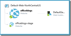
Resource Map
I mentioned that the new portal was designed to bring together all of the individual resources of an application into a consolidated view. This is most evident by looking at the Resource Map part on this dashboard. The Resource Map is a visualization of a Resource Group, which is a model where the relationship between resources is stored (along with other important information). For this application, you can see the relationship between the production web site, the staging web site, and the billing plan. For other applications you might also see databases, database servers, or even Visual Studio Online team projects where the source code is managed and bugs related to this application are being tracked. To learn more about Azure Resource Groups, watch Azure Resource Group Model: Modern Management for Modern Cloud.
Analytics
The new portal brings in Application Insights capabilities which provide you with a wide range of analytics for your applications. This allows you to understand if your application is available, how it is performing, and even how users are interacting with it.
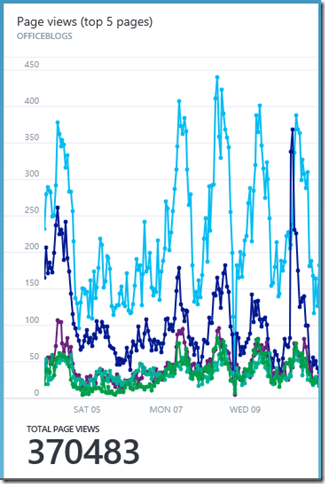
For example, this graph shows you the top 5 pages which are being requested for your application:
Clicking the part above opens a new blade which details the top-requested page URL’s.
Not surprisingly, the default page was the most-requested page. But a close second was the announcement of Office for iPad.
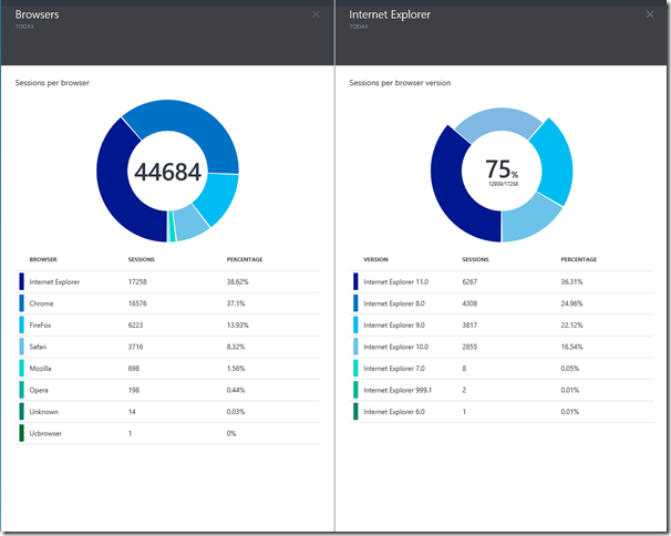
The Browsers part is another simple but effective chart which helps you understand the makeup of web browsers which are accessing your application. In the screenshot below, I have clicked on Internet Explorer in the Browsers blade to open the Internet Explorer blade. This new blade shows me a breakdown of the various versions of Internet Explorer being used by my application’s visitors. I then clicked on the pie chart wedges making up Internet Explorer 9, 10, and 11. This gave me the sum total (75%) of Internet Explorer traffic attributed to those browsers. This can be helpful in making product development and testing decisions regarding which browsers I should be supporting.
Service Health
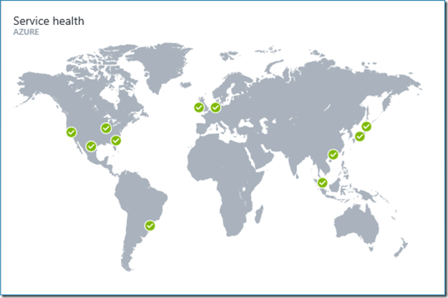
Building any cloud application means that you are taking dependencies on a range of services which are probably outside of your control. Since no cloud vendor can guarantee 100% uptime, it is important to understand at a glance if there is an outage for a service you depend on.
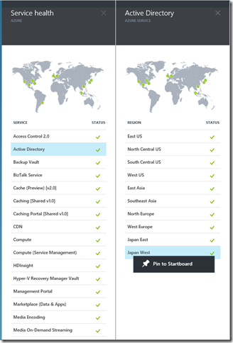
The Service Health part provides this global view across Microsoft Azure.
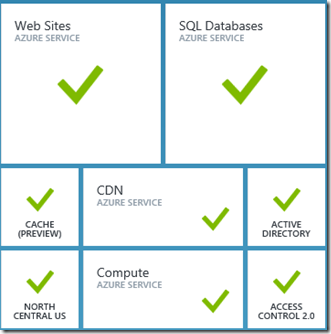
You can click on this part to open a set of blades which allow you to explore each Azure resource type and the regions each resource is available in. You can easily pin the resources you care about back to your Startboard to tell at a glance if a service you care about is degraded or offline.
Pricing and Billing
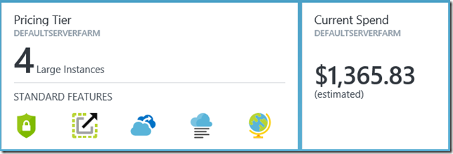
One of the top-requested features by Azure customers is for more visibility into how much cloud resources are costing them. The new portal provides unprecedented transparency into this information. The parts below show me the billing plan I have elected for this application, along with a projection of the total estimated charges for the month. The Current Spend part you’re looking at below for the Office blog illustrates the economics of Azure Web Sites – this is for a site which serves up hundreds of millions of requests per month.
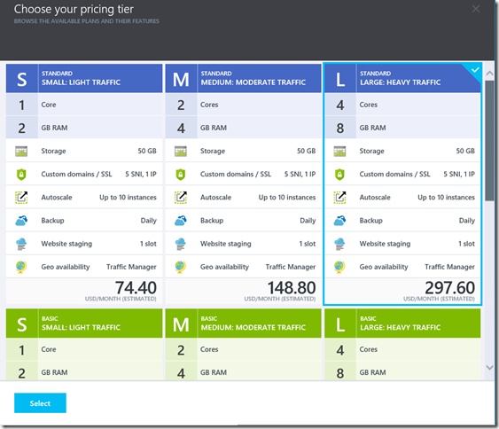
Clicking on the Pricing Tier part allows you to choose a different pricing plan for your Azure Web Site. From here I could select a new pricing plan, click Select, and in seconds my Azure Web Site would scale to the new resource model.
Customization Mode
Most customization is performed by entering a customization mode in the portal. If you are familiar with customizing a Windows Phone or a Windows 8 start screen you will be immediately familiar with customizing the portal. Enter the customization mode by clicking on your user avatar and selecting Customize.
It’s worth noting in the screenshot above that “Restore default settings” would reset your Startboard back to the default state. Avoid clicking this if you have invested in creating a customized dashboard.
Alternatively, you can also right-click almost anywhere in the portal and choose Customize.
Once in customization mode you can select an individual part and click the orange pin to change the size of the part. Most parts support a range of tile sizes, each thoughtfully designed to present the right amount of information for that configuration.
You can also drag and drop parts to reposition them. A positioning grid helps you understand your alignment options.
When you are done customizing, click Done in the upper-right corner:
Or right-click anywhere and select Done customizing:
Touch
The portal works really great on a touch-screen device. I’ve tried it on my Surface, and on an iPad, but my favorite experience so far has to be on one of the Microsoft Perceptive Pixel devices we had at Build. We loved it so much, in fact, that we rolled it out on stage for Bill to show off during the keynote:
I expect that in the not-too-distant future these types of high-PPI touch-enabled displays will become commonplace in DevOps team rooms. But until then, you can get started with a cheap projector or LCD monitor.
Considerations
All of the capabilities mentioned above are available to you today using the new Azure Preview portal. But you should be aware of some of the limitations of the preview.
Only a subset of Azure resources can be managed from this portal today – namely Web Sites, SQL, MySQL, and Visual Studio Online team projects. More resources will be coming over time, but you can always access the release version of the portal (https://manage.windowsazure.com) when you need to do something that the new portal doesn’t yet provide.
Additionally, accessing the new portal requires that you are an administrator or co-administrator for a given subscription. This means that in addition to being able to view the health of your applications, somebody with access to your portal could accidentally (or maliciously) stop/delete resources or create new ones. This is no different from granting someone co-admin access to a subscription today, but it’s something to be aware of if you intend to create a centralized dashboard for the entire team. Role-based access control (RBAC) is an important part of the team’s backlog, and this will be coming in the future.
Summary
The new Azure Preview portal paints an exciting look at the future of DevOps. This is a first-of-its-kind experience which brings together all of the individual resources, people, and lifecycle stages of your application into a unified portal. In this post I have just introduced you to a very narrow set of its capabilities, and Microsoft is just getting started. There is a lot of future investment happening which will make this experience even better over time.
We want to see you take the portal and make it your own. I would love to see pictures of your own dream dashboard created with the new portal. You can link to them from the comments below, or hit me up on Twitter @briankel.
Thanks for reading!
Comments
Anonymous
April 12, 2014
Is it possible to plug my own content into that portal to monitor other sort if data? For example, the output of a CI system?Anonymous
April 13, 2014
Old MSFT slogan.. "the wow starts now" . Excellent preview, it's fast, feels like it's an app (please yes) in a browser. Great to have metrics and insights now all integrated!Anonymous
April 13, 2014
Miguel, good question! We're working with some partners now. I'll email you directly about this.Anonymous
April 13, 2014
I did enable this on my web app and it is quite helpful. I however want to enable the full Application Insights in my application and then I am presented with a new Guid for it to be tracked. How can I make use of just one Guid Id and have both portals track using the same Guid Id? That would be a bit cleaner than to register the second Guid Id.Anonymous
April 14, 2014
I am also interested in displaying data from nginx etc in the portal. Maybe ability to Iframe in urls would work.Anonymous
April 15, 2014
@Marais, great question. I have asked the App Insights team if this is possible and for the moment it isn't. They are considering it for the backlog.Anonymous
April 16, 2014
Does this works only for Apps hosted on Cloud infrastructure? We have some CRM services hosted on IIS Servers On-Premise and their endpoints only exposed in through cloud to be consumed by any mobile/tablet applications. Can it be able to monitor these web servers as well which are hosted on-premise and are not directly exposed to OPEN Internet? Any solutions/workarounds would be super beneficial because we are looking for a monitoring capability which can collect data both from On-Premise servers/applications as well as if hosted on Cloud then from public cloud as well.Anonymous
April 16, 2014
Hi Raj, Today the preview only works with a subset of Azure resources (see the "Considerations" paragraph of my post). But Application Insights might work for you, depending on the type of applications you are hosting. Get started here: msdn.microsoft.com/.../dn481095.aspx For this to work your on-premises servers will need to be able to push data to the cloud. Otherwise, if you require everything to live on-premises you should look into System Center Operations Manager (SCOM).

